Design Approach
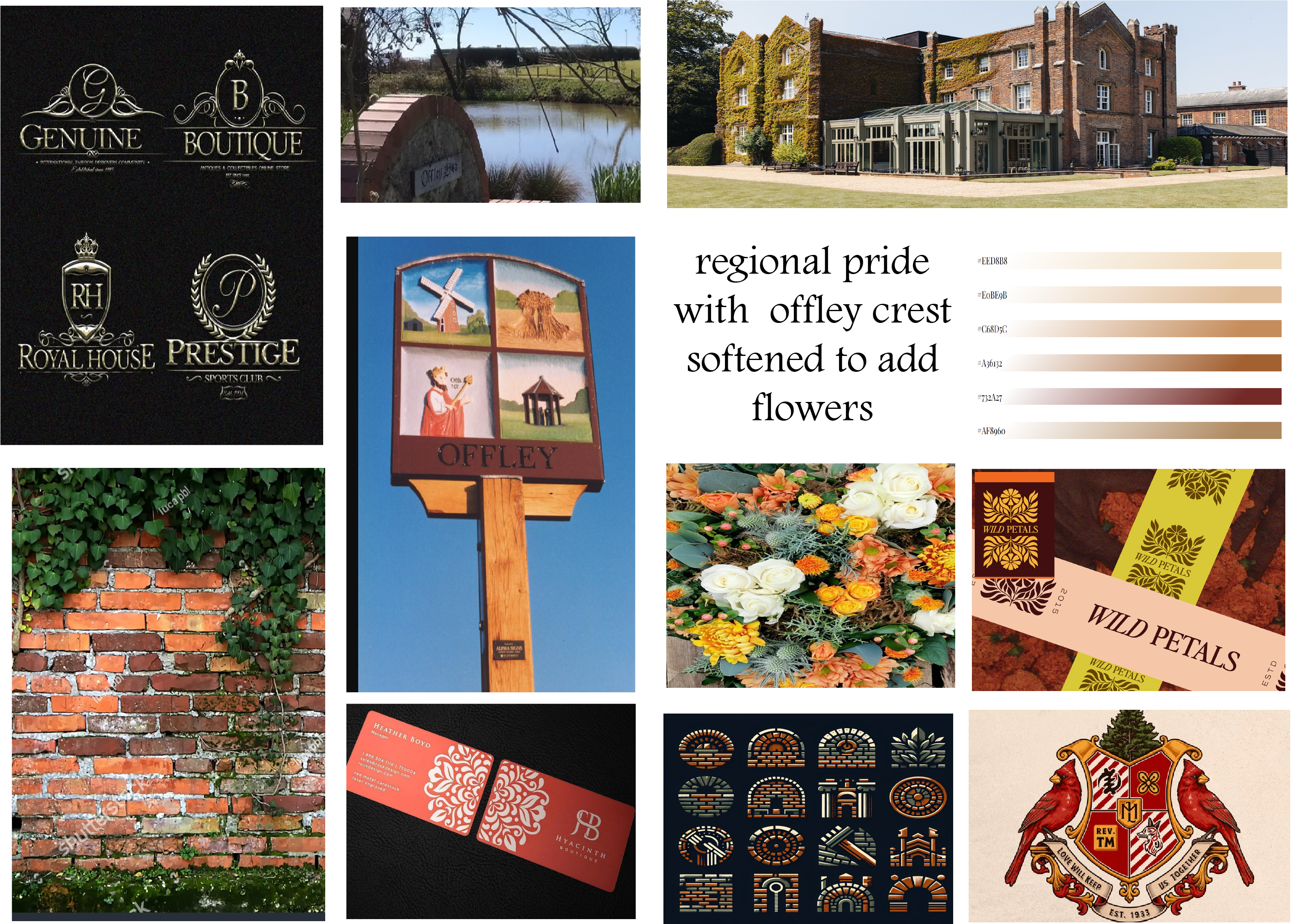
This project required deep research into the floral industry in the United Kingdom, along with historical and geographic study of the region in southern England where the business is based. Understanding local craft traditions, native plant symbolism, and the cultural role of floristry in rural communities helped shape a visual identity that reflects place, not just aesthetics.
Problem Space
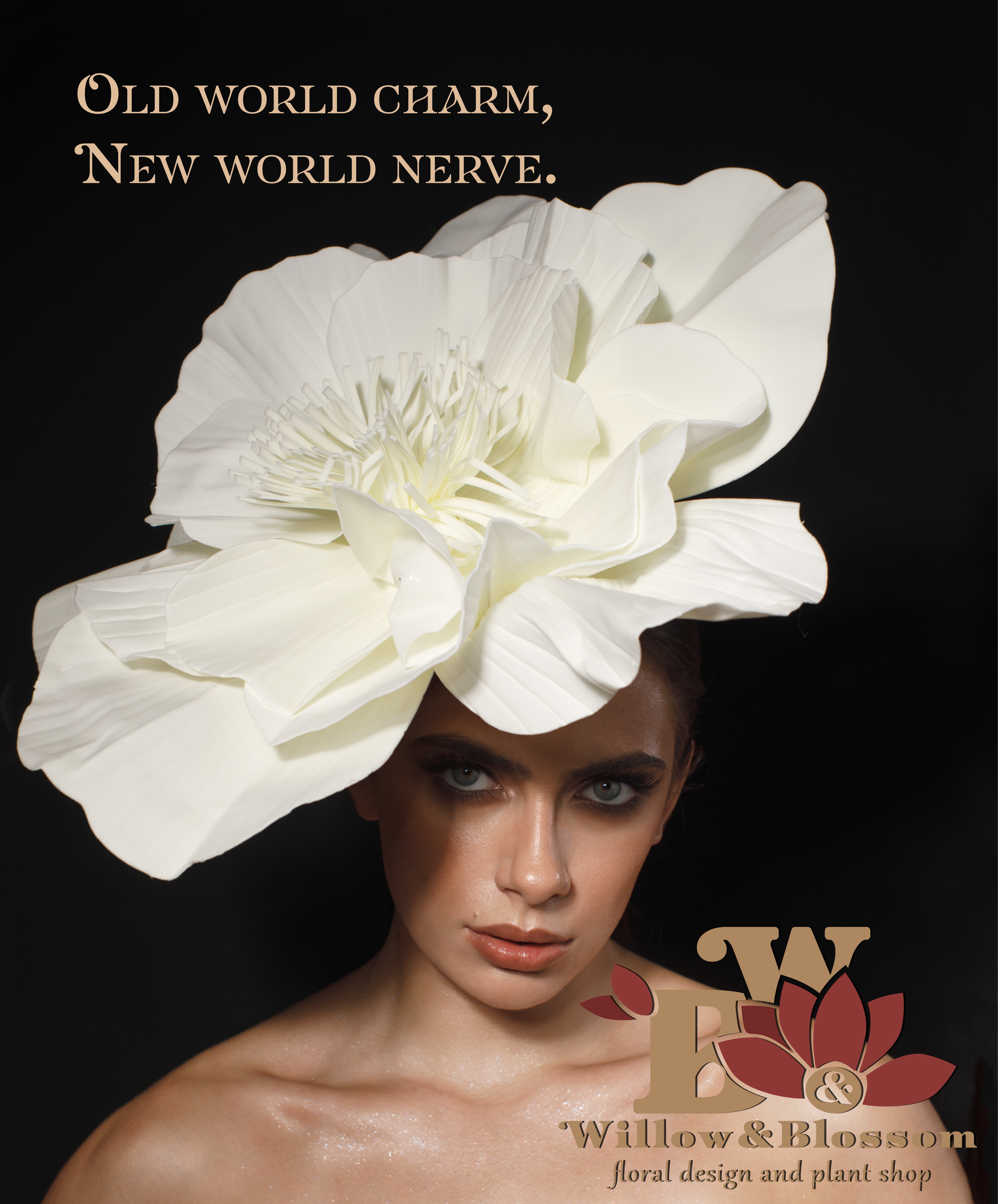
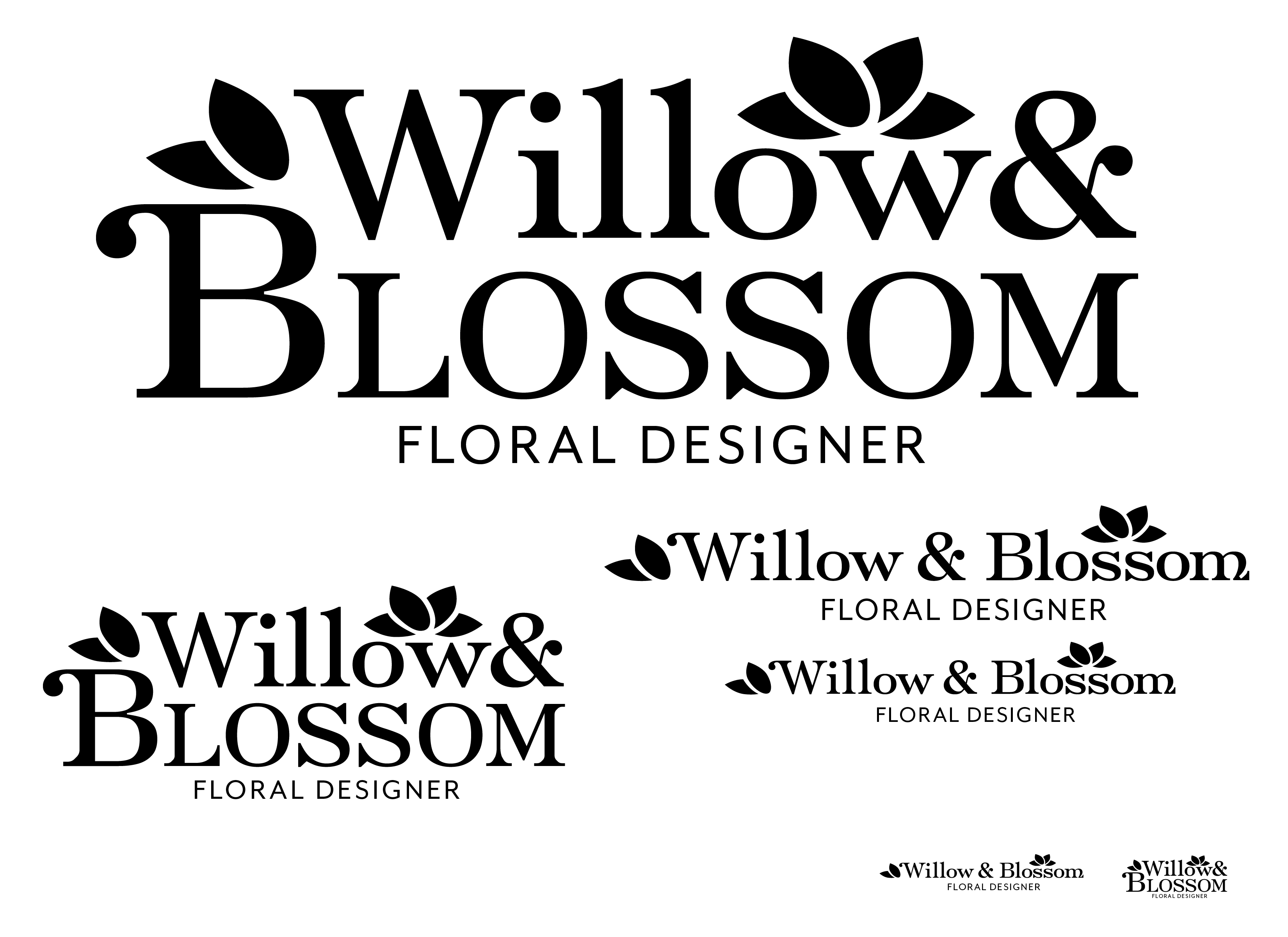
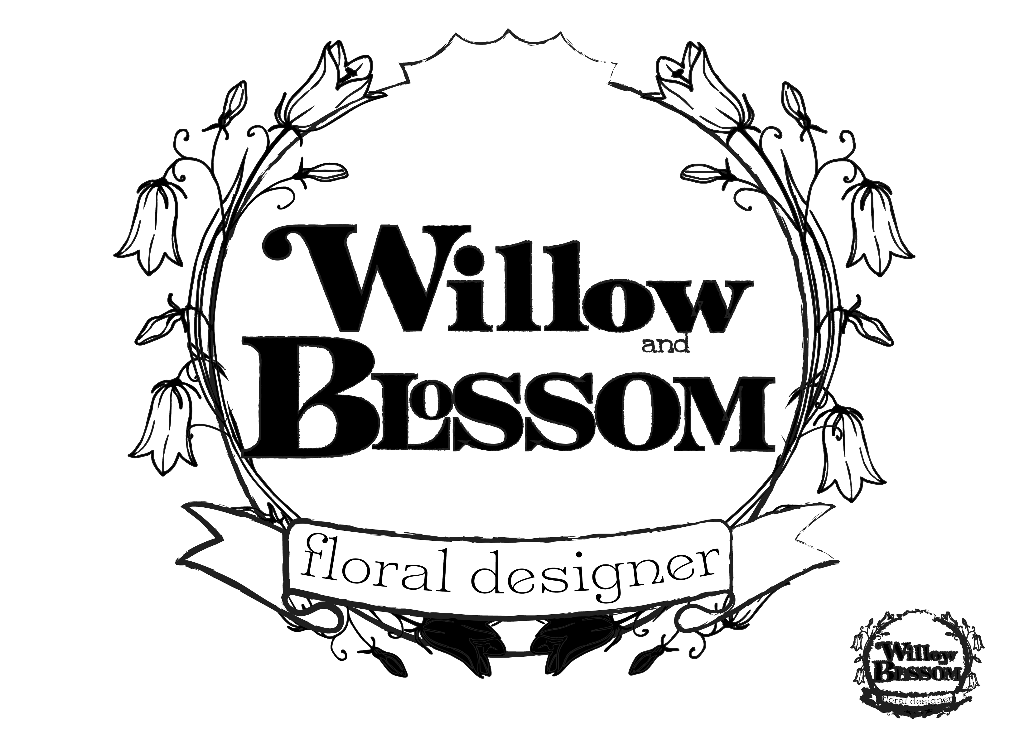
Most floral brands lean into the same aesthetic vocabulary: watercolor flowers, blush tones, cursive typography, and overly "delicate" branding. The result is sameness. Willow & Blossom needed a system that communicated craft, heritage, and artistry — not just event décor.