The Designer’s Mind
Overview
The Designer’s Mind is a typographic poster series exploring design, thought, and cultural expression through verified quotes from Black designers, artists, and thinkers.
Rather than presenting biography-heavy tributes, the series centers each person’s words and uses typography, scale, color, and composition to interpret the ideas behind them. The result functions as both a visual study and an invitation to learn more about the voices that have shaped design and culture.
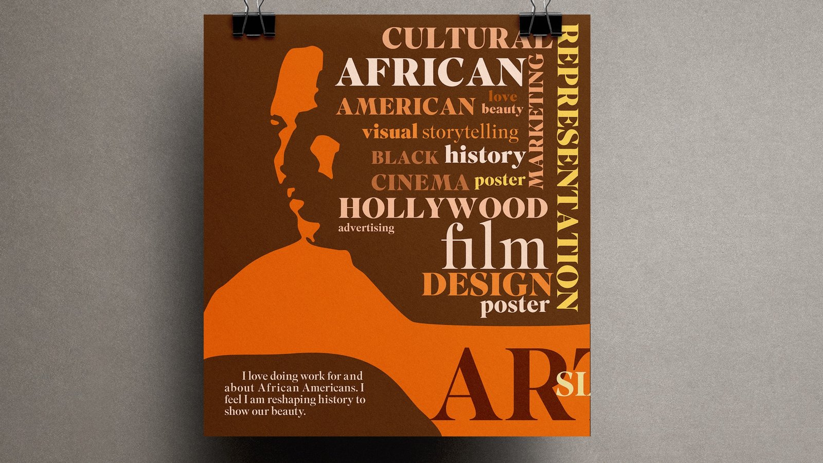
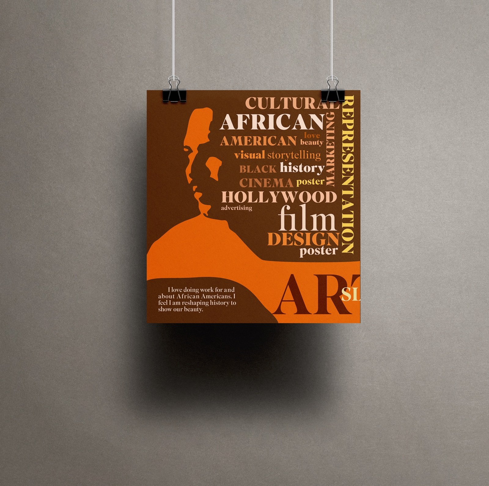
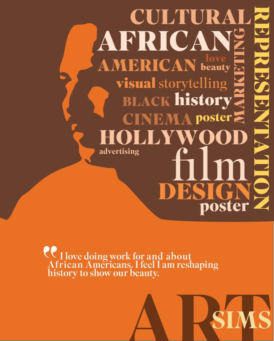
Art Sims
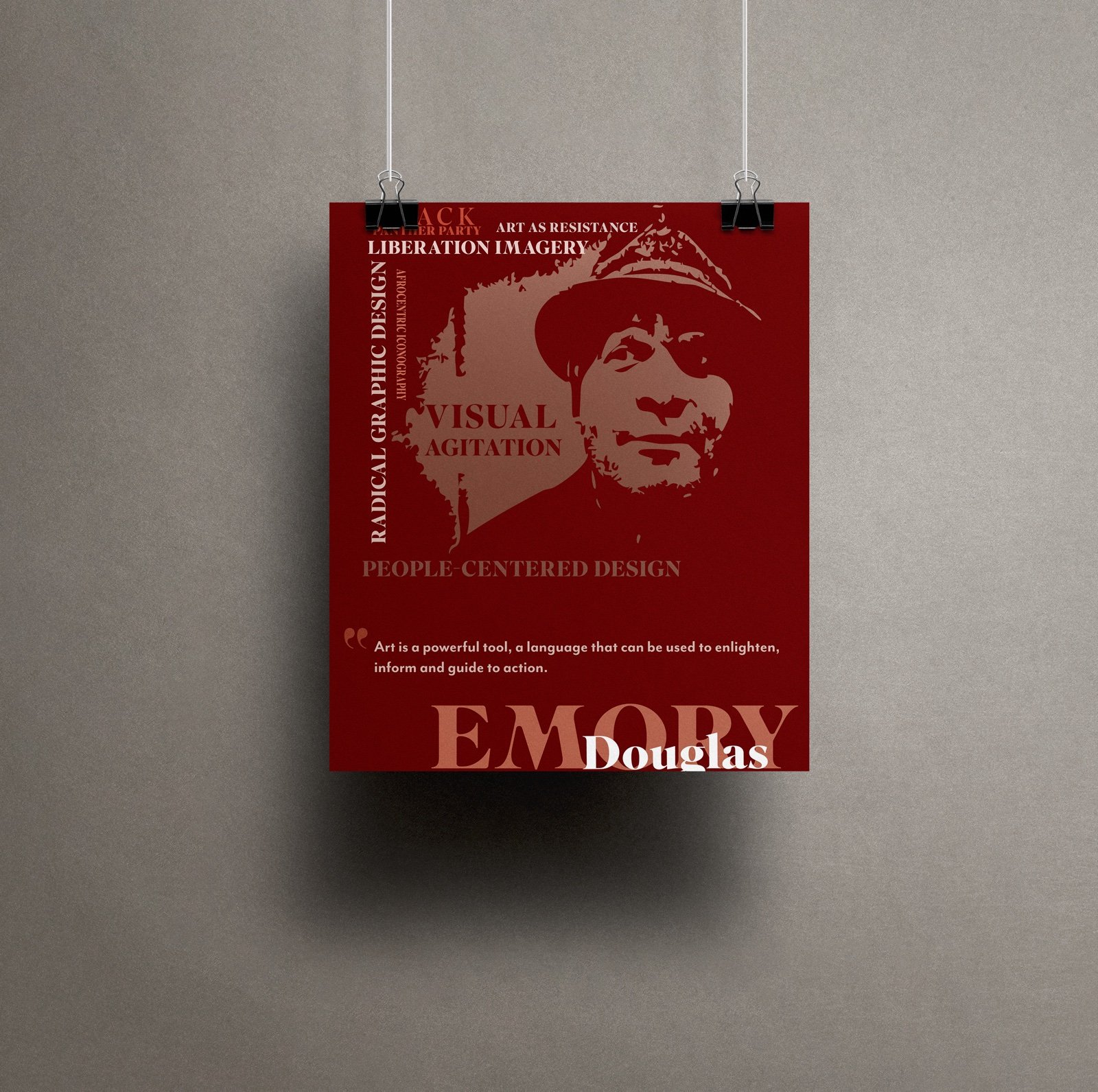
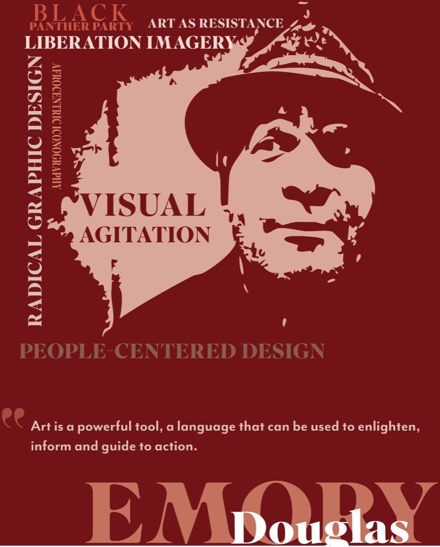
Emory Douglas
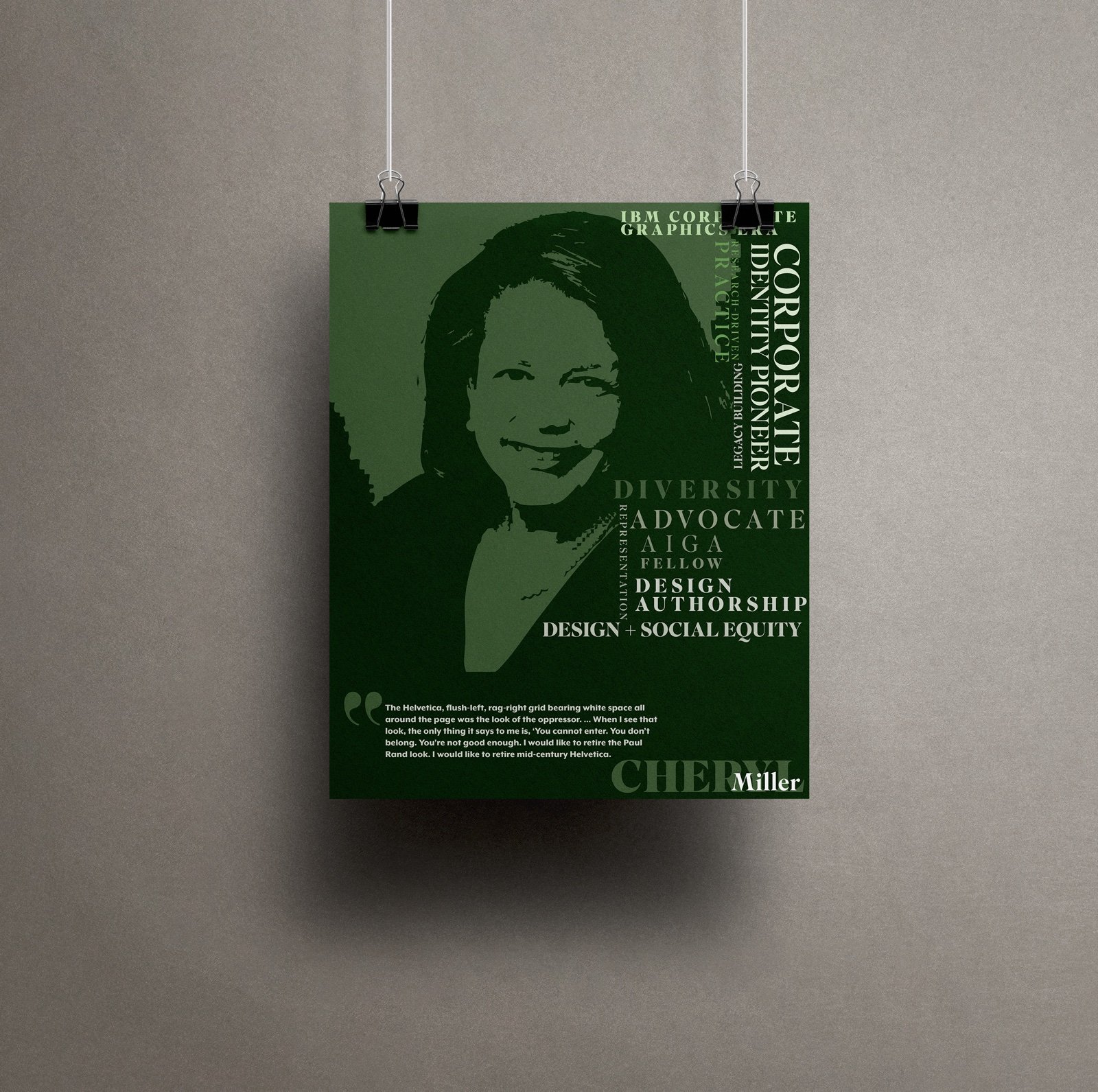
Cheryl D. Miller

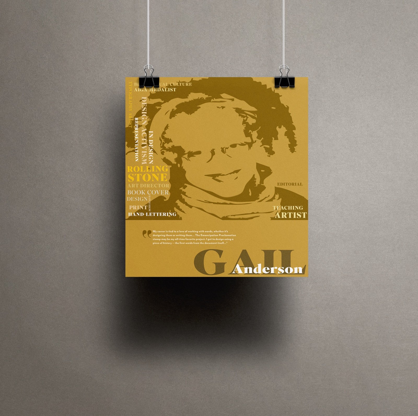
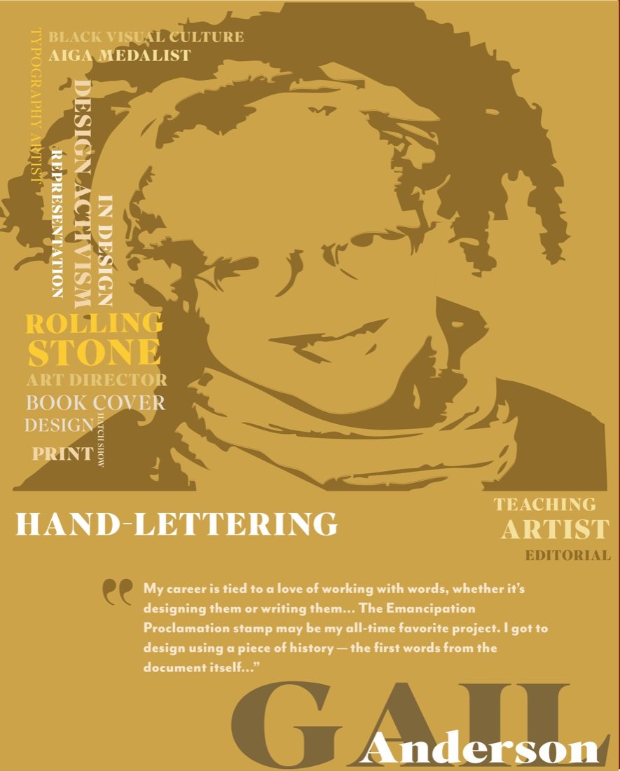
Gail Anderson
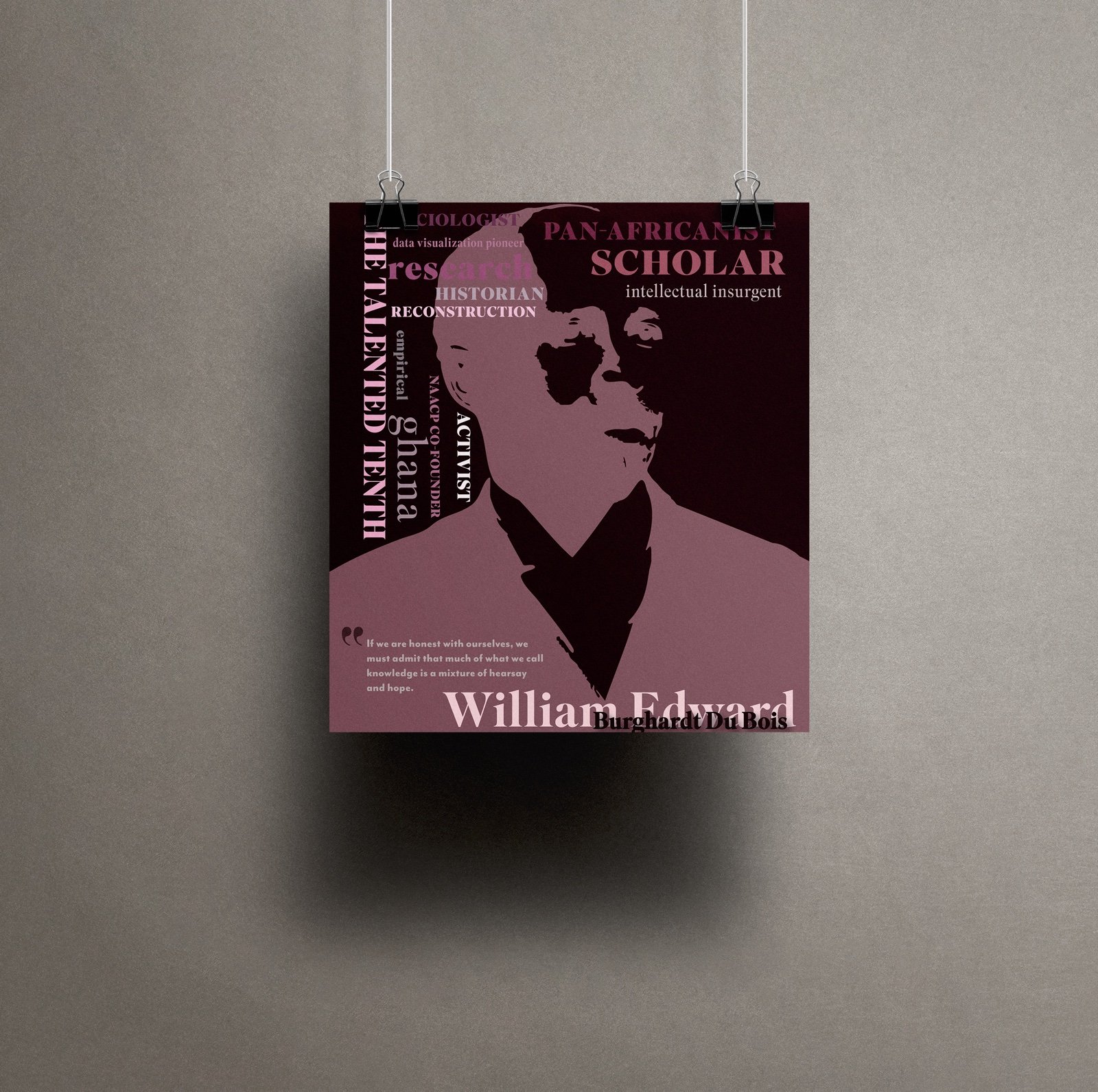
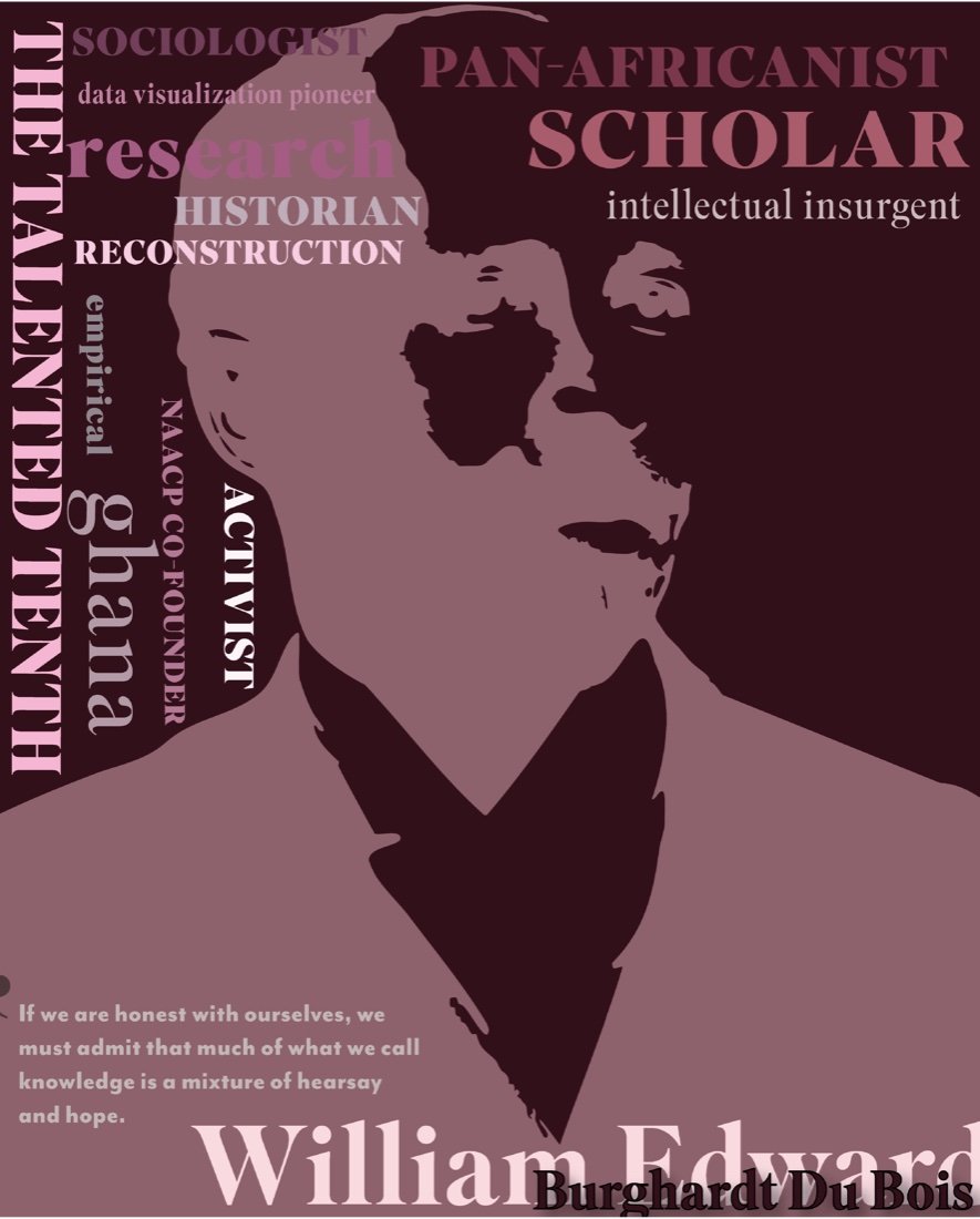
W.E.B. Du Bois
Quote Research + Concept
Problem
Black designers and thinkers are often reduced to brief biographies or included as supporting references rather than treated as central voices within design history.
Solution
The series begins with carefully verified quotes that reflect the core concerns of each person’s work.
Art Sims, Emory Douglas, Cheryl D. Miller, Gail Anderson, and W.E.B. Du Bois were selected for their distinct perspectives on representation, political art, design systems, knowledge, and cultural power. Each poster allows the quote to lead, using visual interpretation rather than biography to communicate voice and meaning.
Typography + Visual System
Problem
The posters needed to feel cohesive as a series without flattening the distinct tone and perspective of each featured voice.
Solution
A shared grid, limited palette, and consistent typographic hierarchy create unity, while color, scale, and composition shift to match the tone of each quote.
Superior Title provides a high-contrast serif foundation with enough visual authority to carry both intellectual and expressive content. A loose golden-ratio grid controls placement and rhythm, while each poster is limited to two or three colors to maintain focus and discipline.
Academic plum, propaganda red, reclamation green, heritage gold, and future orange give each poster its own emotional register while preserving the larger visual system.
Portrait Illustration + Composition
Problem
The series needed recognizable portraits without allowing imagery to overpower the language at the center of each poster.
Solution
Reference photographs were traced, refined, and converted into simplified silhouettes in Adobe Illustrator.
The portraits provide recognition and historical context while keeping the quotes visually dominant. Consistent placement of names, silhouettes, and text creates a clear hierarchy, while scale and contrast emphasize the words most central to each message.
Digital Adaptations
Problem
The poster system needed to retain its hierarchy and emotional impact beyond large-format print, where scale and viewing distance change significantly.
Solution
Each composition was adapted for social, portfolio, and digital-display formats using responsive cropping, simplified hierarchy, and controlled type scaling. These variations preserve the featured quote and designer’s voice while allowing the series to circulate as educational content across platforms.
Outcome
The Designer’s Mind demonstrates how typography alone can carry voice, movement, history, and emotion.
By treating Black designers, artists, and thinkers as sources of knowledge rather than supporting references, the series creates educational work that is designed to inspire curiosity as much as admiration. Each poster stands on its own, but together they form a cohesive visual record of ideas that continue to shape design and culture.