The Sanctuary Bistro
Overview
The Sanctuary Bistro is a conceptual rebrand for a local vegan restaurant led by a classically trained chef. The identity was designed to bring the visual brand into alignment with the restaurant’s refined food, thoughtful service, and warm dining experience.
Rather than relying on familiar wellness or “healthy eating” tropes, the system uses Art Deco geometry, natural materials, and richly textured imagery to position The Sanctuary Bistro as an elevated plant-based dining destination.
Logo, Color + Typography
Problem
The existing identity did not reflect the quality of the food, the chef’s training, or the sophistication of the guest experience.
Solution
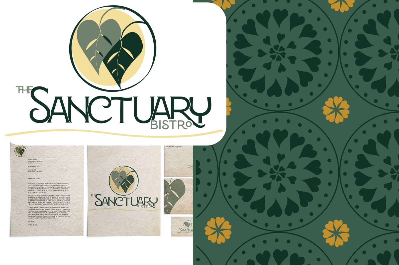
A refined visual system combines Art Deco influence with organic symbolism to express both culinary craft and environmental stewardship.
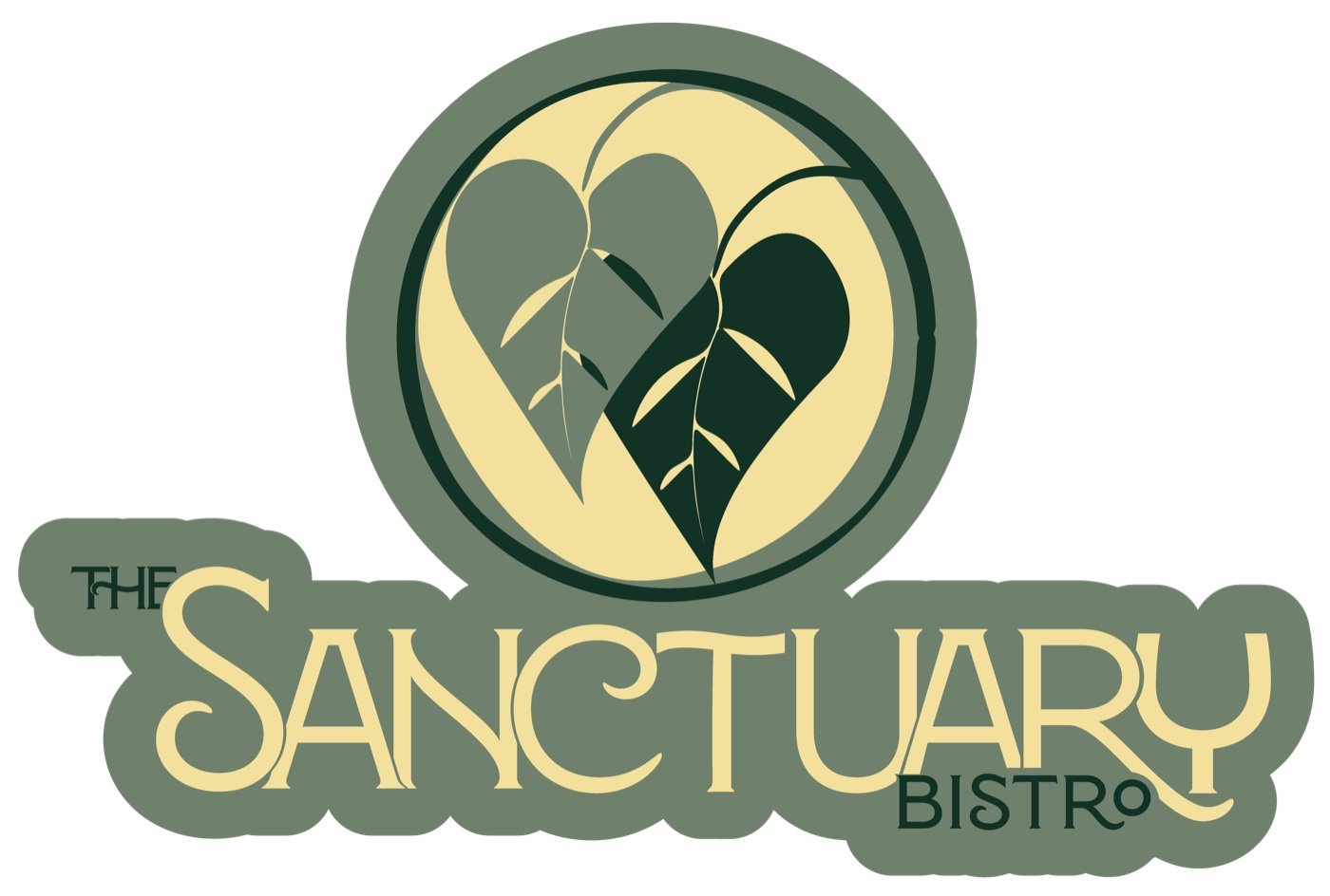
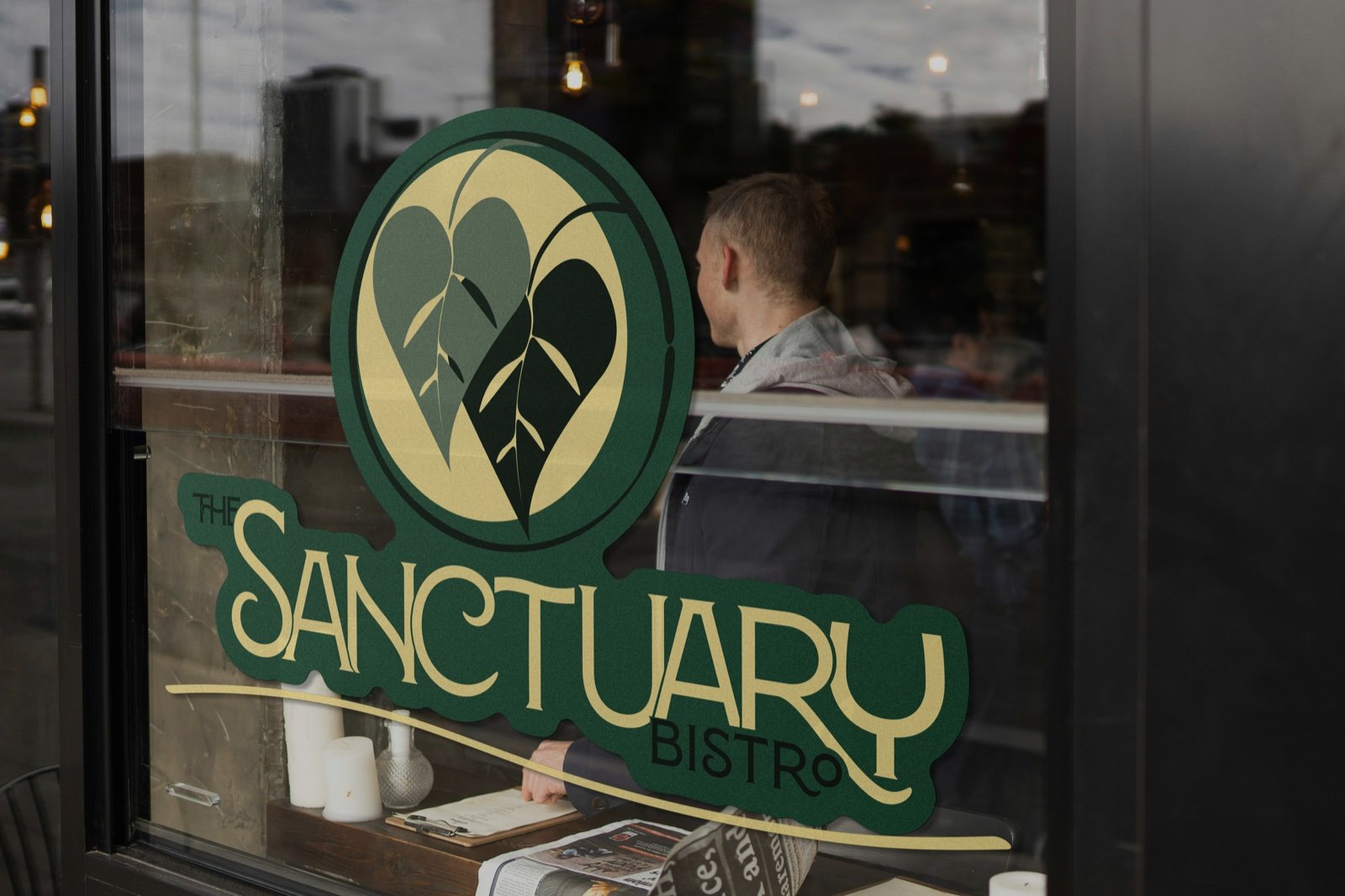
The double heart-leaf mark reinterprets a familiar vegan symbol through a more distinctive form representing care, renewal, and responsibility. Disalina gives the wordmark sculptural character and cinematic elegance, while Area Normal provides clarity across menus, signage, packaging, and digital applications.
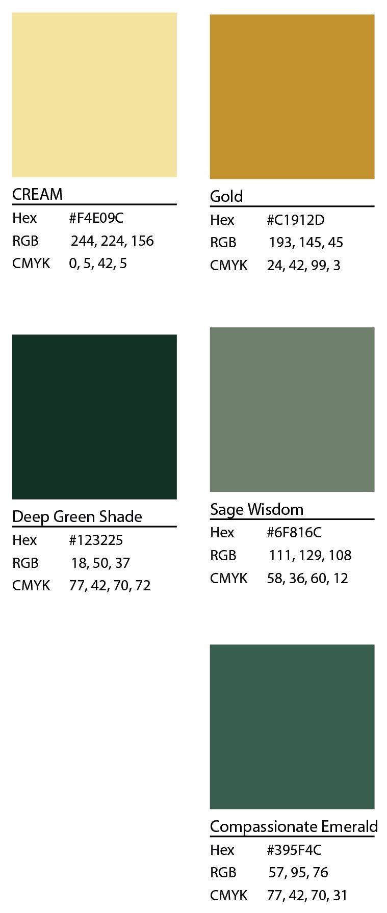
Grounded greens, deep forest tones, warm metallics, and sunlit neutrals create a palette that feels natural without becoming rustic or predictable.
Menu Experience
Problem
The menu needed to communicate the chef’s creativity and seasonal approach without overwhelming guests or making plant-based dining feel overly technical.
Solution
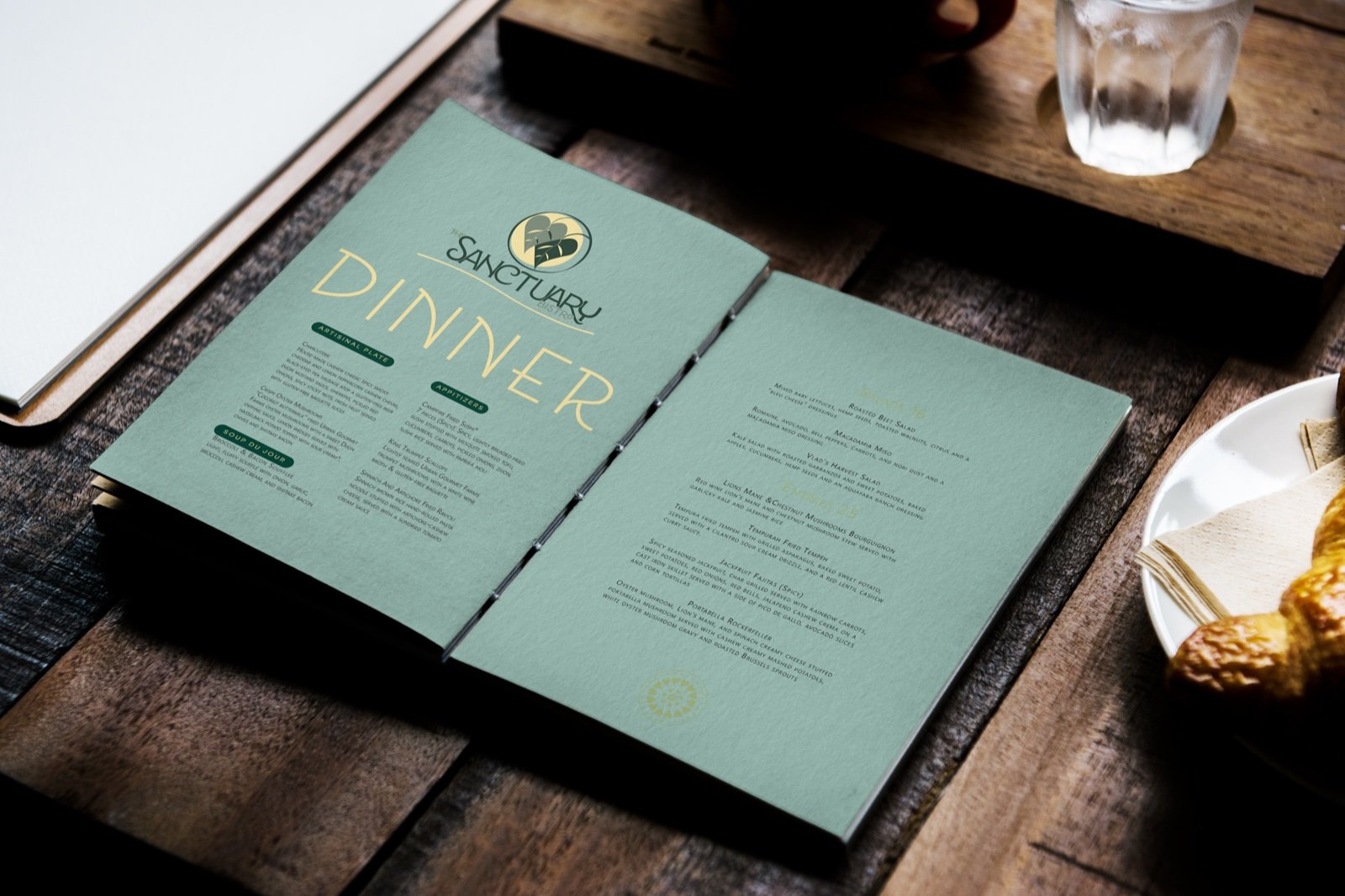
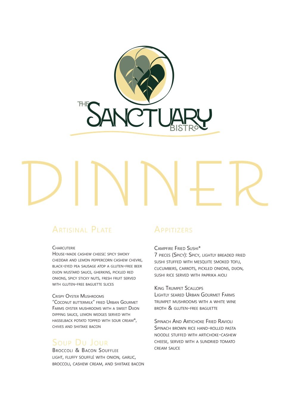
Generous spacing, clear hierarchy, and restrained illustration create a menu that feels curated, calm, and easy to navigate.
Tasting and pairing pathways guide guests through the experience, while seasonal highlights give the chef room to introduce changing ingredients and dishes without disrupting the larger system. The result supports both practical decision-making and the slower, more intentional rhythm of fine dining.
Digital Presence
Problem
The restaurant’s digital presence needed to communicate an elevated dining experience while supporting practical needs such as menu updates, seasonal promotion, and guest discovery.
Solution
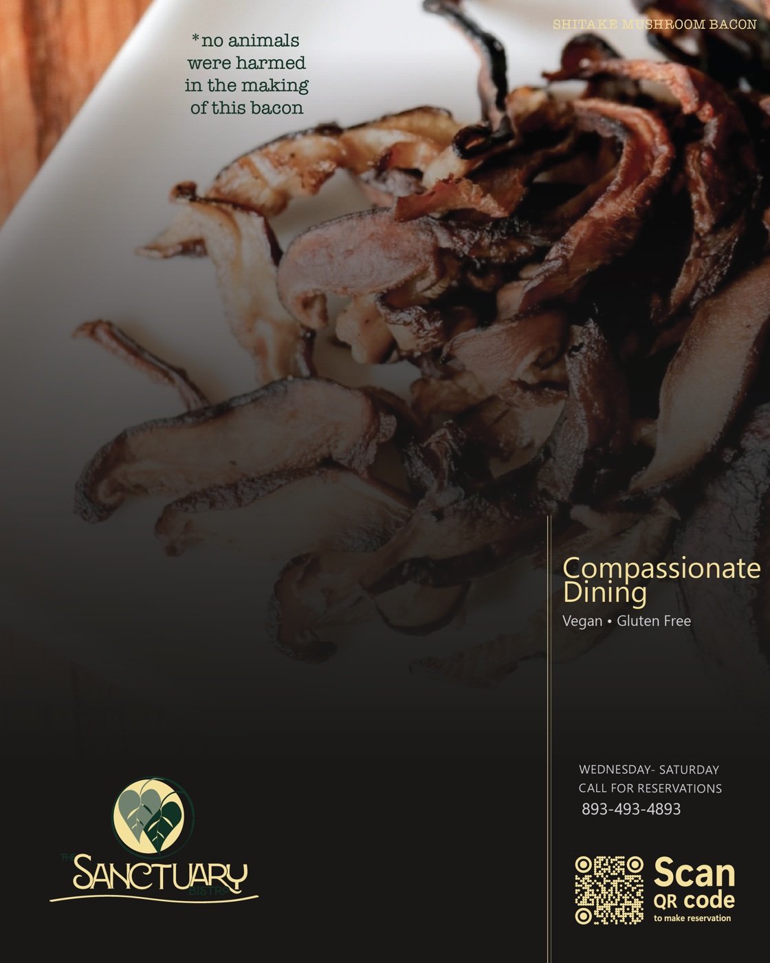
The identity extends across web and social applications through editorial food photography, controlled typography, and consistent use of the double heart-leaf mark. Flexible templates allow seasonal dishes and campaigns to change without making the brand feel inconsistent.
Environment + Guest Touchpoints
Problem
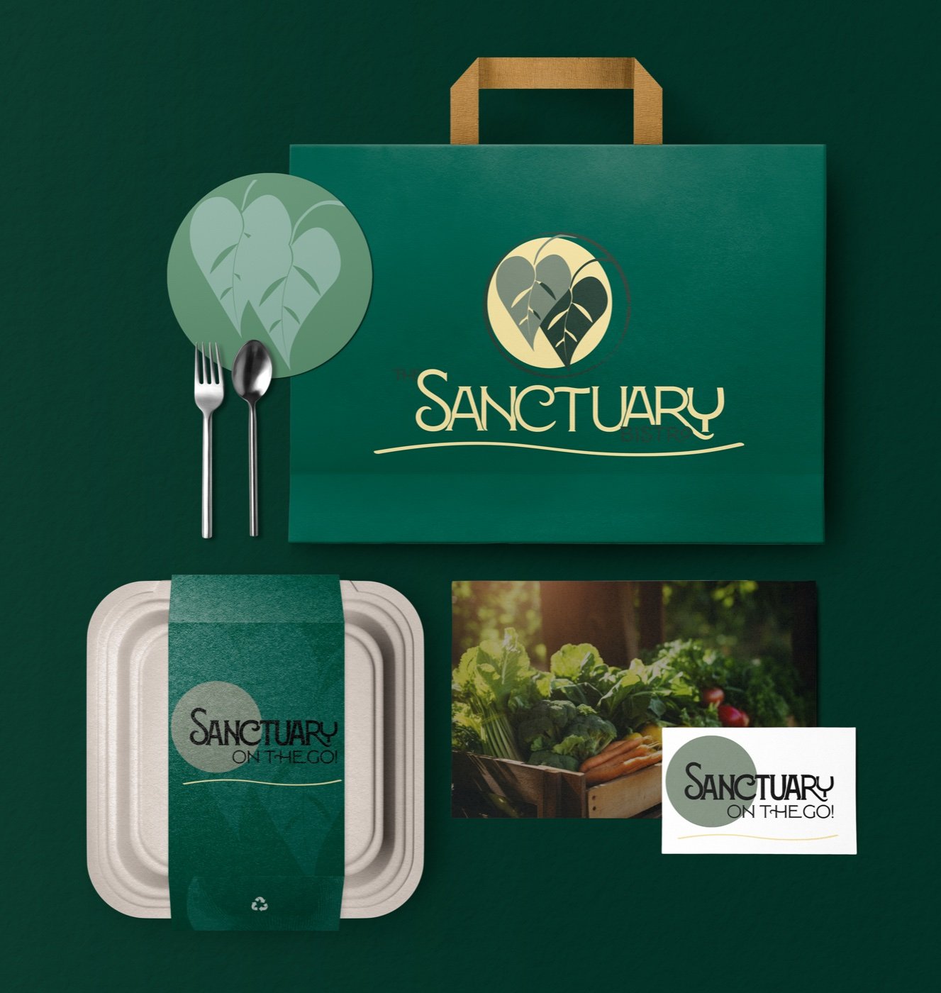
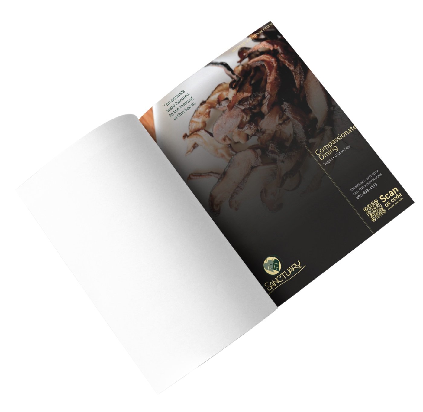
The brand needed to remain cohesive beyond the menu and dining room, including takeout, signage, and print.
Solution
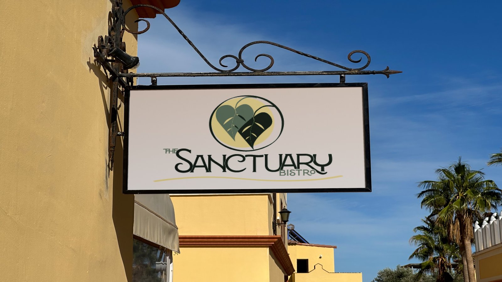
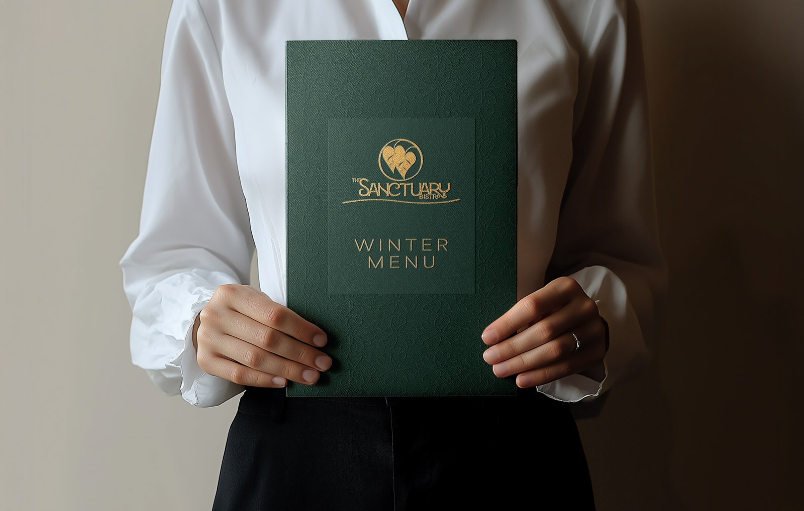
The identity extends across storefront graphics, packaging, and guest collateral through consistent typography, color blocking, and use of the double heart-leaf mark.
Linen textures, recycled paper stocks, wood finishes, and tactile materials reinforce the restaurant’s sustainability values while preserving a polished, premium tone. Each touchpoint carries the same balance of warmth, restraint, and hospitality.
Outcome
The rebrand positions The Sanctuary Bistro as a refined dining experience that happens to be vegan, rather than a vegan restaurant defined by restriction or familiar health branding.
The final system connects food, service, space, and communication through one cohesive identity, giving the restaurant a visual presence that matches the quality and care already present in the guest experience.