Conceptual Boutique Hotel
A hospitality brand built at the intersection of craft, place, and cultural memory.
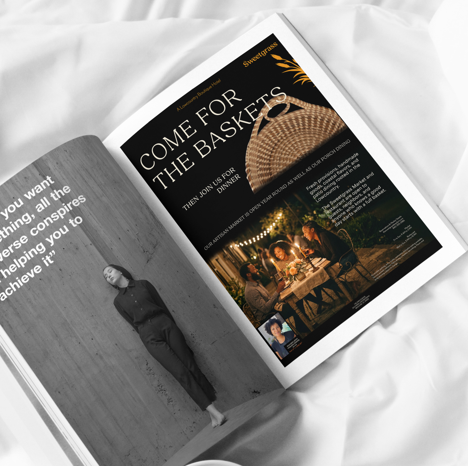
Sweetgrass is a conceptual boutique hotel, and year-round craftsman market in the South Carolina Lowcountry near Beaufort, built to hold hospitality, cultural preservation, and living craft in one voice.
The Problem
Three unique spaces with one goal.
What interested me most was that it was not really a resort in the usual sense. Basket weavers work on site, and guests encounter cultural memory as something living rather than preserved behind glass. The identity had to hold all of that without turning any of it into scenery.
Audience & Positioning
The primary audience is Black culturally engaged travel enthusiasts and local guests who value authenticity over performative diversity. This is not a brand that acknowledges its audience. It assumes them.
That framing mattered because I wanted the work to start from the position that Black wealth, Black leisure, and Black cultural engagement are the default, not the exception.
Visual Thesis
Design Decisions
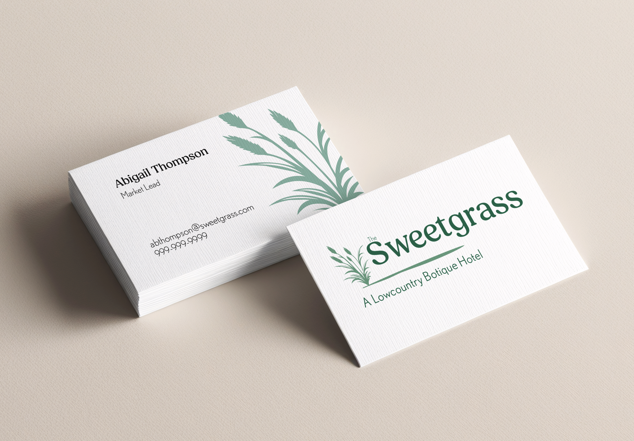
Logo System
Logo System
The horizontal stroke connects the plant mark and wordmark, functioning as a literal horizon line that anchors the identity in the coastal landscape. The color palette is what carries the wordmark across the different hotel environments and times of day.
Because sweetgrass basket weaving carries such a rich cultural history in the Lowcountry, the plant icon became central to the mark rather than a decorative add-on. It functions as both a botanical reference and a cultural anchor, connecting the hotel’s visual language to craft, landscape, and tradition.
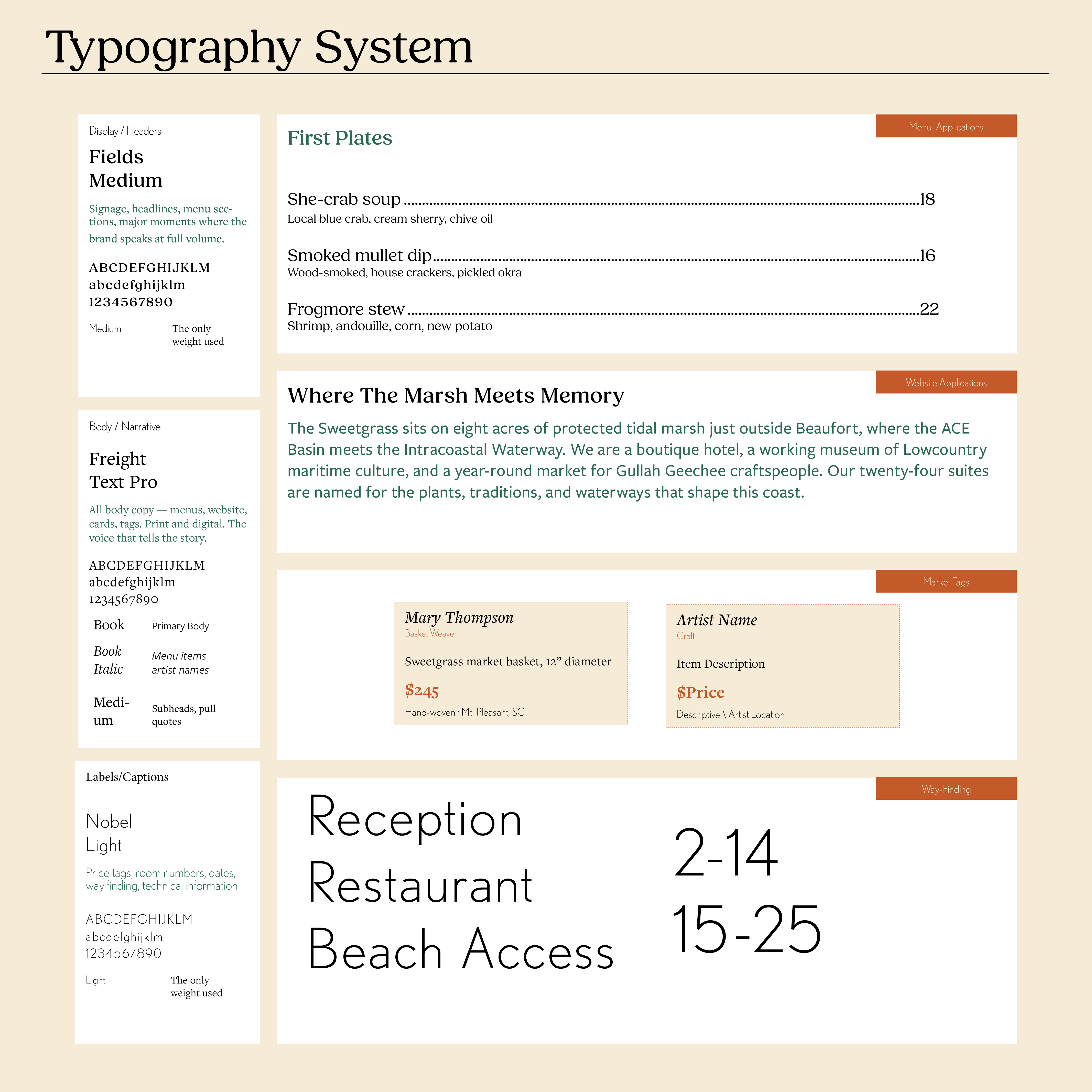
Typography
The broader typography system supports that balance: Fields provides authority and character, Freight Text Pro brings narrative warmth, and Nobel handles neutral system information. Together, they create a flexible identity that can move between hospitality, market, editorial, and wayfinding applications. The wordmark holds across both day and night palettes without losing its weight, making the system feel cohesive across the full guest experience.
Colors in Action
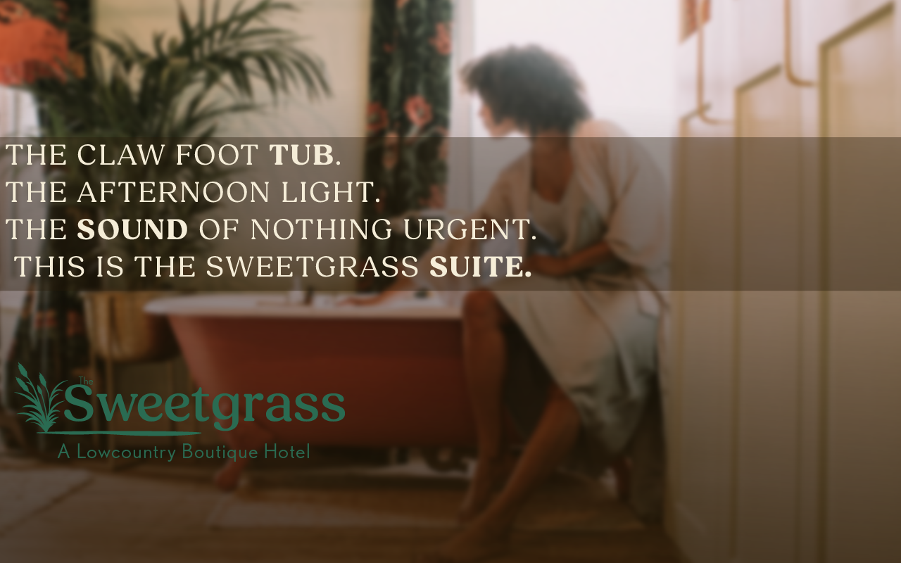
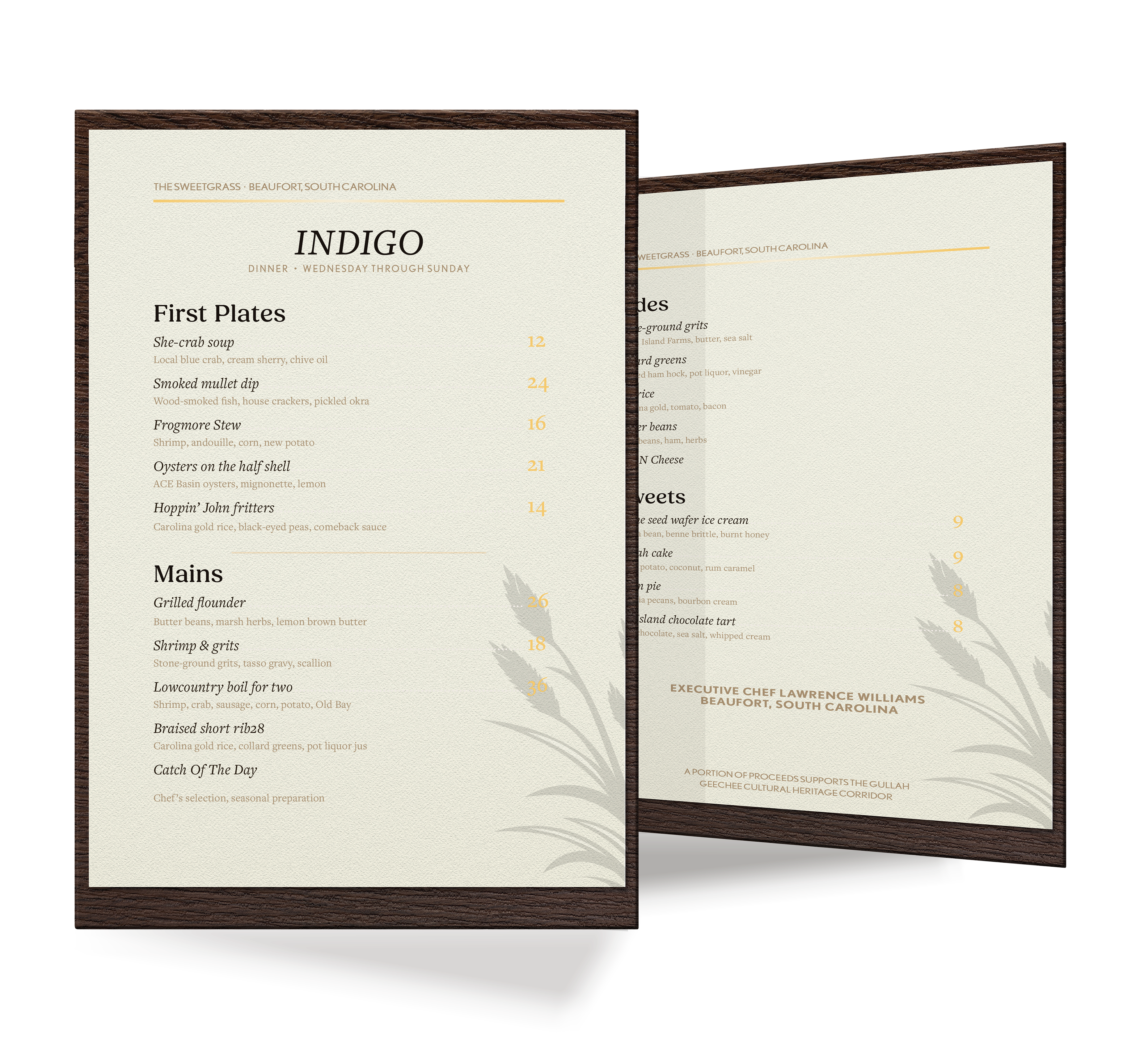
The identity is built around two complementary palettes. Sea Island Bright handles the day expression with warm cream, marsh green, and gold across stationery, menus, signage, and guest-facing collateral. Lowcountry Gold becomes the evening register, with deeper browns and amber tones for dinner menus, suite materials, and more premium touchpoints.
Sea Island Bright
Use examples
A bright daytime expression focused on legibility, hospitality warmth, and quick wayfinding cues across stationery, printed collateral, and guest touchpoints.
Lowcountry Gold
The evening palette introduces deeper contrast and richer amber tones for dinner, bar, and premium in-room pieces while maintaining the same system logic.
Use examples

Wayfinding
Designing with accessibility in mind also extended to the environmental design concepts of the space. Just as the color scheme helps to orient guests to different areas of the property, the wayfinding system relies on a layered sensory approach to create a cohesive experience across the hotel, and market. Each zone has its own scent profile, tactile signage, and material cues that work together to guide guests through the space without relying solely on visual information.
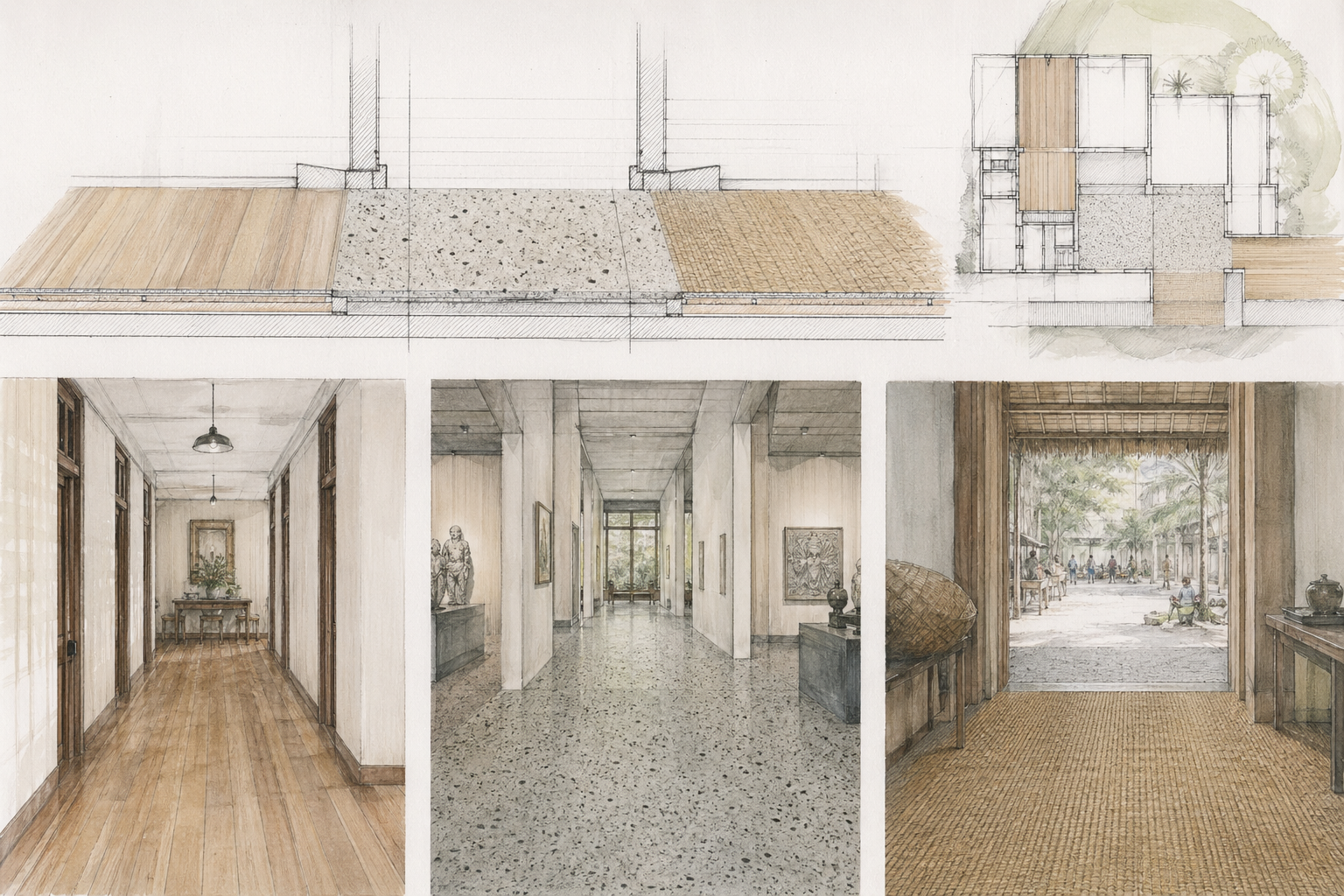
For the build phase, floor material transitions are specified as a passive acoustic layer. Heart pine marks the hotel corridors, tabby grounds the general spaces, and sweetgrass matting defines the market thresholds. These material changes create subtle shifts in sound and footfeel, helping guests understand movement through the property without relying only on sight.
Concept renders used to explore floor material transitions and tactile wayfinding cues before fabrication and on-site photography.
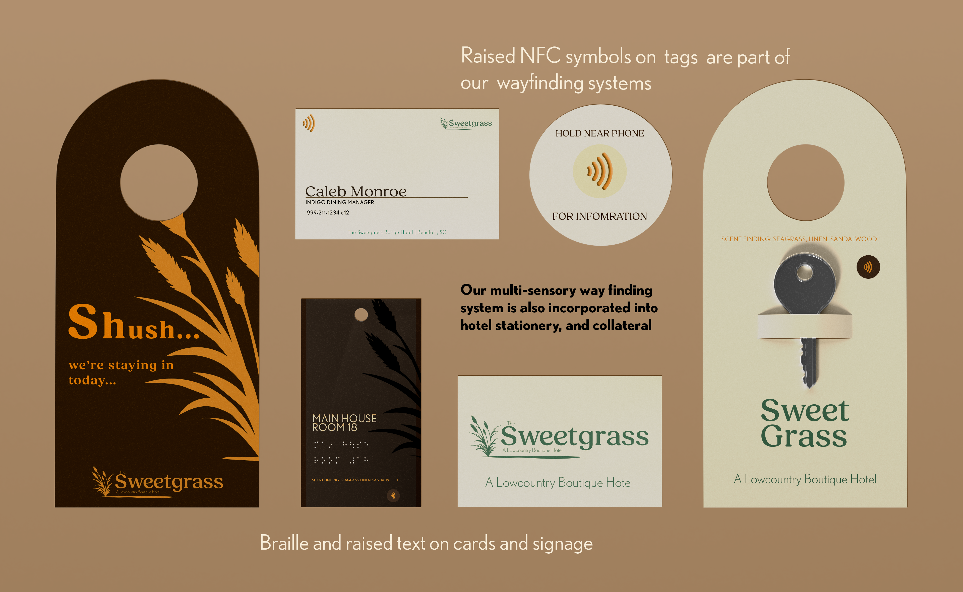
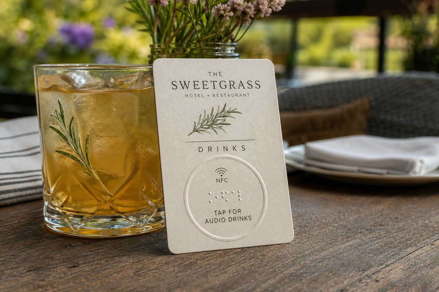
Areas of the resort are named for Lowcountry plants, waterways, and landscape references: ACE Basin, Palmetto, Bulrush, Indigo. Each sign is designed as a full sensory object rather than a visual sign with accessibility added at the end. The nameplates carry five core layers: high-contrast visual typography, a botanical relief engraved into the panel, Grade 2 Braille, an NFC tap point that opens a chaptered audio guide in the guest's browser with no app required, and a dried botanical sachet below the plate scented to match the suite's namesake reference.
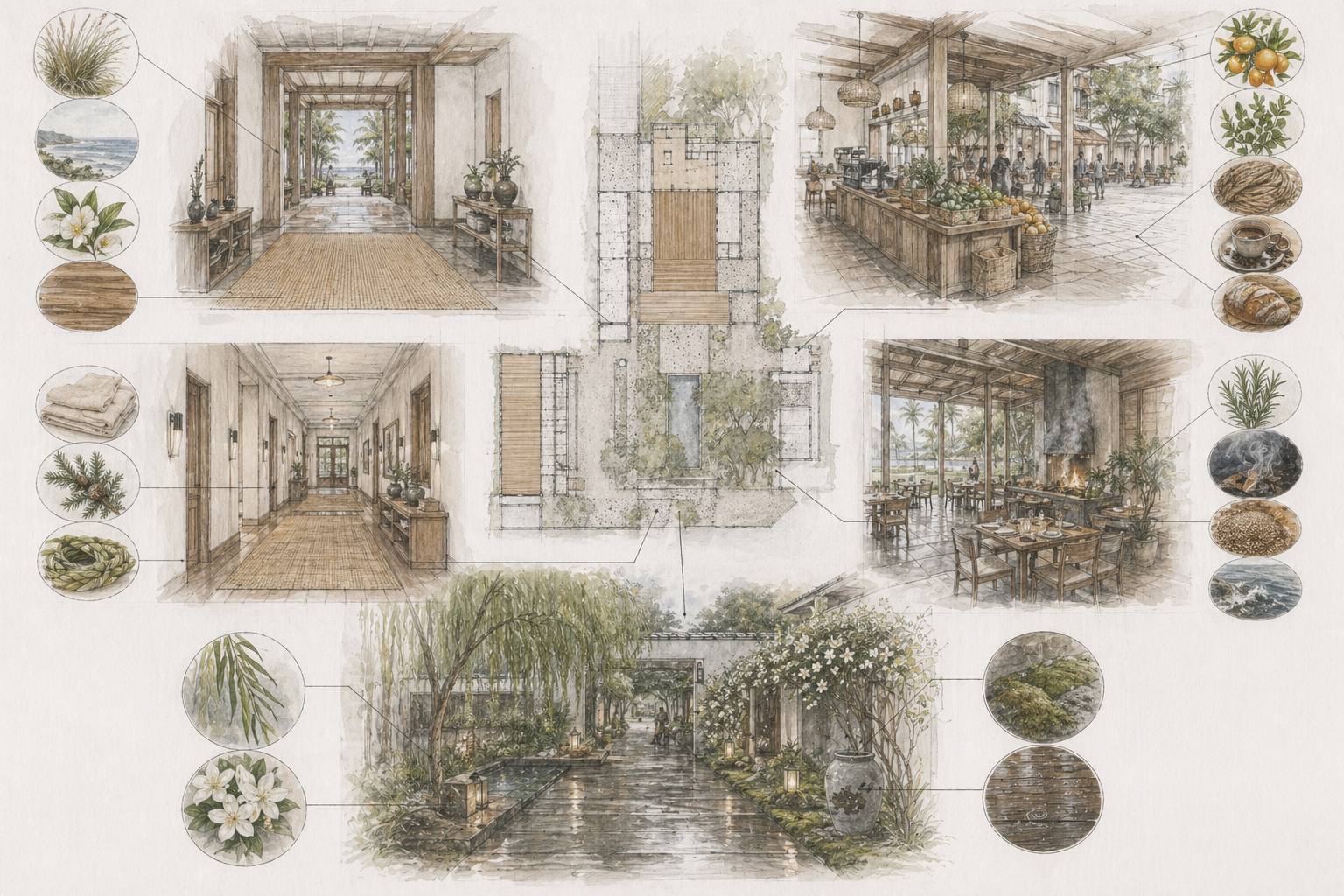
The scent layer works as a subtle wayfinding cue, not decoration. The Main House uses sweetgrass, salt air, white tea, and warm wood to signal arrival and welcome. The market shifts brighter with citrus, fresh herbs, woven fiber, coffee, and baked bread. The restaurant and patio introduce rosemary, smoke, warm grain, and coastal mineral notes. Guest corridors remain quiet with linen, cedar, and soft sweetgrass; the courtyard carries willow, wet stone, jasmine, moss, and rain-warmed wood. Each scent is tied to a specific zone, mood, and function — arrival, gathering, dining, rest, retreat.
The design argument is simple: a property rooted in Gullah Geechee craft tradition should not be experienced through sight alone. Basketry, foodways, shoreline ecology, music, material craft, and oral history are tactile, olfactory, sonic, and spatial by nature. Designing for every sense from the beginning does not cost the experience anything. It deepens it.
Concept render used to visualize scent-zone mapping across the property before commissioning real photography.
Market
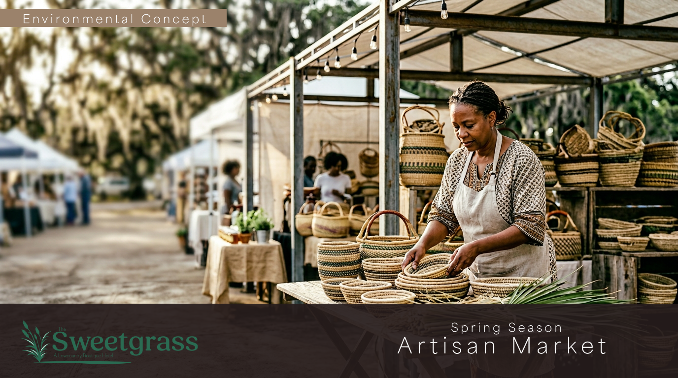
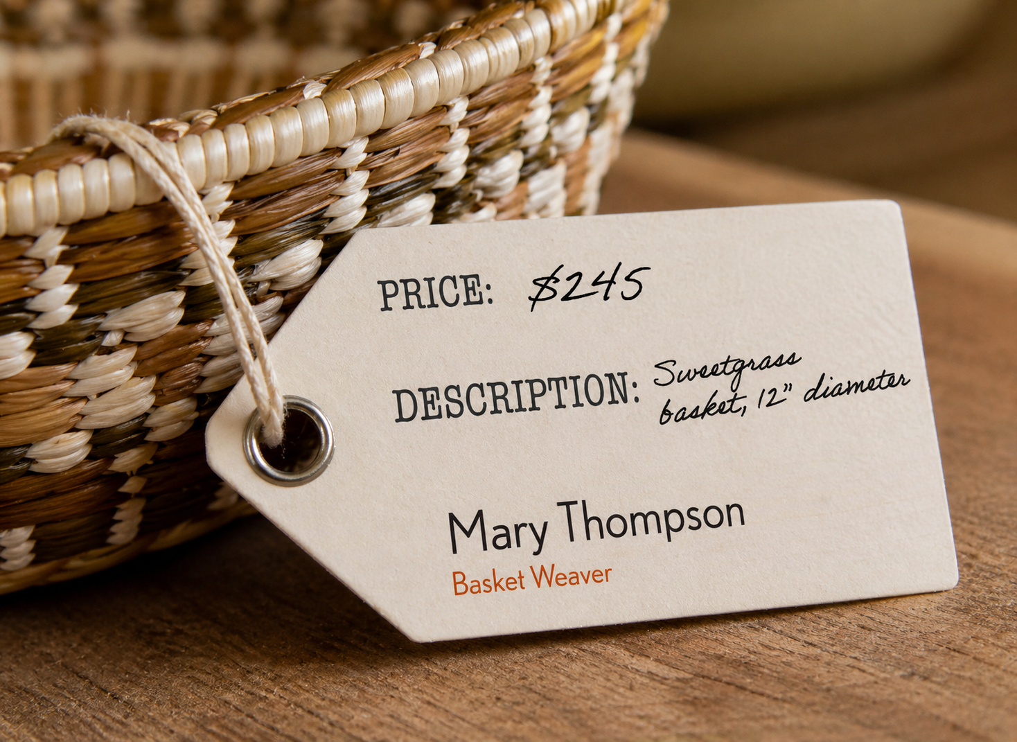
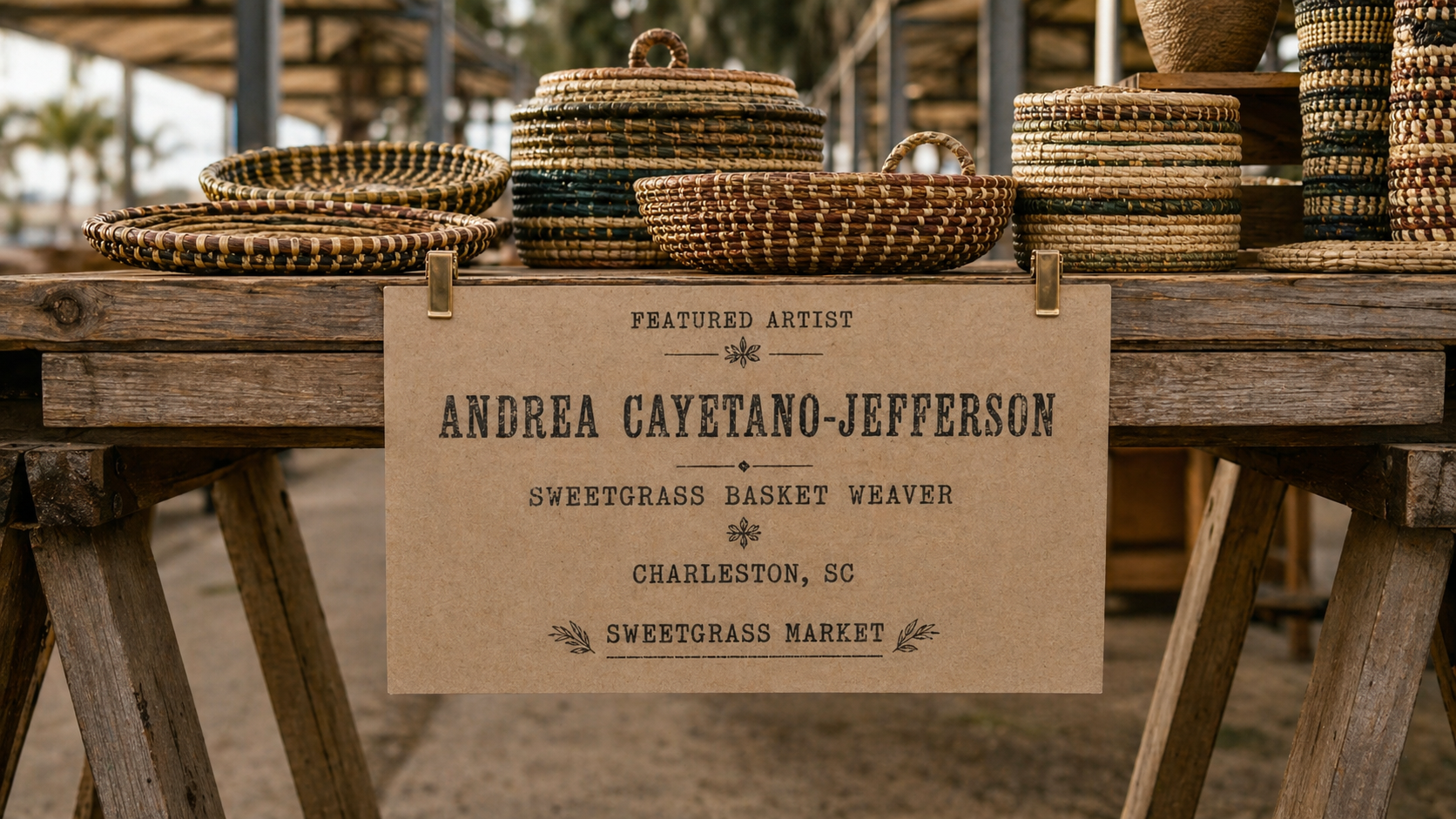
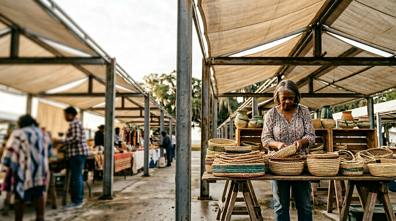
The market acts as a community touchpoint as well as a retail space for the craftspeople who work on site. The market identity is more playful and reads much like a farmers market. It relies on the same logo system but leans into the brighter end of the palette with more flexible layouts and a more casual tone. The market collateral includes price tags, tote bags, staff aprons, and wayfinding signage for the market stalls.
Concept renders used to explore vendor scale, signage ergonomics, and tag application across the market before commissioning real photography.
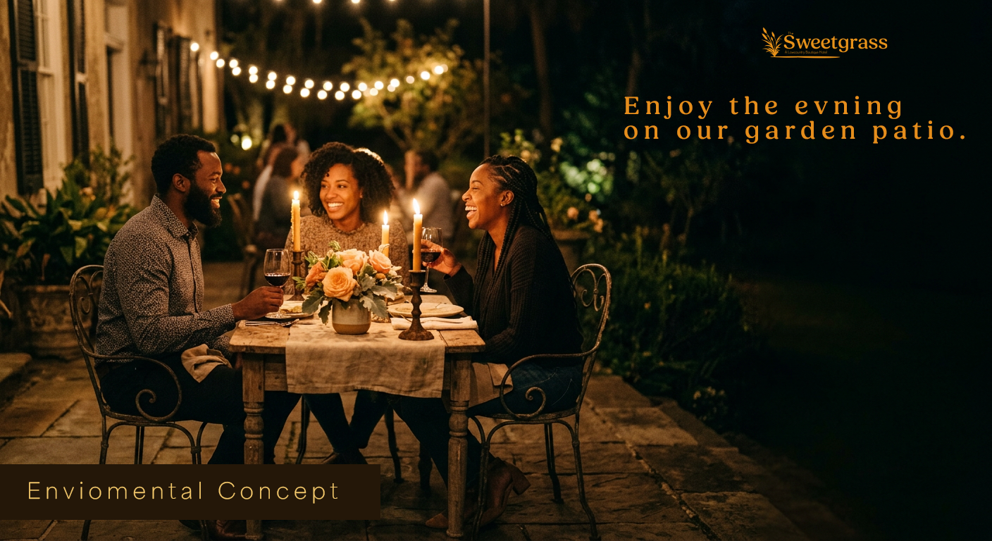
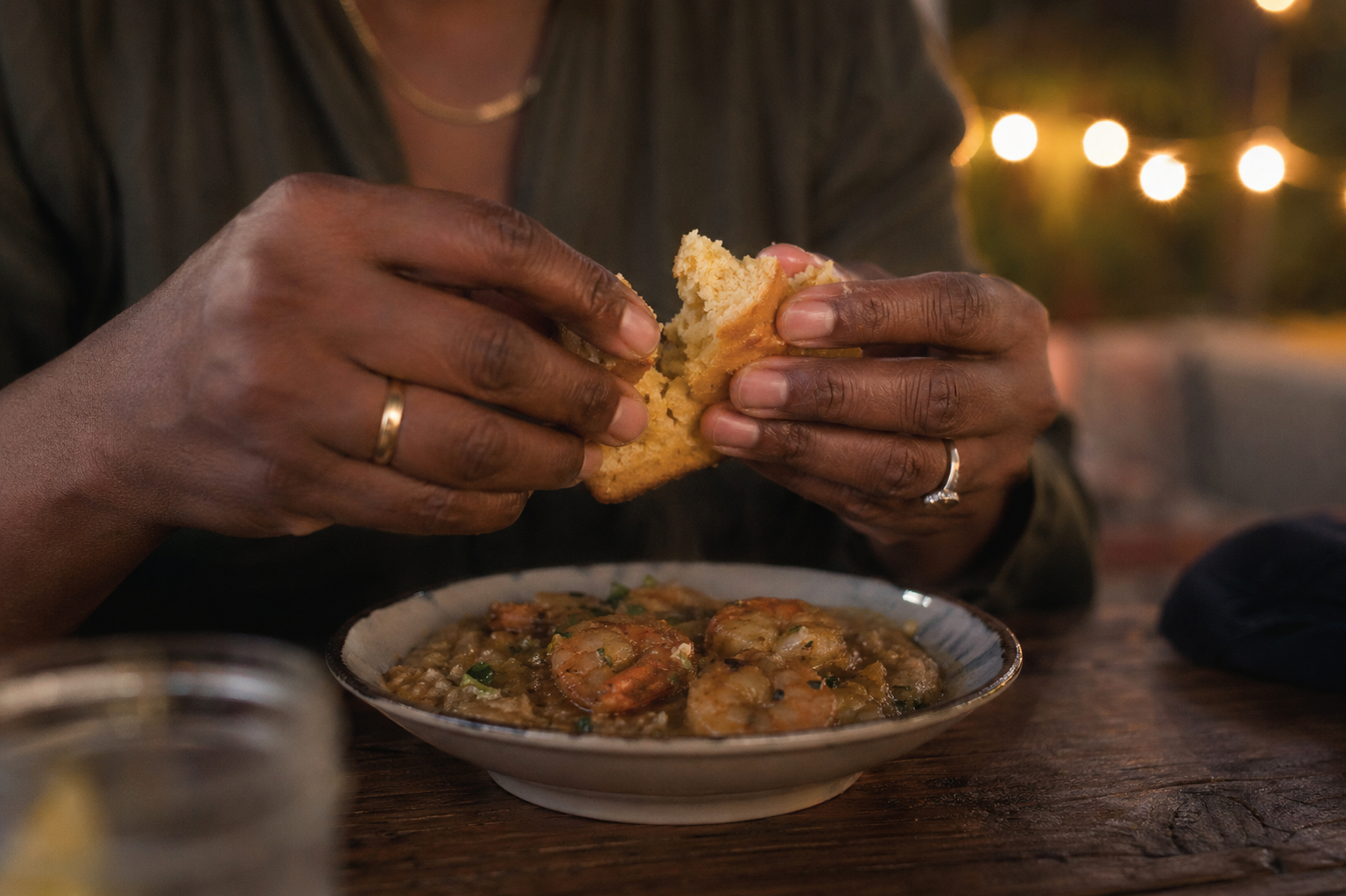
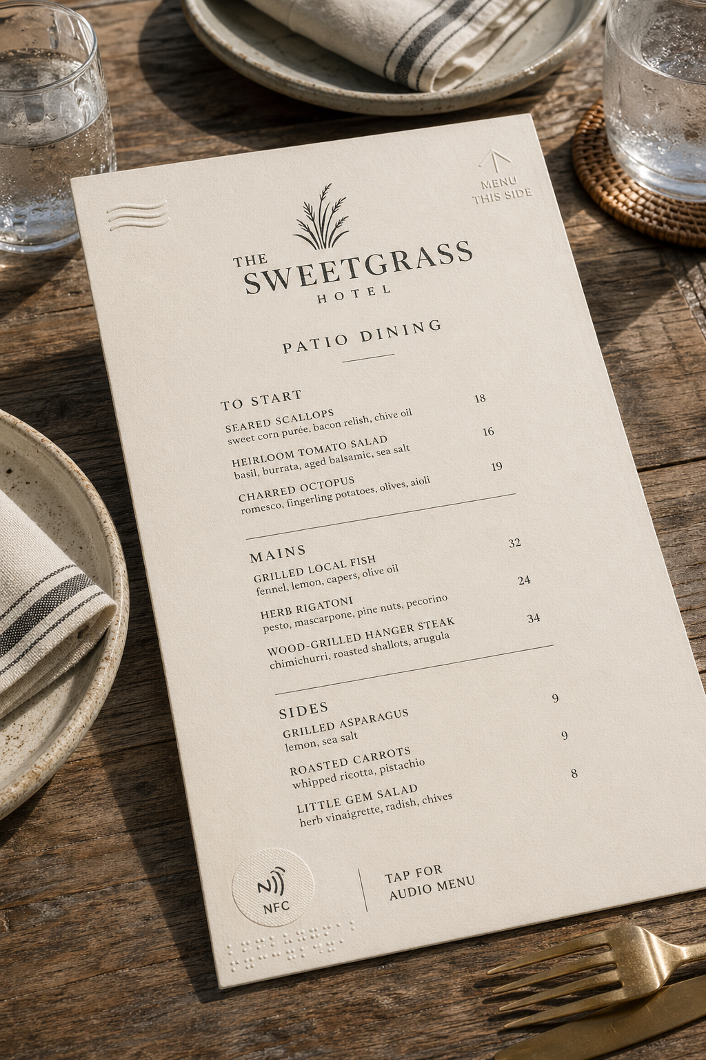
Patio Dining
The patio is a more casual dining experience with a focus on local seafood, small plates, and coastal cocktails. The design for the patio menu leans into the more playful end of the palette with a more casual tone and flexible layout. The menu design uses a single-page format that can rotate daily specials, seasonal seafood, and coastal cocktails without breaking the system.
Concept renders used to explore patio dining context, menu format, and drink card layout before commissioning real photography.
Outcome / Reflection
One coherent voice across hotel, and market.
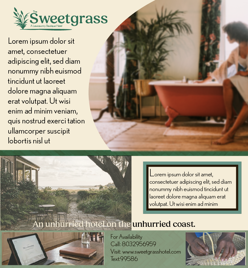
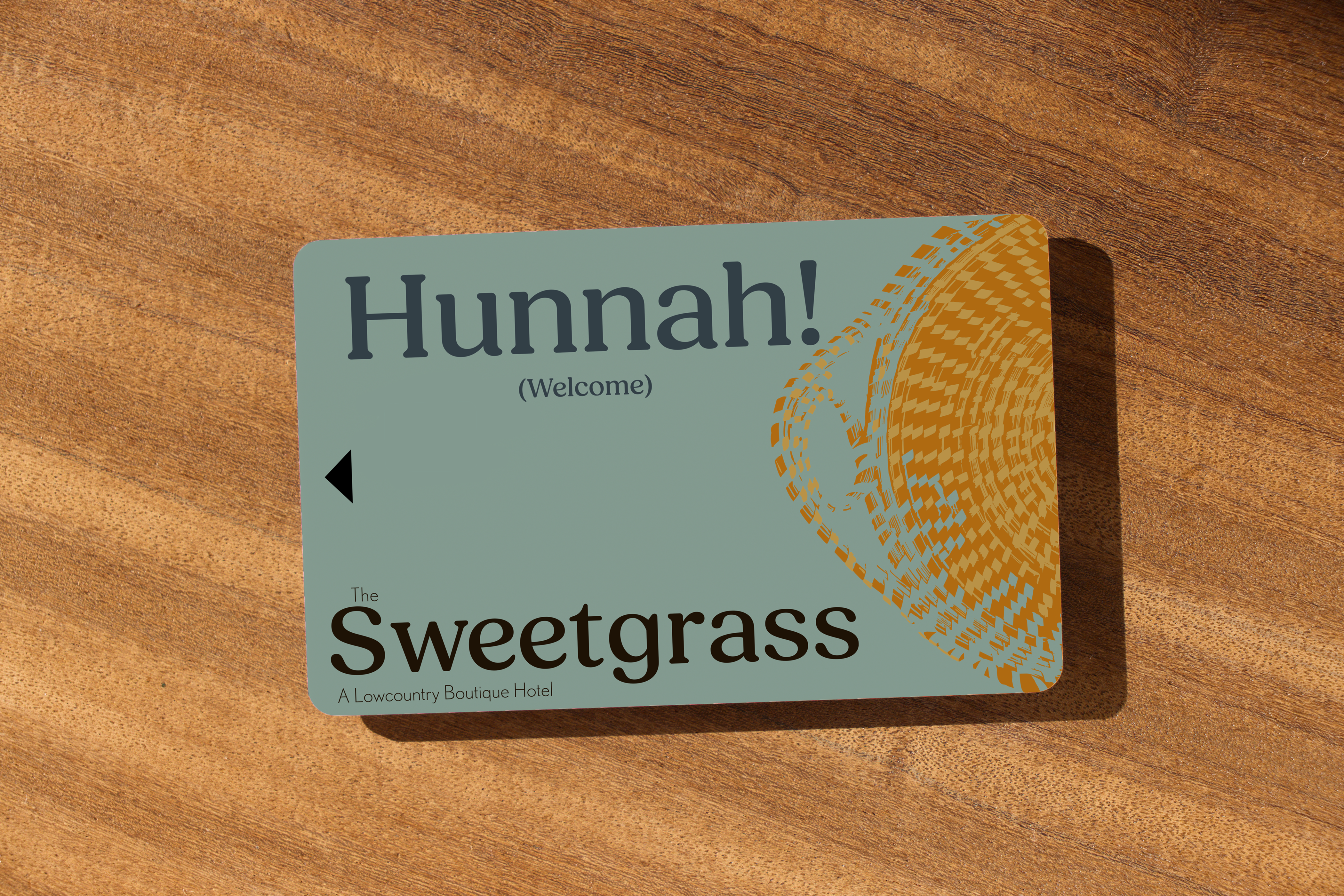
The final system includes logo variations, business cards, room key cards, a dinner menu direction, and foundational color and typography rules. Every part was designed to work across different touchpoints and times of day while still feeling unmistakably of the same place.
What matters most to me about this project is that it shows hospitality branding can center cultural specificity, living craft, and Black leisure without apology or explanation. It is less about styling a hotel and more about giving a whole ecosystem a coherent voice.
Next →
AyaFold!
A culturally grounded STEAM kit using Adinkra symbolism, origami, and nonlinear career storytelling to reframe how girls imagine making, learning, and future work.
← Back to home