AyaFold!
Overview
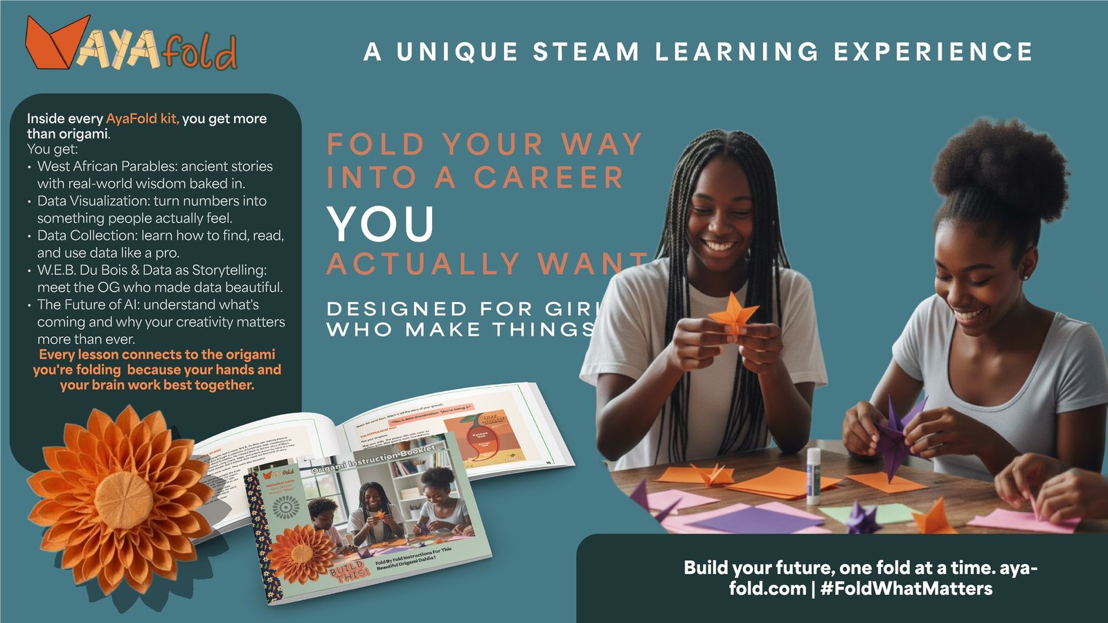
AyaFold! is a conceptual craft and learning kit designed to help tween and teen Black girls imagine themselves in STEAM careers through storytelling, cultural symbolism, and paper folding.
Research showed that real career paths are rarely linear, even though career education often presents them that way. AyaFold! reframes learning as a process of exploration, adaptation, and self-discovery, using tactile activities to make technical concepts feel approachable, relevant, and memorable.
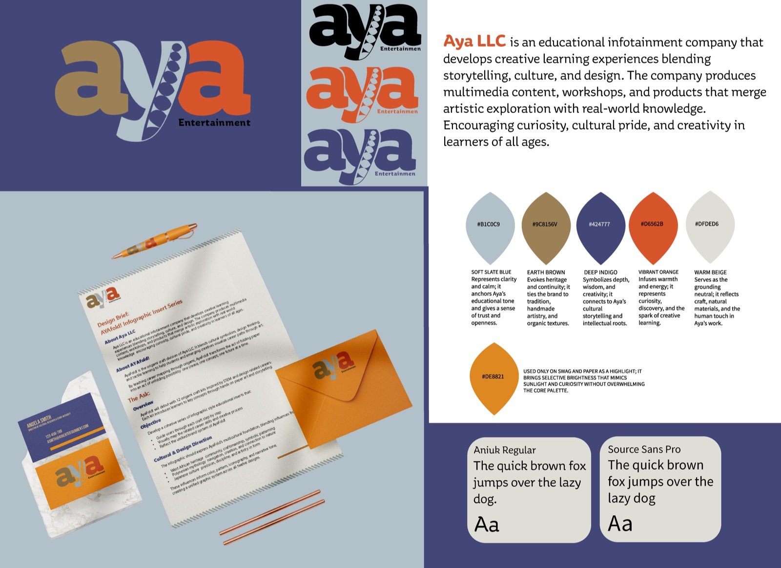
Logo, Color + Typography
Problem
The identity needed to feel culturally grounded and educational without becoming overly academic, childish, or dependent on decorative symbolism.
Solution
AyaFold! draws from Adinkra symbols, botanical forms, and the geometry of folded paper to create a visual language built around meaning and transformation.
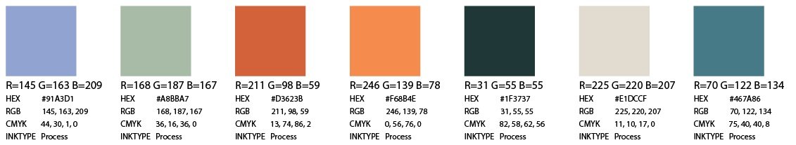
The name combines the Aya symbol, representing endurance and resourcefulness, with the kit’s paper-folding learning model. Each letter in the wordmark follows the structure of a folded form, giving the identity a tactile quality while remaining clear and recognizable.
Deep greens, slate tones, clay, marigold, and paper-inspired neutrals balance structure with youthful energy. The palette allows the brand to move between instructional materials, packaging, activities, and promotional applications without feeling either clinical or juvenile.
Product Concept + Educational Booklet
Problem
Many young girls are interested in STEAM but struggle to imagine themselves in those careers because the learning materials, imagery, and pathways presented to them often feel distant or overly rigid.
Solution
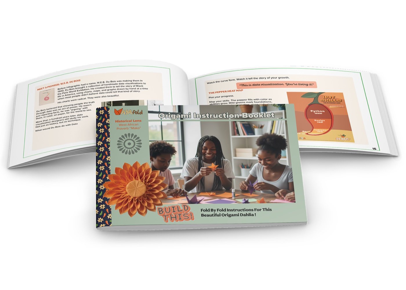
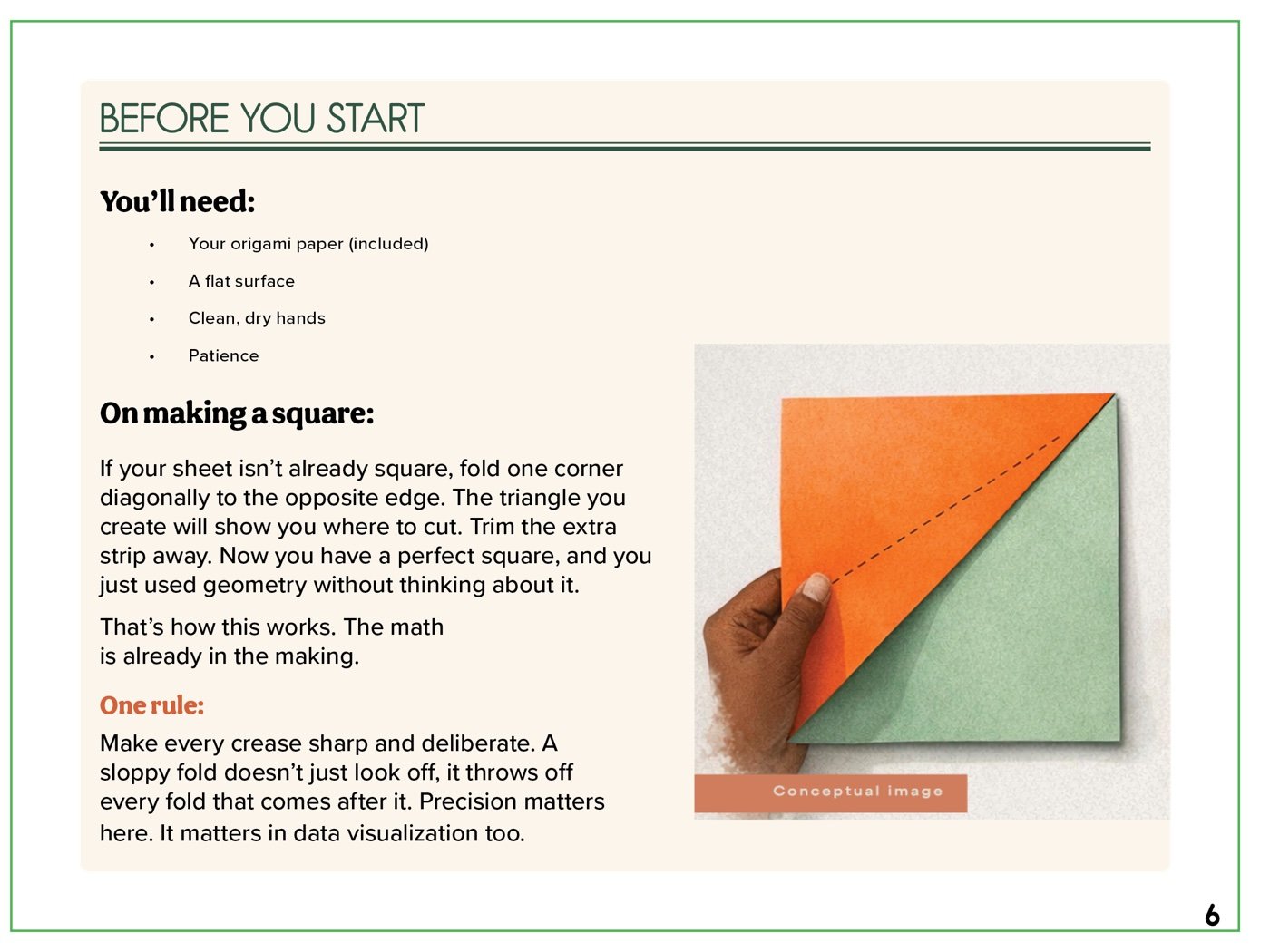
AyaFold! turns the learner’s hands into part of the instruction system. Each fold represents a step in a nonlinear learning journey, transforming abstract STEAM concepts into physical, sequential actions.
The booklet combines origami instructions, cultural storytelling, and career exploration through the Mako proverb, “Not all peppers ripen at the same time.” Each activity reinforces the idea that growth happens at different speeds and that side steps, experimentation, and changing direction are natural parts of learning.
The result is a low-barrier activity with enough depth to support spatial reasoning, technical confidence, curiosity, and self-discovery.
Digital Learning + Campaign
Problem
AyaFold! needed to reach young learners, parents, and educators across digital platforms without losing the tactile, culturally grounded character of the physical kit.
Solution
The digital system adapts the kit’s symbols, folded forms, color palette, and instructional hierarchy across campaign graphics, educational content, and future learning extensions. The result keeps the experience recognizable while allowing the brand to grow beyond the box.
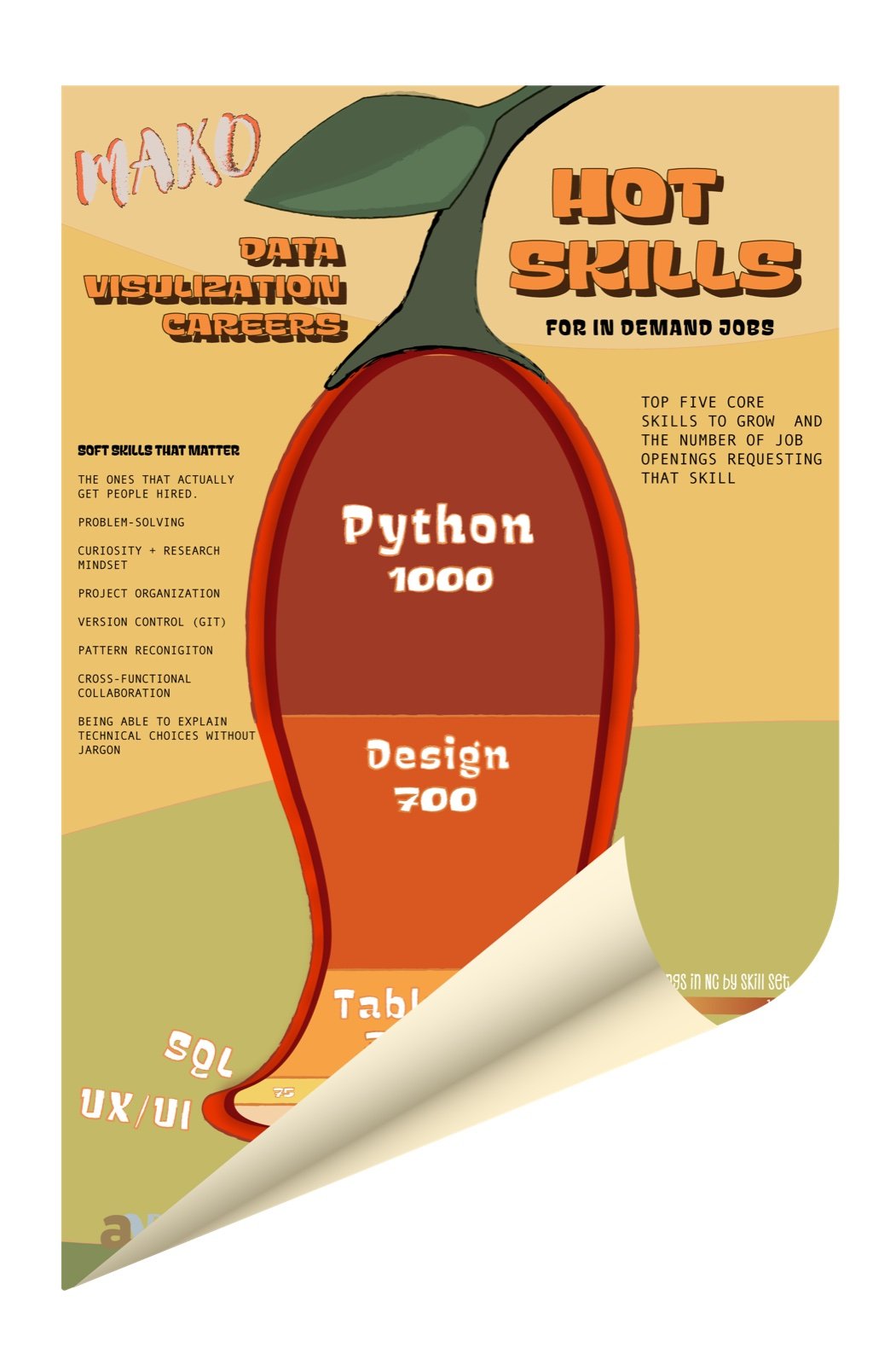
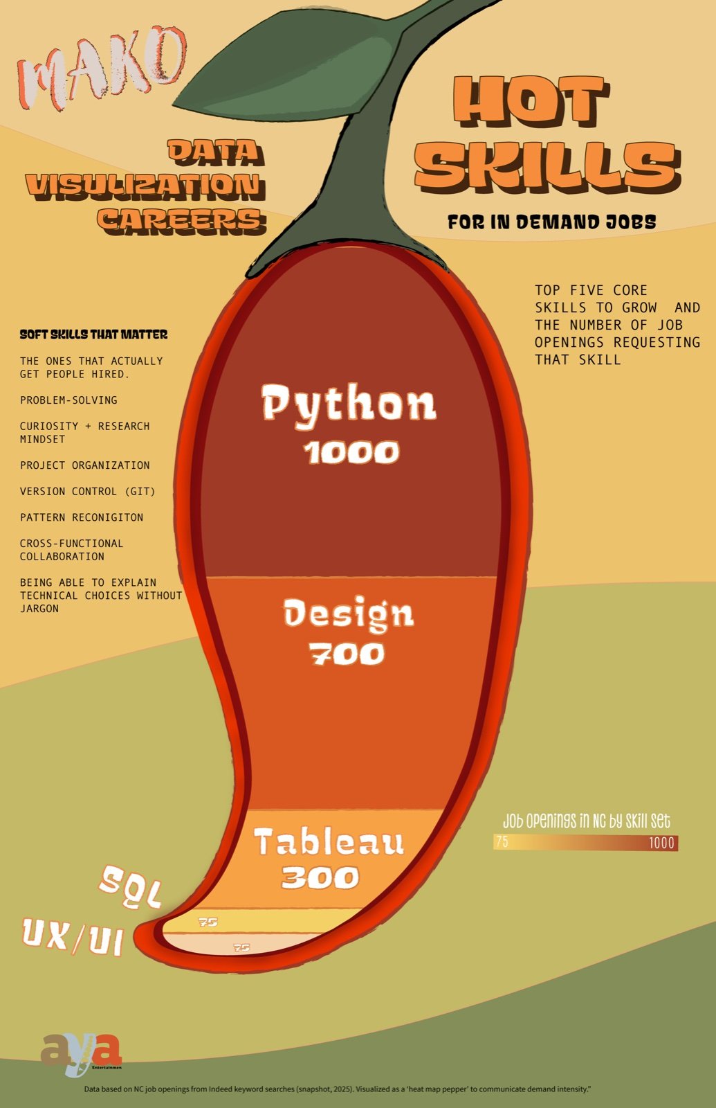
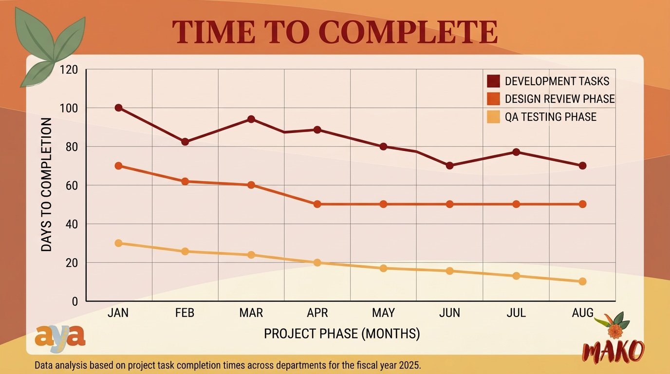
Infographic Suite
Problem
STEAM careers can feel abstract when students are shown job titles without seeing the skills, decisions, and experiences that lead to them.
Solution
The infographic system translates career pathways into clear, visual exercises connected to the Mako parable.
Learners collect, organize, and visualize information about real STEAM fields, turning career exploration into a practical introduction to data literacy. The posters and booklet graphics make complex pathways easier to understand while reinforcing that there is no single correct route into technical or creative work.
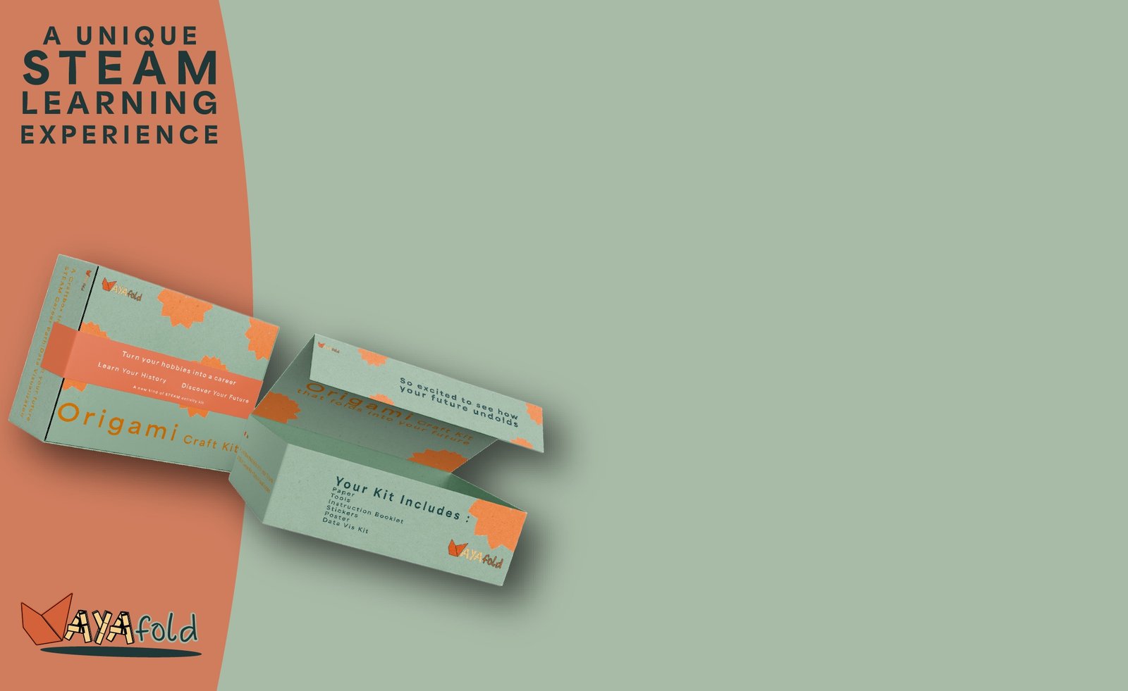
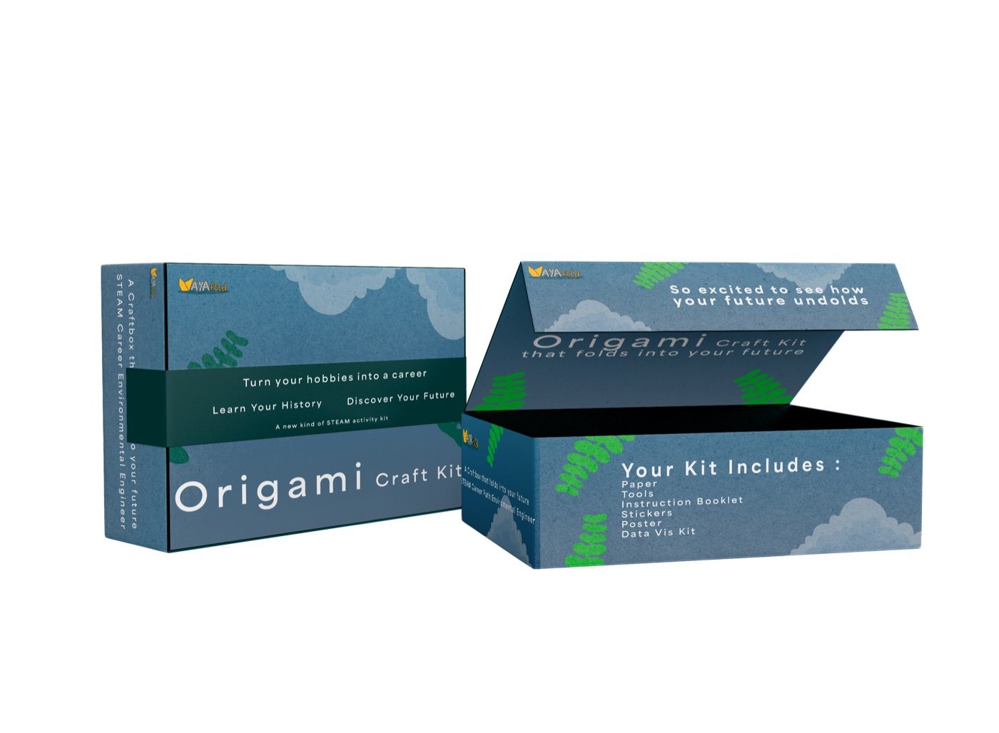
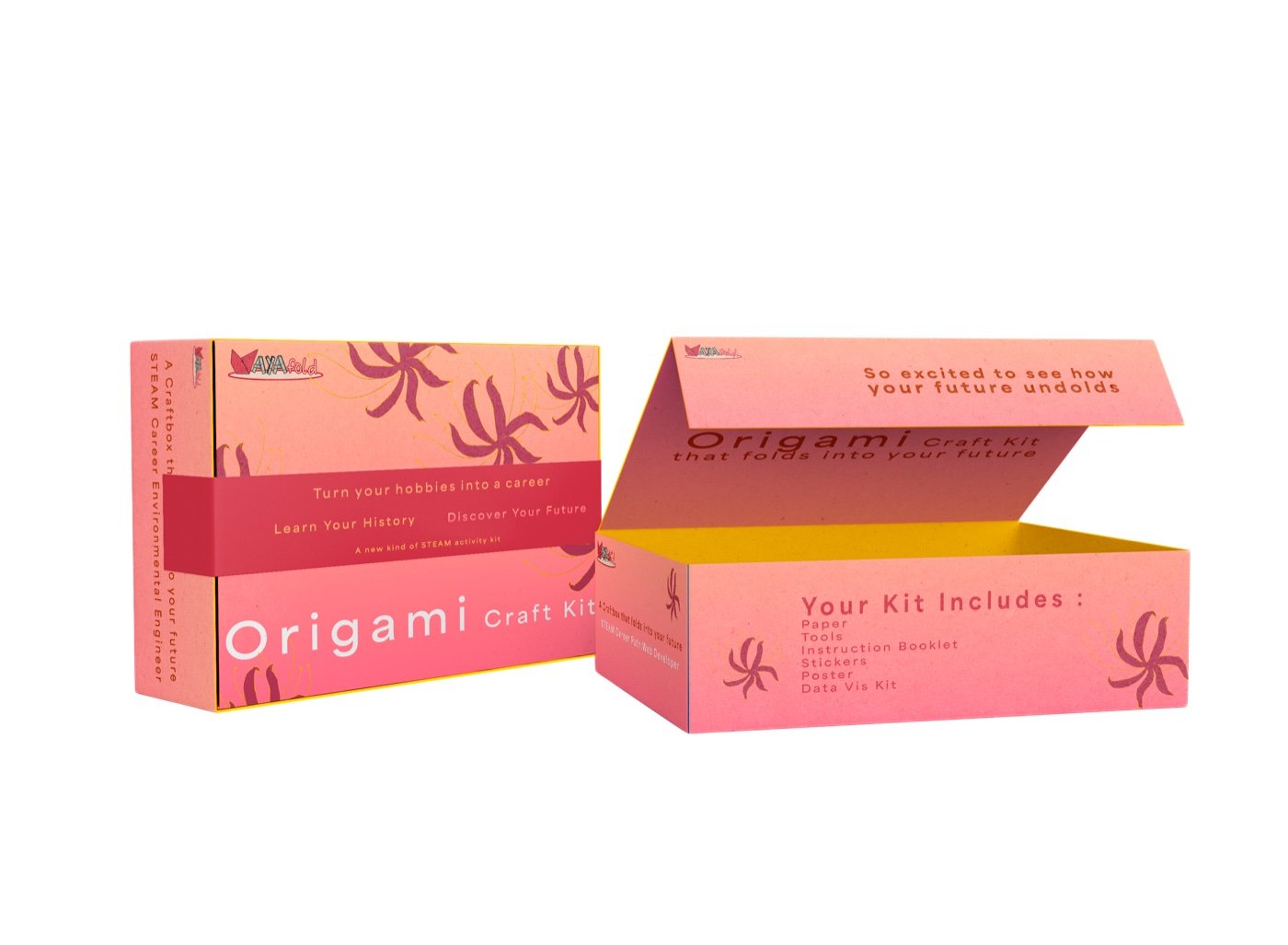
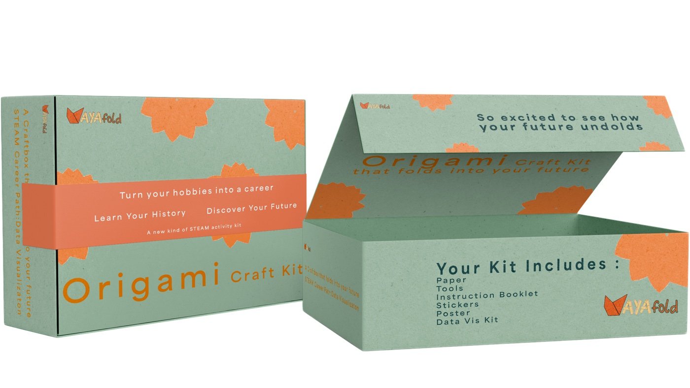
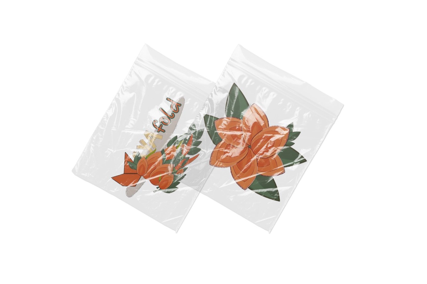
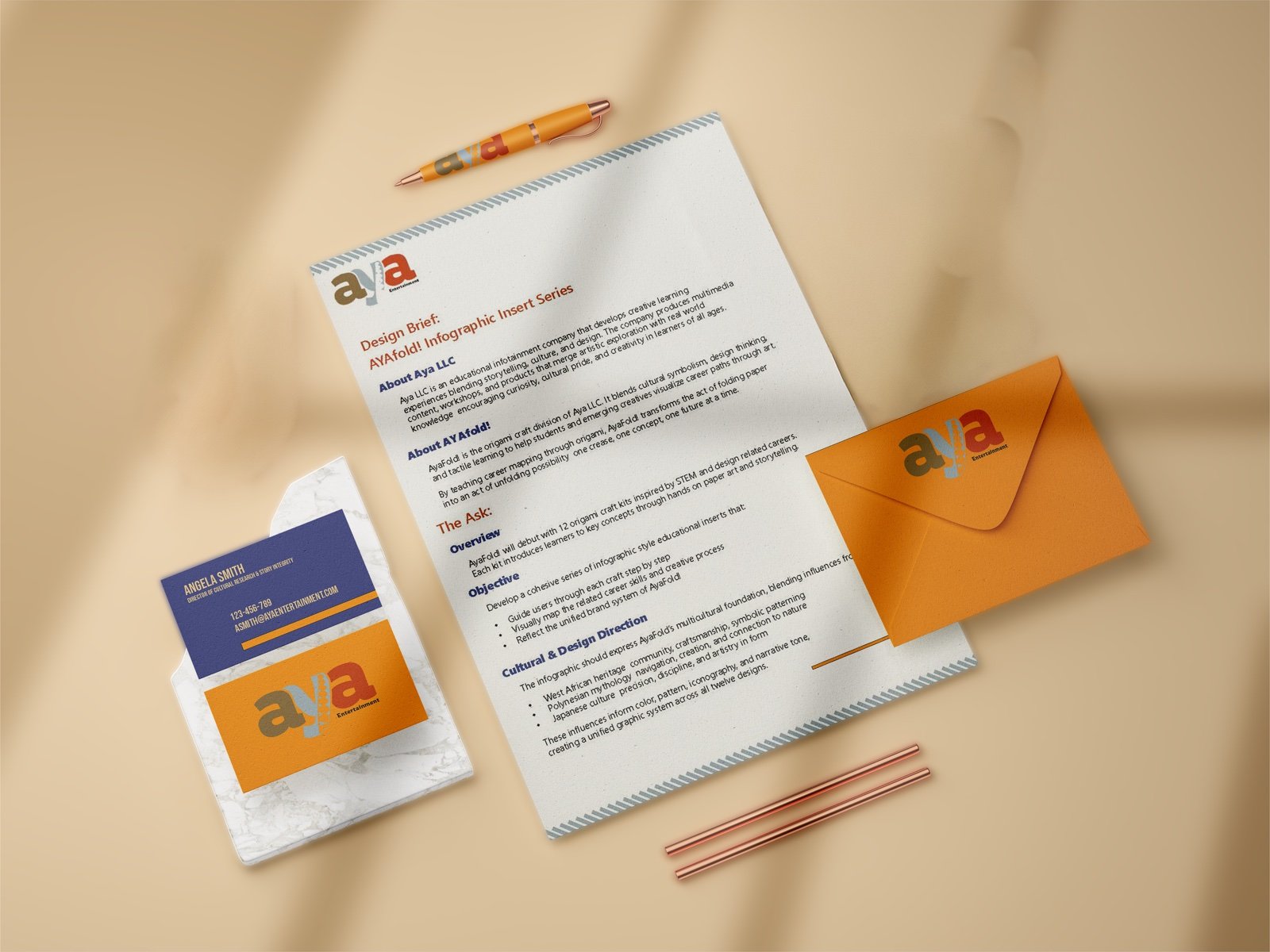
Packaging + Kit Components
Problem
The product needed to function as a credible educational tool for parents and educators while still feeling personal, exciting, and worth claiming as their own to young learners.
Solution
The packaging, booklet, folding materials, and sticker sheet were designed as one complete learning experience.
The box establishes the instructional structure, while the stickers and customizable components create space for identity and self-expression. Adinkra-inspired symbols are treated as cultural messages rather than surface decoration, ensuring that each component supports either learning, storytelling, or personal ownership.
Campaign + Brand System
Problem
The campaign needed to communicate educational value without making AyaFold! look like homework or speaking to teenagers in a childish voice.
Solution
Print and digital advertisements position the kit as both a creative activity and a meaningful introduction to STEAM.
Bright compositions, tactile imagery, and confident messaging balance aspiration with play. Aya LLC extends that system into a parent brand capable of supporting future kits, symbols, stories, and career pathways without forcing every product to look identical.
Outcome
AyaFold! demonstrates how cultural history, tactile learning, and product design can work together to make STEAM education more meaningful and inclusive.
Nothing in the system is purely decorative. The symbols communicate. The folding teaches. The parable supports multiple career paths. Every component helps learners understand that discovery is not a straight line and that their own way of learning can be part of the journey.