2038 Olympics Brand Identity | Conceptual Project
An Olympic identity built to honor tradition, inspire the present, and celebrate the multicultural spirit of the Games.
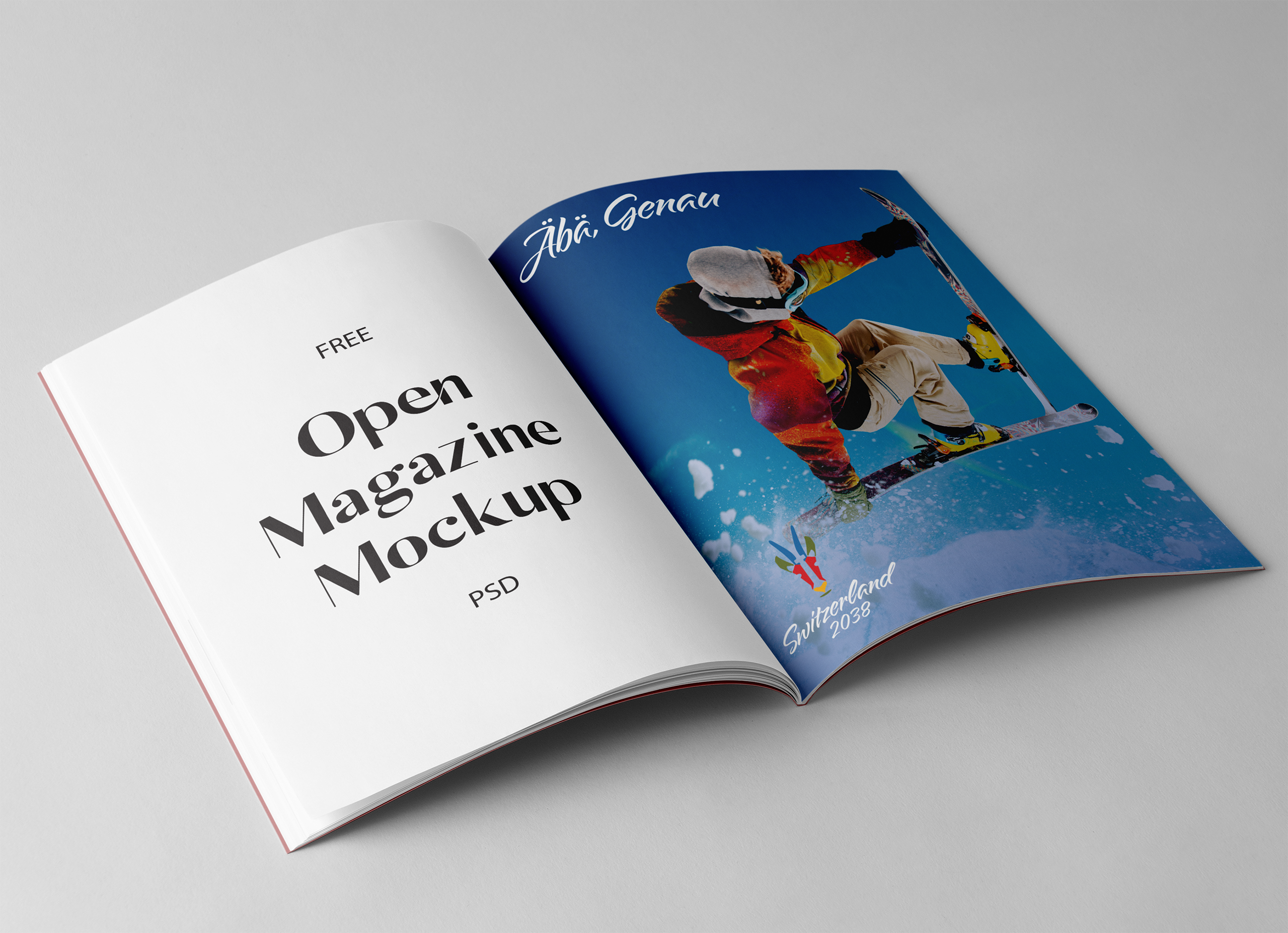
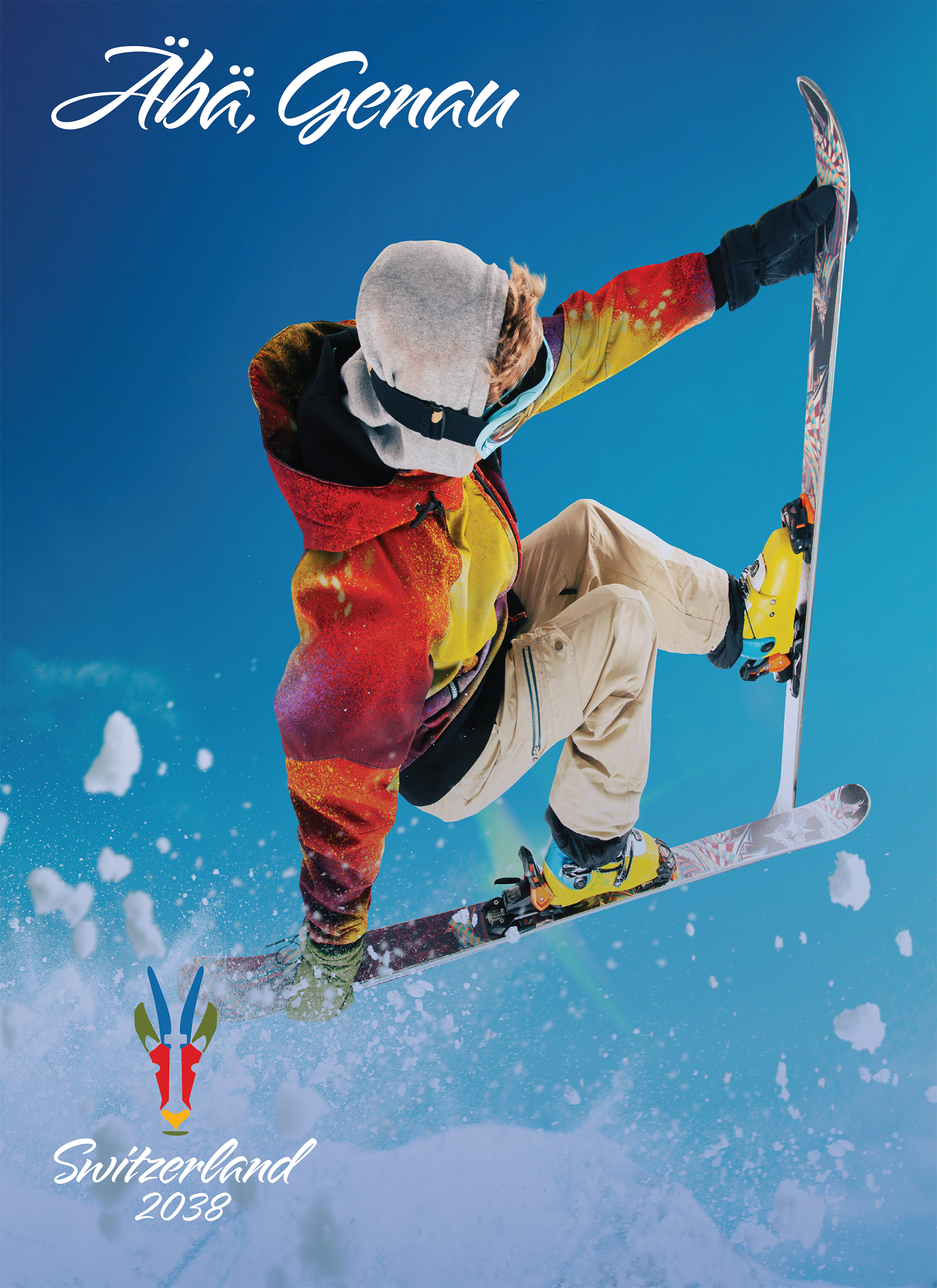
Abä, Genau is Swiss German for "yes, exactly," and became the starting point for this project.
I wanted the identity to feel grounded in Switzerland, but still flexible enough to move across everything from patches and credentials to motion graphics and campaign work.
This is a conceptual event identity developed as a speculative brief, not an official Olympic commission.
Problem
Designing an Olympic identity for a multilingual, forward-thinking host nation.
The challenge was balancing a few things at once: honoring Olympic tradition, reflecting Switzerland in a way that felt specific, and building something clear enough to work across a huge range of uses. It needed to have ceremony, but it also needed to function.
That balance led me toward a heraldic chamois-inspired mascot, a multilingual color system, and typography that could hold both personality and precision.
Research
Research and Symbol Development
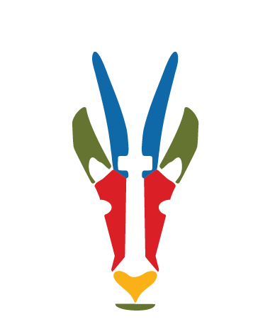
I kept coming back to environmental stewardship as a core part of the Swiss context, which is what led me to the Alpine chamois from the protected Aletsch Forest. It felt like a strong symbol for balance, resilience, and motion without being too obvious.
From there, the crest started pulling in more references naturally: Swiss Renaissance armor, the Matterhorn, ski culture, switchback trails, and the national cross. The goal was never to stack symbols for the sake of it, but to let the mark feel like it belonged to that landscape. Alpine Script gives the project a little ceremony and personality.
Key Insights
Color Palette
Intentional boldness that celebrates the four national languages.
One of the most important choices in this project was treating the four official language groups as equals. I thought the best way was to use the color palette to speak to each language.
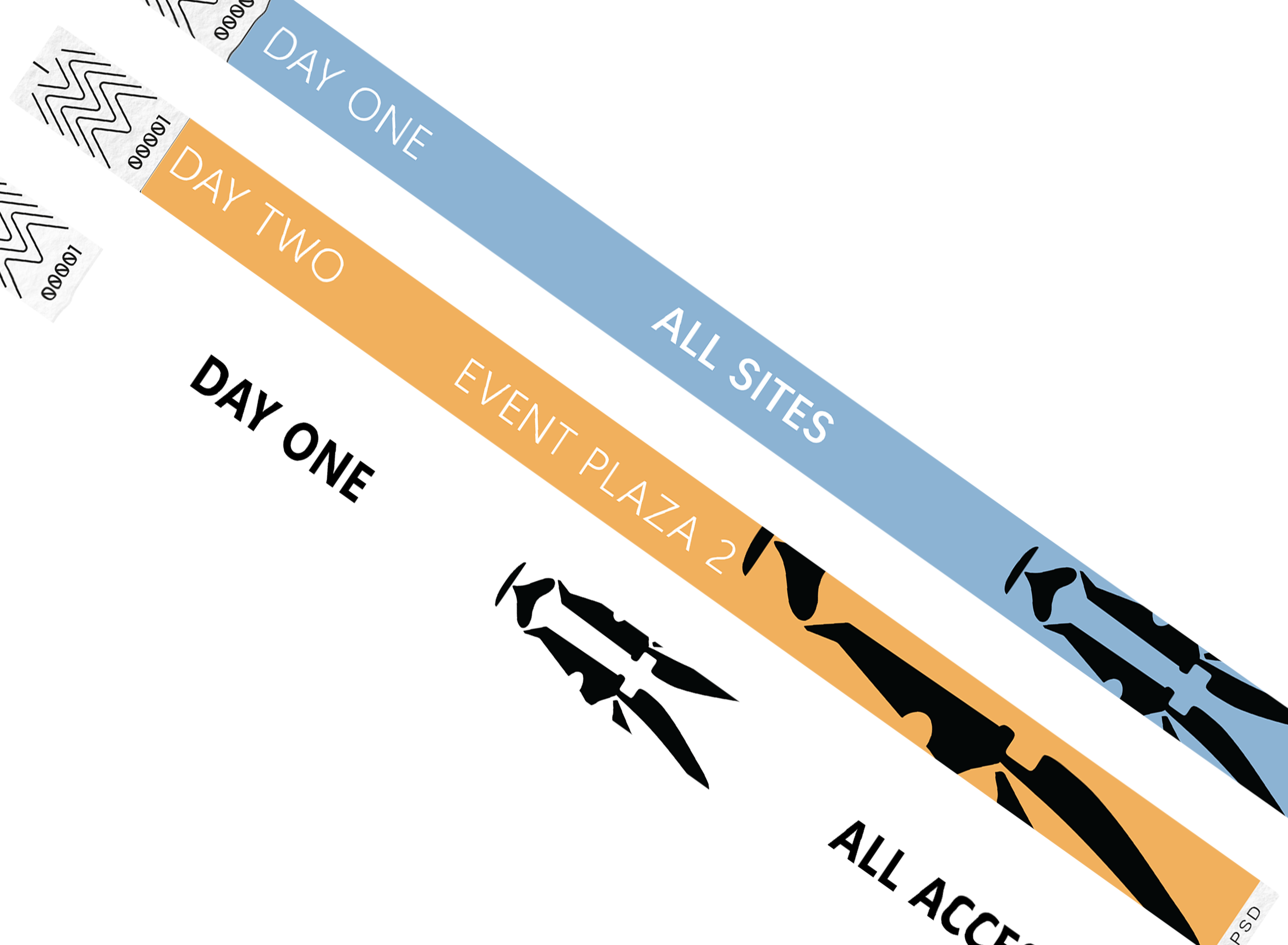
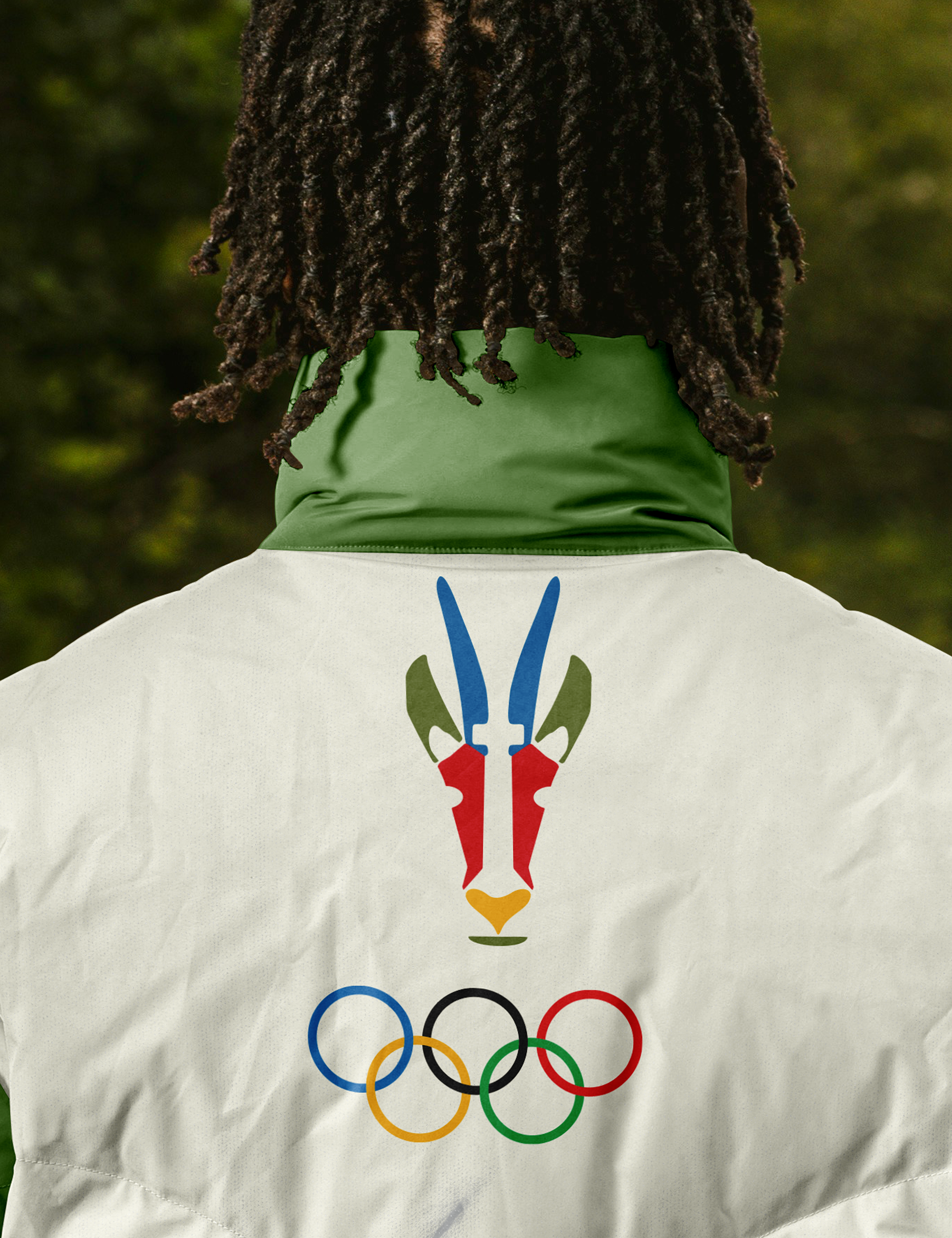
Each color was tied to one language, not as decoration, but as part of the structure of the system itself: Ross Red for Romansh, L'oro del Vincitore for Italian, Jägergrün for German, and Bleu Ciel for the French-speaking region.
The palette needed to do more than look good. It needed to carry meaning and make the identity feel intentionally built.
Applications
In Action
Outcome / Reflection
A system capable of moving from ritual to logistics.
The final concept includes logo variations, color guidance, type hierarchy, credential templates, and application rules all held together by Abä, Genau. Whether the crest shows up on a wristband, a jacket patch, a media badge, or a broadcast graphic, it still feels like the same system.
What I like most about this project is that it let me explore how a big event identity can still feel thoughtful and specific. It’s symbolic, but it still knows it has a job to do.
Next →
About
Background, disciplines, and how research, accessibility, and craft shape the work.
← Back to home