Personal Identity System

Personal Branding

The system centers on the Anansi narrative of knowledge-keeping, Charleston ironwork, and a love of data-driven storytelling. Each asset is built to move from studio decks to community events without losing its cultural roots.

Review my current Brand System

Business card mockup featuring the personal brand identity
Business card mockup displaying the final personal identity

Project Intention

The brief demanded a personal brand that could live with the same professionalism as agency work while still honoring lived experience. The outcome needed to hold space for portfolio decks, classroom critiques, community collaborations, and client-facing deliverables.

At its heart, the brand balances three commitments:

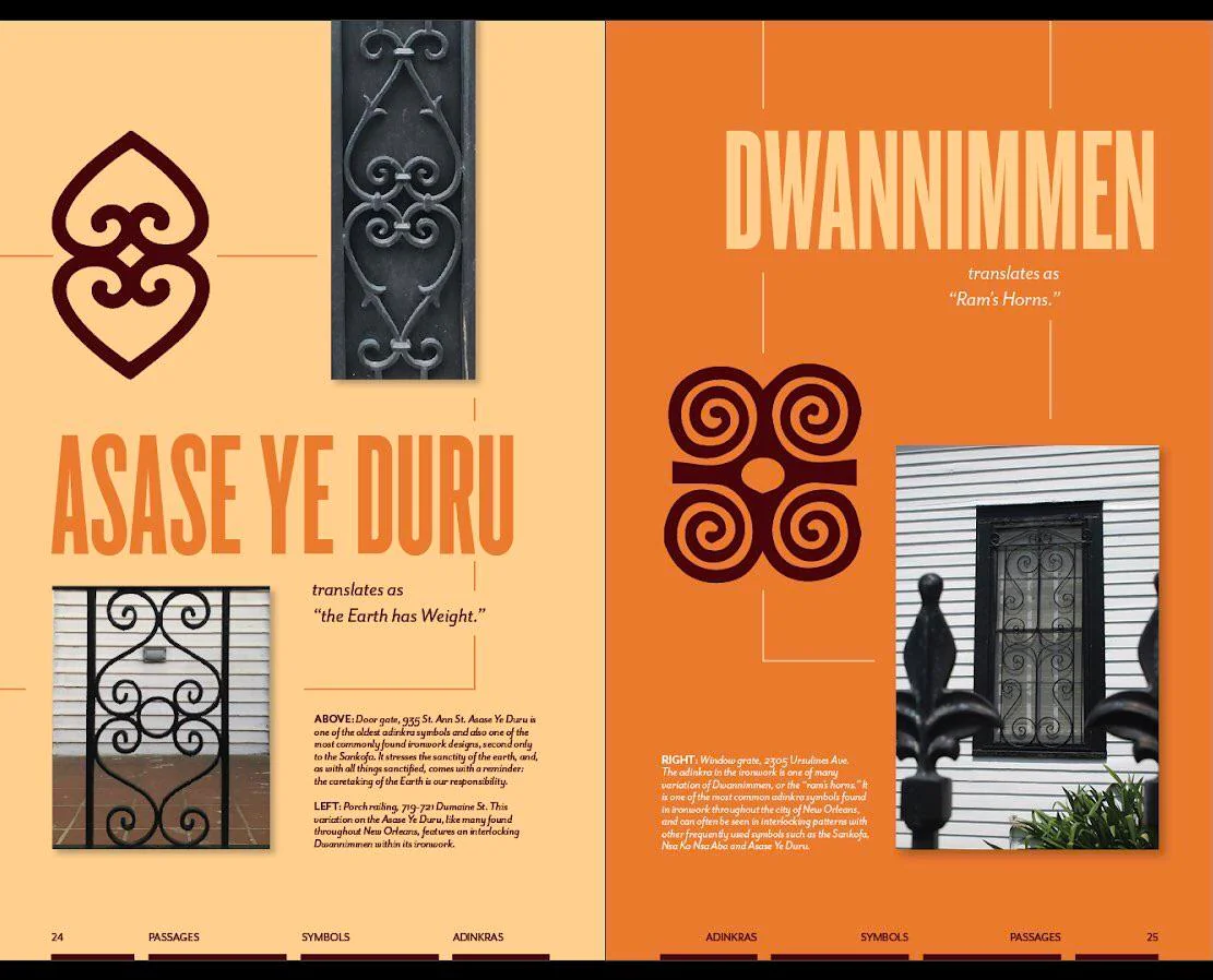
  • Celebrate West African narrative systems without reducing them to decoration.
  • Reflect the tactility of metalwork, textiles, and hand craft in a digital-first toolkit.
  • Stay legible, adaptable, and confident across every scale from favicon to mural.
Full name wordmark for the personal brand
Primary wordmark balancing expressive ligatures with grid-informed structure.

Research & Moodboards

Exploration began with cataloging visual language from Adinkra symbols, Anansi folklore, Charleston wrought iron, and contemporary Black design studios. The intent was to define guardrails—not a mood collage—so every later decision traced back to story and craft.

The collected references focus on geometry, controlled ornamentation, botanical structures, and an archival sense of memory. Those cues guided how shapes repeat, how negative space behaves, and how the mark can shift between quiet and expressive states.

Moodboard exploring cultural aesthetics and color palettes
Cultural aesthetic and material palette cues for the identity system.
Moodboard focusing on craftsmanship and traditional techniques
Craft traditions and material surfaces.
Moodboard investigating typography and visual elements
Typographic rhythm and structural forms.
Moodboard examining contemporary applications of traditional motifs
Modern interpretations of traditional motifs.

Sketch Exploration

Hundreds of analog sketches captured monograms, floral abstractions, and modular frames. The priority was momentum—testing how far a gate, web, or bloom could stretch before usability dropped off. Iterations that kept narrative clarity without sacrificing legibility moved forward.

Volume sketching ensured the final mark could fragment into patterns, frame photography, and act as a standalone symbol for avatar use. The lightbox below documents that process arc.

Initial concept exploration.
Symbol development studies.
Type and mark relationships.
Integrating cultural motifs.
Geometric pattern directions.
Monogram variations.
Layout and framing ideas.
Refining promising directions.
Pre-digital final passes.
Alternate concepts that were parked.
Range of exploration at a glance.
Primary direction that moved forward.

Digital Iterations

Moving into Illustrator, the sketches evolved into modular systems that could flex between geometric restraint and floral expression. The final mark balances both: architectural structure with organic line work, hinting at story-holding webs and basketry without literal depiction.

Tightening vector construction also allowed the identity to scale effortlessly across print, web, and motion—an early decision that kept production straightforward later on.

Primary concept exploration with geometric elements
Primary geometric concept exploration.
Secondary concept with refined proportions
Proportion and spacing refinements.
Final Anansi flower concept
Final botanical core concept.
Floral-focused brand mark exploration
Expressive floral alternative for seasonal campaigns.
Monogram style development
Compact monogram for avatars and favicons.
Windmill and Anansi split concept
Modular system exploring rotational repetition.

Cultural Influence

West African storytelling appears less as literal illustration and more as guiding logic. Anansi reminds the system to make space for knowledge-sharing and humor; Adinkra symbols demonstrate how meaning can compress into repeated forms that read as both language and pattern.

Anansi spider folklore reference
Anansi folklore as strategy: storytelling, craft, and resilience underpin the mark.
Adinkra symbols and traditional West African design patterns
Adinkra as a modular language influencing iconography and repeat patterns.
Charleston wrought iron craftsmanship inspiration
Charleston wrought iron framing the balance between negative space and repetition.
Sankofa bird symbol inspiration
Sankofa principle anchoring the brand in reclamation and forward movement.

Color & Typography System

The palette pairs grounded greens with copper accents and quiet neutrals. Deep greens evoke foliage and growth; copper nods to metalwork; neutral sand tones ensure clarity across copy-heavy layouts. Typography mirrors the balance with a clean grotesk for body copy and an expressive display serif for headlines.

Canopy Green
#1B3B32
Shadow Fern
#10231D
Copper Ember
#C98042
Parchment Sand
#F0E7D6
Moss Steel
#3C4F45

Outcome & Reflection

The final identity operates as a small ecosystem rather than a single logo. It can sit quietly on presentation decks, expand into pattern-heavy spreads, or distill into a monogram for pragmatic use cases. Every asset stays anchored in the same cultural narrative.

Ultimately, the project proves that personal branding can hold multitudes: rigorous systems, data-friendly layouts, and unapologetic cultural storytelling. It invites collaborators to step into a space where heritage and contemporary design fuel each other.

Monogram of the personal brand in gold
Final monogram ready for print, motion, and tactile production.