Personal Brand System

Current Visual Identity

This snapshot captures the active toolkit—from logotypes and color architecture to supporting patterns. The identity is intentional, rooted, and ready for both professional engagements and community partnerships.

Business card suite showing the current personal identity
Business card mockups highlighting the current brand system.

Logo Architecture

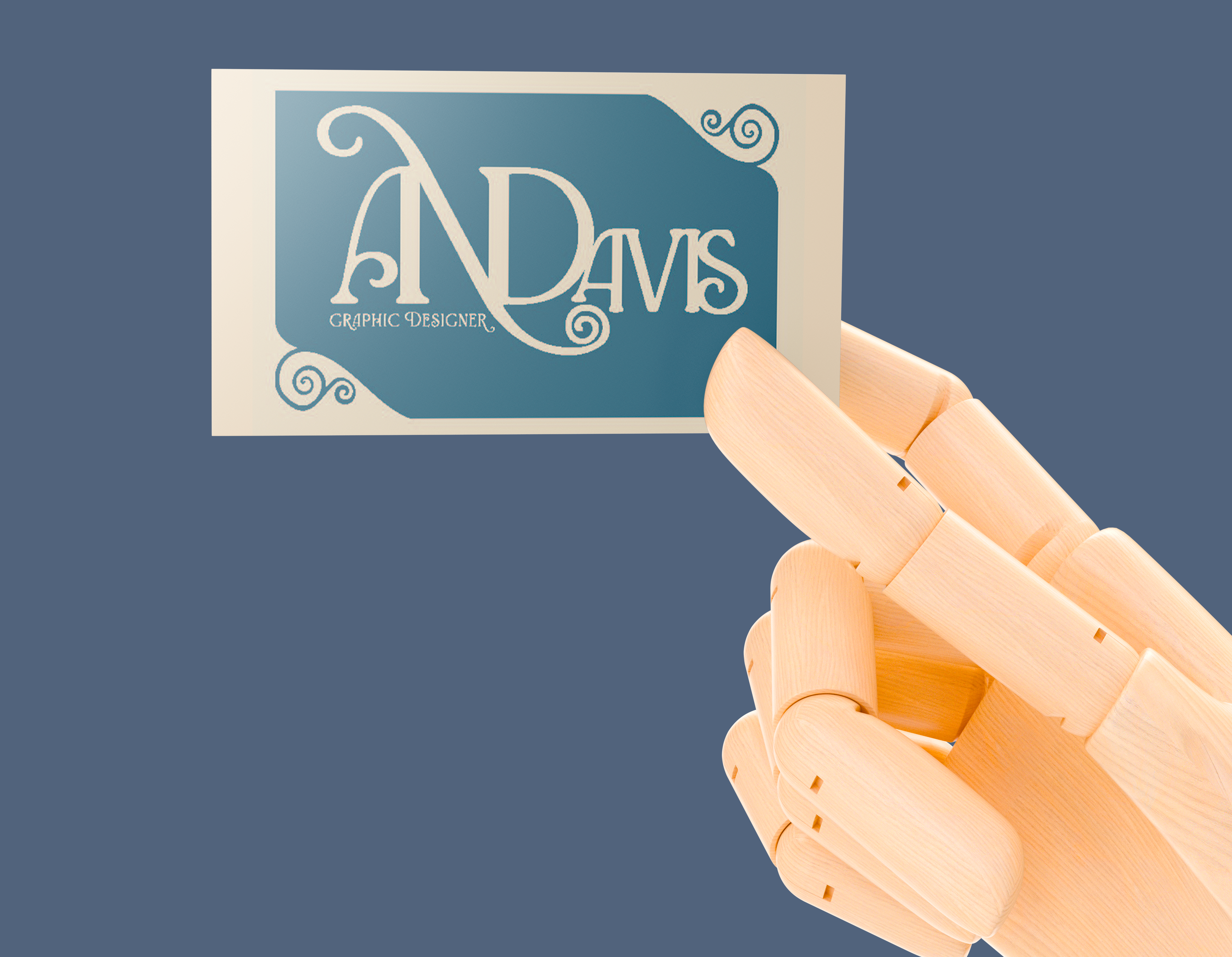
The logo suite balances flexibility with cultural integrity. Wordmarks and monograms pull from wrought-iron curves, botanical motifs, and Adinkra principles while staying precise enough for digital and print production.

Each lockup maintains optical spacing so deployments across decks, social assets, and stationery stay consistent without constant tweaking.

Primary black wordmark Gold wordmark variation Gold on green lockup Sand on water lockup

Color Architecture

The palette balances cultural resonance with professional accessibility. Deep indigos ground the system, antique brass brings ceremony, iron-inspired charcoal anchors typography, and heritage sand keeps documentation legible.

Every swatch is calibrated for cross-medium use with contrast ratios that meet accessibility guidance across UI and long-form narratives.

Deep Indigo #1D3A4D
Midnight Indigo #1D3A4D
Antique Brass #B09C34
Iron Noir #1D1D1E
Heritage Sand #DCC192

Typography Principles

Mr Eaves Sans provides structural clarity for titles and navigation, while Mr Eaves Modern handles body copy. Accent scripts such as Canto Brush appear sparingly for ceremonial headlines and storytelling moments.

The hierarchy favors breathing room, consistent baselines, and contrast between weights so long-form reading stays effortless.

Patterns & Motifs

Supporting patterns pull from wrought-iron geometry and woven storytelling. They scale from subtle texture behind case studies to bold wraps for packaging and signage.

Interlocking pattern
Interlocking lattice for large-format backdrops and presentation dividers.
Repeating emblem pattern
Emblem repeat supporting packaging sleeves and environmental graphics.
Diagonal weave pattern
Diagonal weaving motif reinforcing hand-crafted narrative elements.

Iconography & Symbols

Custom icons translate Adinkra teachings into a contemporary vector language. They root the brand in legacy while remaining modular for digital touchpoints.

Nyame Nnwu Na Mawu icon
Nyame Nnwu Na Mawu: resilience and ancestral continuity.
Dwinnimmen icon
Dwinnimmen: humility and quiet strength drawn from wrought-iron scrollwork.
Leaf icon
Leaf element signaling growth, stewardship, and care.
Sankofa swirl icon
Sankofa swirl encouraging mindful forward motion rooted in history.
Moss icon
Moss icon referencing shared roots and sustainable practice.
Water icon
Water emblem capturing flow, adaptability, and community care.

Applications

Brand components come together across business collateral, presentation templates, and digital touchpoints. Every instance holds the same balance of clarity, craft, and cultural storytelling.

Stationery system featuring current visual identity
Stationery system illustrating typography, palette, and pattern integration.

Evolution & Governance

The identity is a living framework. Quarterly audits ensure assets stay aligned with accessibility standards and strategic goals while leaving room for experimentation in future brand phases.