Overview
This project explores the development of a professional identity system for emerging special effects artist Naomi Davis. I grounded my approach in research on genre perception and visual semiotics, balancing professionalism with creative intensity.
I drew the aesthetic from sci-fi and practical effects iconography—textures of metal, latex, and light—to evoke the visceral and imaginative nature of her work. The result is a brand that communicates both technical craft and artistic fearlessness.
Objectives
I set out to design a complete brand identity system including primary logo, monogram, color palette, and application templates for both digital and print use.

Concept: The Uncanny Valley
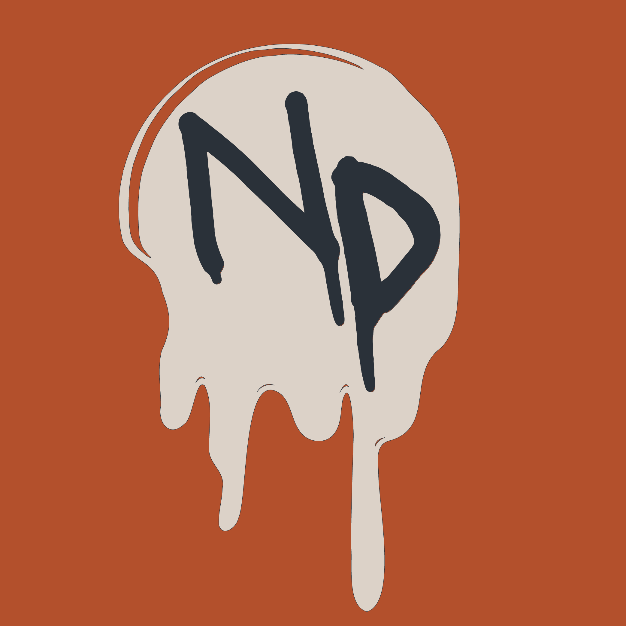
During the conceptual phase, Naomi and I identified the uncanny valley as central to her artistic identity — a tension between the real and the artificial that defines her work.
The letterforms appear to drip from the top edge, a deliberate nod to classic horror typography, while her title "effects artist" is set in lowercase and distorted into an unnatural perspective to subtly unnerve the viewer.
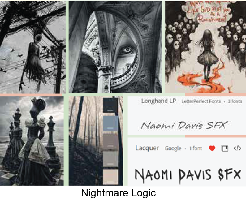
Moodboard & Visual Direction
The moodboard helped me define the tone for Naomi's brand and clarify why this palette works. I paired deep navy with burnt orange to create that heat–cold tension, then brought in beige and grey neutrals to soften what could otherwise feel too severe.
Those neutrals pull the palette back from the edge—grounding the uncanny Americana vibe without dulling it. I wanted colors that create contrast and tension while still feeling professional, without falling into cliché horror-industry territory.
Cinematic Craft Palette
I built a cinematic craft palette that balances warmth and technical precision—reflecting the dual nature of special effects artistry.
Burnt Orange
#B3502C
Deep Navy
#2A3139
Steel Grey
#7B8C98
Warm Beige
#DDD3C8
Warm Grey
#989590
Logo Development
The primary logo functions as a bold, typographic wordmark designed to be both recognizable and unsettling. The letterforms appear to drip from the top edge, a deliberate nod to classic horror typography.
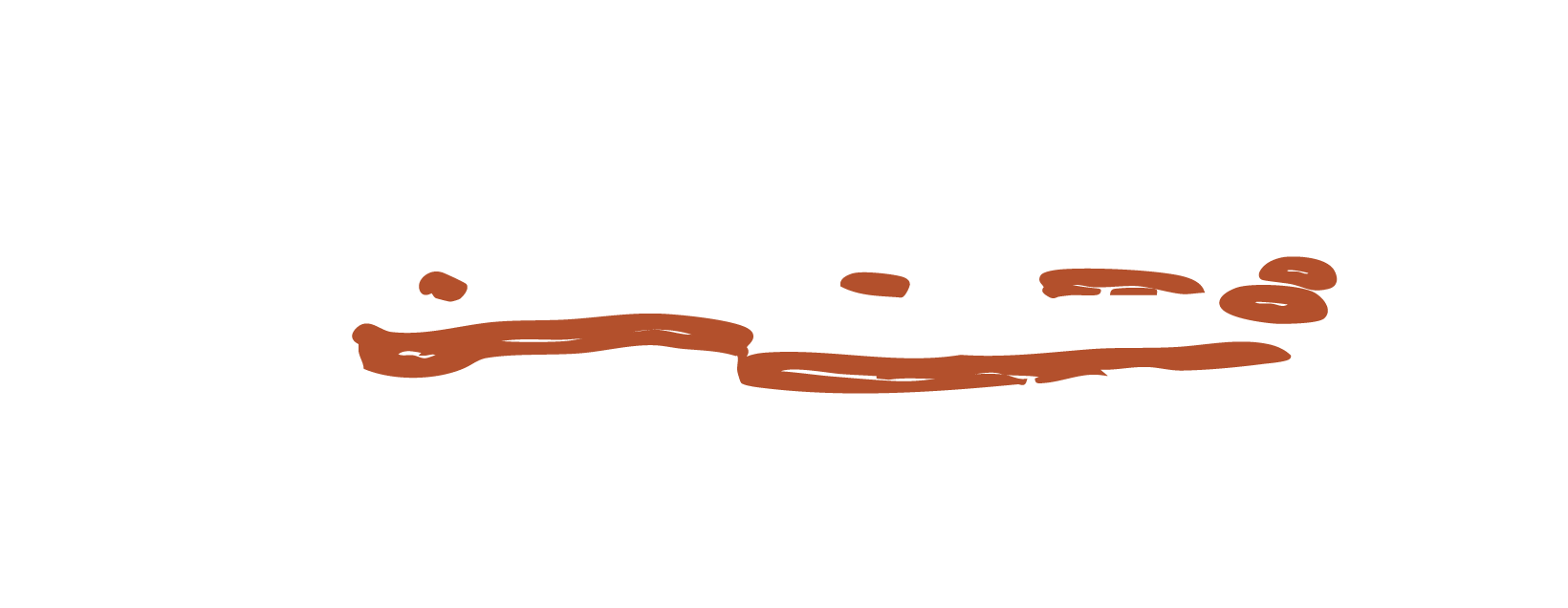
Beneath it, a spill rendered in negative space grounds the lockup, suggesting ink — or perhaps something darker — draining from the logo above. The result captures the eerie allure and cinematic craft of Naomi's SFX practice.

Dark background version — primary use case for most applications.
Light background version — maintains legibility and brand recognition.
Standalone spill graphic — usable as decorative element across touchpoints.
Monogram Logo
In a high-digital world, Naomi needed an icon that wouldn't turn to mush at small sizes. Enter the monogram. It sits inside a drip-shaped container pulled from the same uncanny universe as the main wordmark, but with a stronger, punchier silhouette.
The result is a compact mark that scales cleanly, stays recognizable, and still carries that horror-sci-fi edge her brand lives on.

Dark background — favicons, social avatars, app icons.

Light background — print materials, merchandise, UI elements.

Supporting graphic — puppetry motif for layout accents.
Visual Graphics & Icons
Another key motif had to nod to her puppetry work. Naomi's range swings from cute-and-weird to scary-and-weird — you get the idea.
So the brand pulls in those unsettling puppet eyes, letting them creep over the corners of layouts and graphics. They signal where her puppetry shows up in the work, and they add just enough eerie humor to feel unmistakably her.
Eye motif — puppetry reference
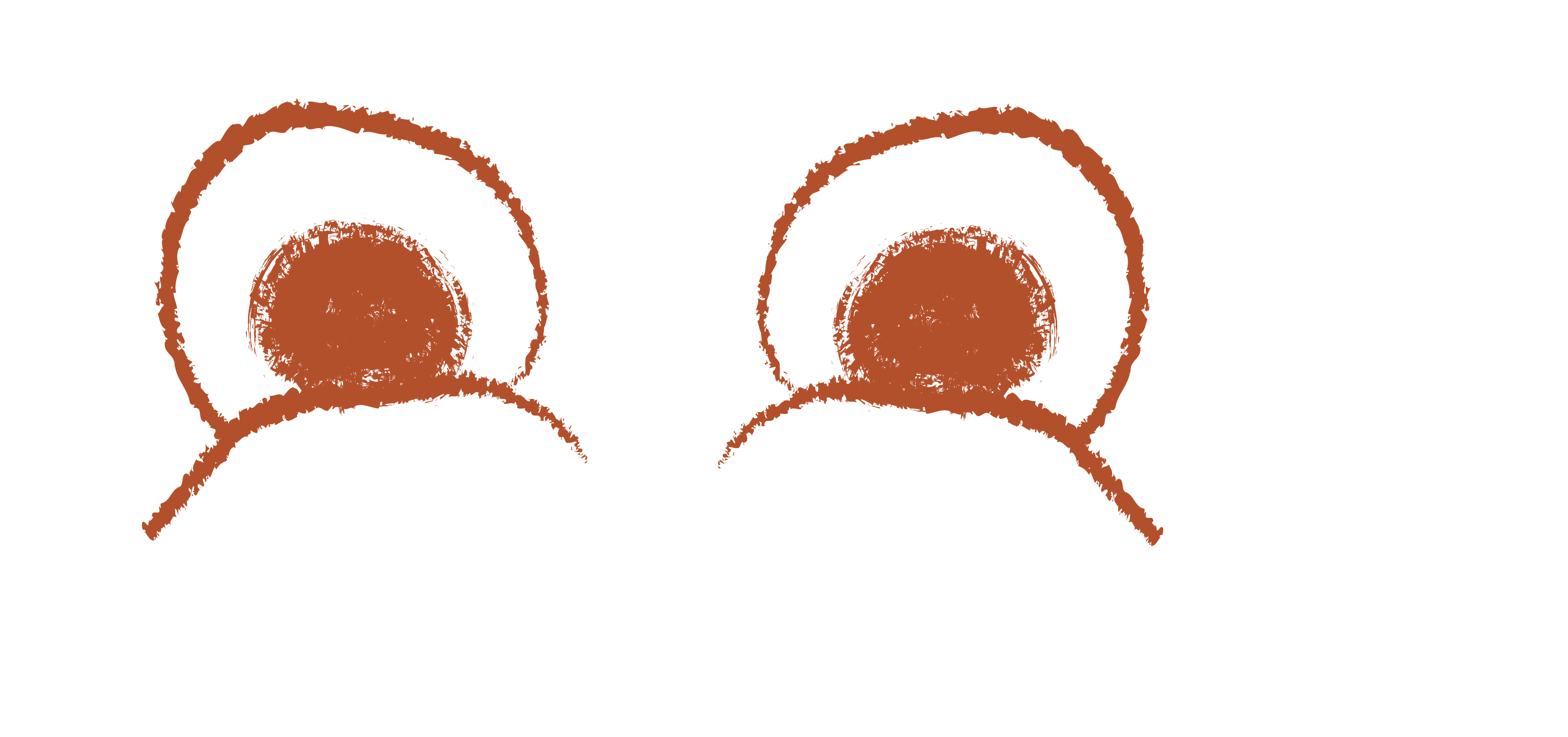
Cinematic eye — film industry aesthetic

Brand graphic — visual consistency
Signature spill — uncanny visual language
Monogram — compact mark
Monogram — light variant
Brand in Use
The Naomi Davis SFX brand identity comes to life across digital and print applications, showcasing how the cinematic aesthetic translates into professional business materials and online presence for the entertainment industry.
Every touchpoint — from business cards to Etsy templates — maintains the uncanny tension while establishing credibility.
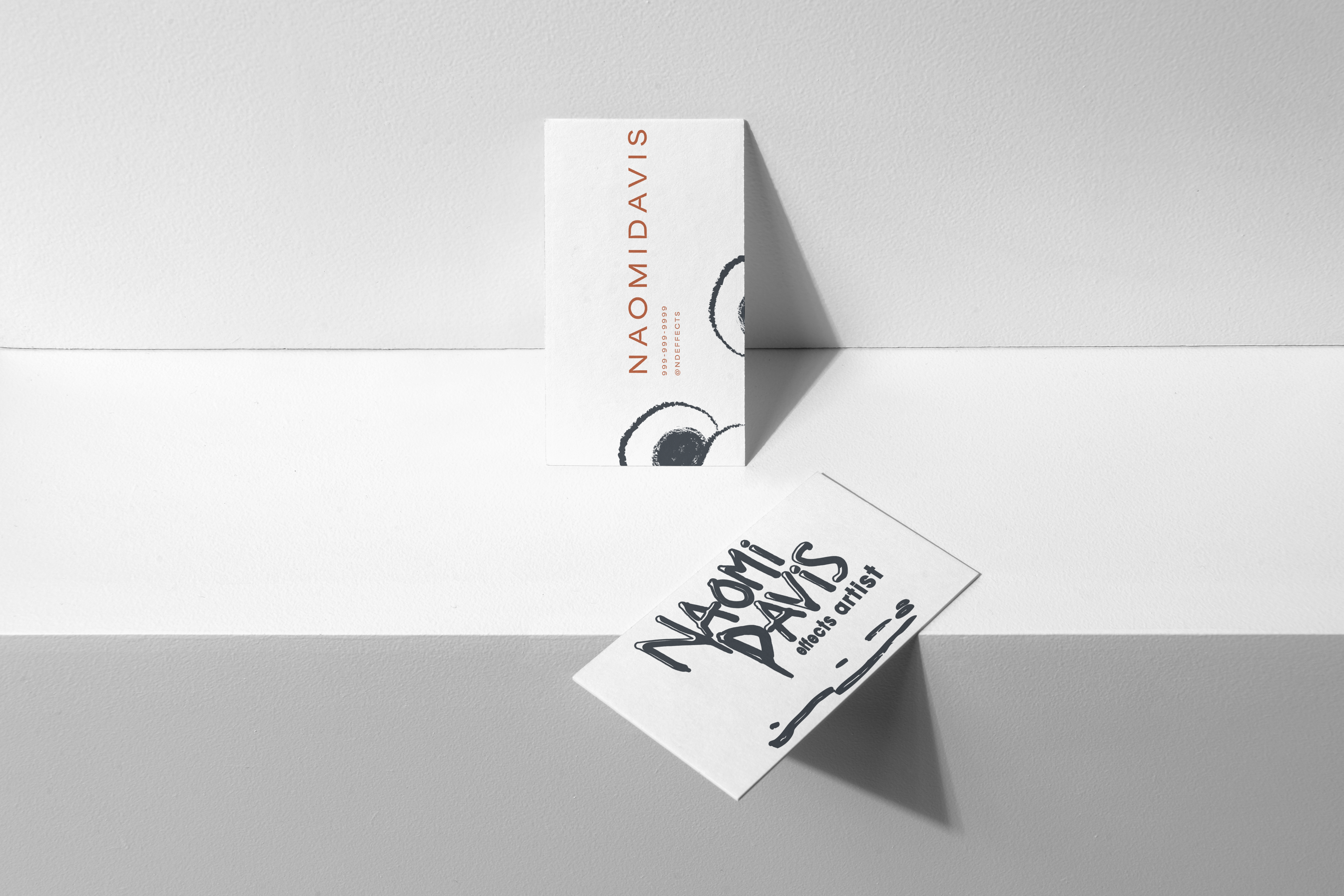
Business cards — professional credibility in the entertainment industry.
Dynamic presentation — brand flexibility across applications.
Social media — brand fidelity on handheld devices.
Digital Presence: Etsy Store
Naomi sells custom SFX pieces through Etsy, so the brand needed to translate seamlessly into that platform's constraints. The graphics maintain the cinematic voice while working within Etsy's template requirements.
Banners, listing templates, profile imagery, and shop icons all reinforce the brand's identity while optimizing for marketplace visibility.
Shop Banner
Establishes cinematic brand voice at storefront level
Seasonal Banner
Adapts palette for campaigns without losing identity
Listing Template
Emphasizes process shots and practical effects work
Template Variant
Showcases testimonials and materials callouts
Profile Imagery
Reinforces cinematic persona across platform
Shop Icon
Scaled for avatars and marketplace badges
Design Intent
The Naomi Davis SFX brand operates on multiple levels: it signals industry credibility to potential clients, establishes a memorable visual presence in a crowded marketplace, and authentically reflects Naomi's artistic voice.
Nothing in the system is arbitrary. The dripping typography, the uncanny puppet eyes, the heat-cold color tension — each element traces back to research on genre perception and Naomi's own creative identity.
The result is a brand that doesn't just look professional — it feels like her work.
Conclusion
The Naomi Davis SFX identity proves that niche creative fields deserve thoughtful, research-driven branding. By grounding the visual system in genre semiotics and Naomi's own artistic practice, the brand transcends typical horror-industry clichés.
From wordmark to monogram to Etsy templates, every element works together to communicate craft, credibility, and creative fearlessness — exactly what an emerging SFX artist needs to stand out.