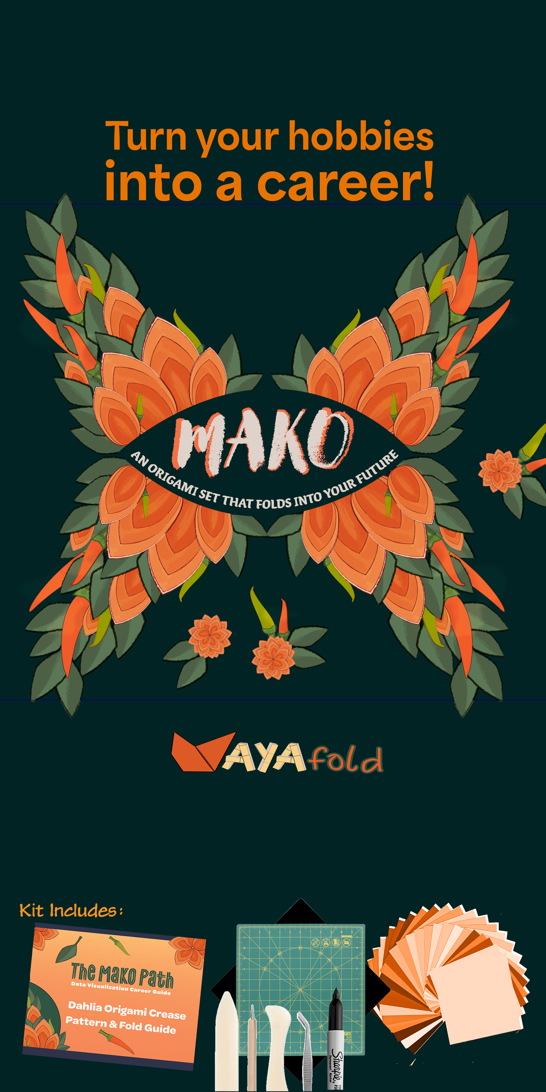
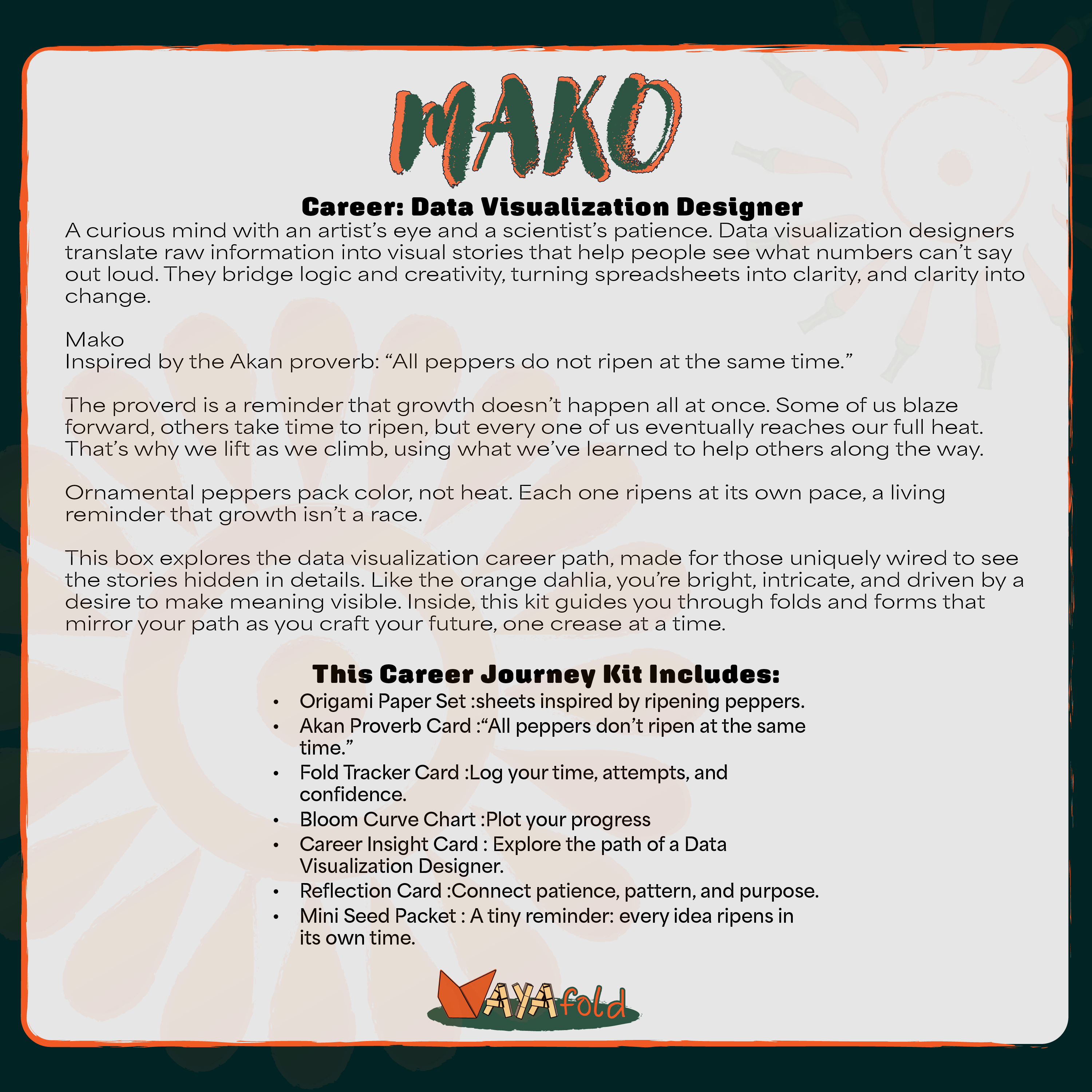
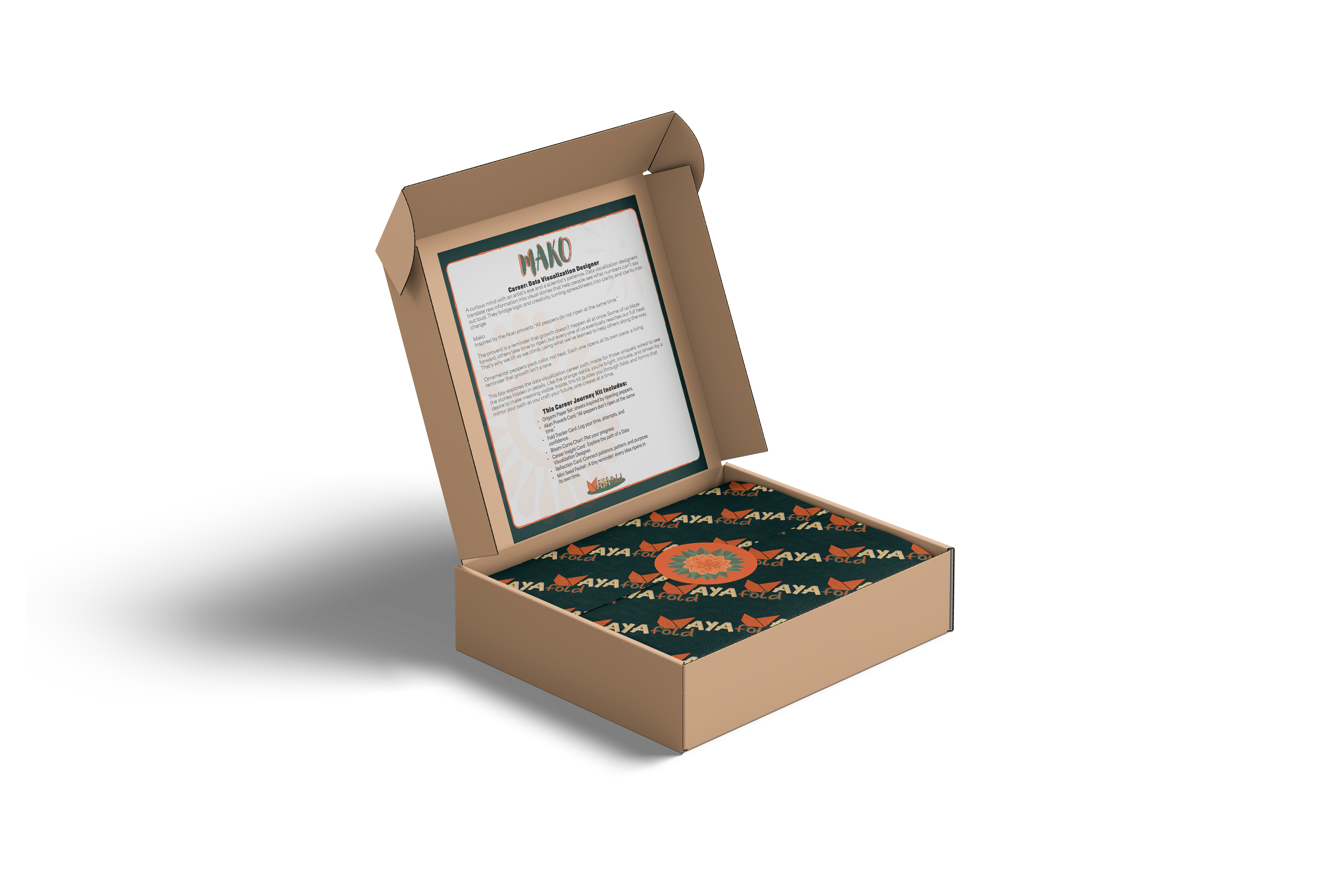
Brand Identity & Product Design

Ayafold!

Aya Entertainment Hero Ad

Overview

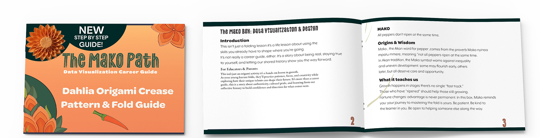
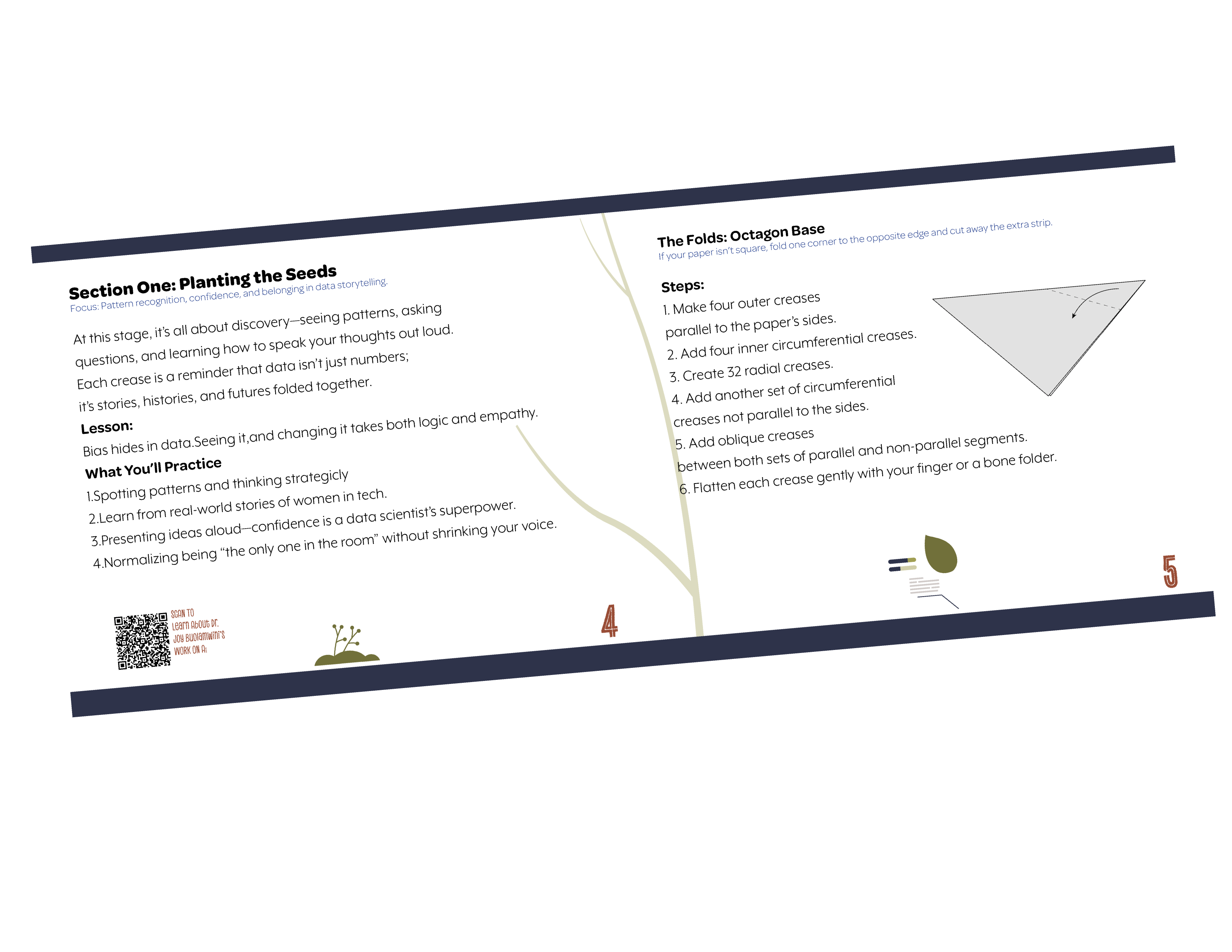
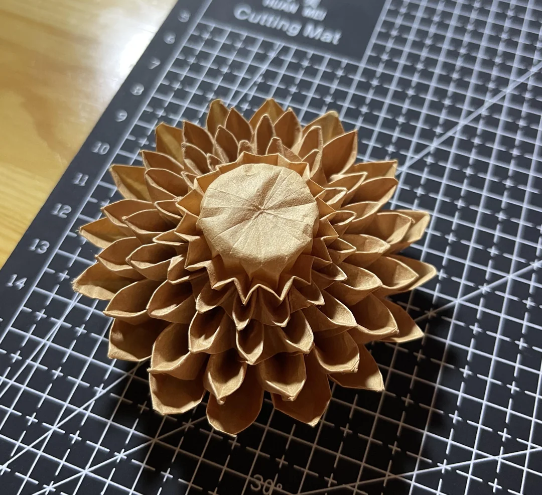
AyaFold! is a conceptual sub-brand under Aya Entertainment, LLC. The line reimagines STEAM outreach for tween and teen girls through culturally grounded storytelling and tactile craft kits. Each kit positions a hands-on paper activity as a gateway to understanding real STEAM skills and potential career paths.

Objectives

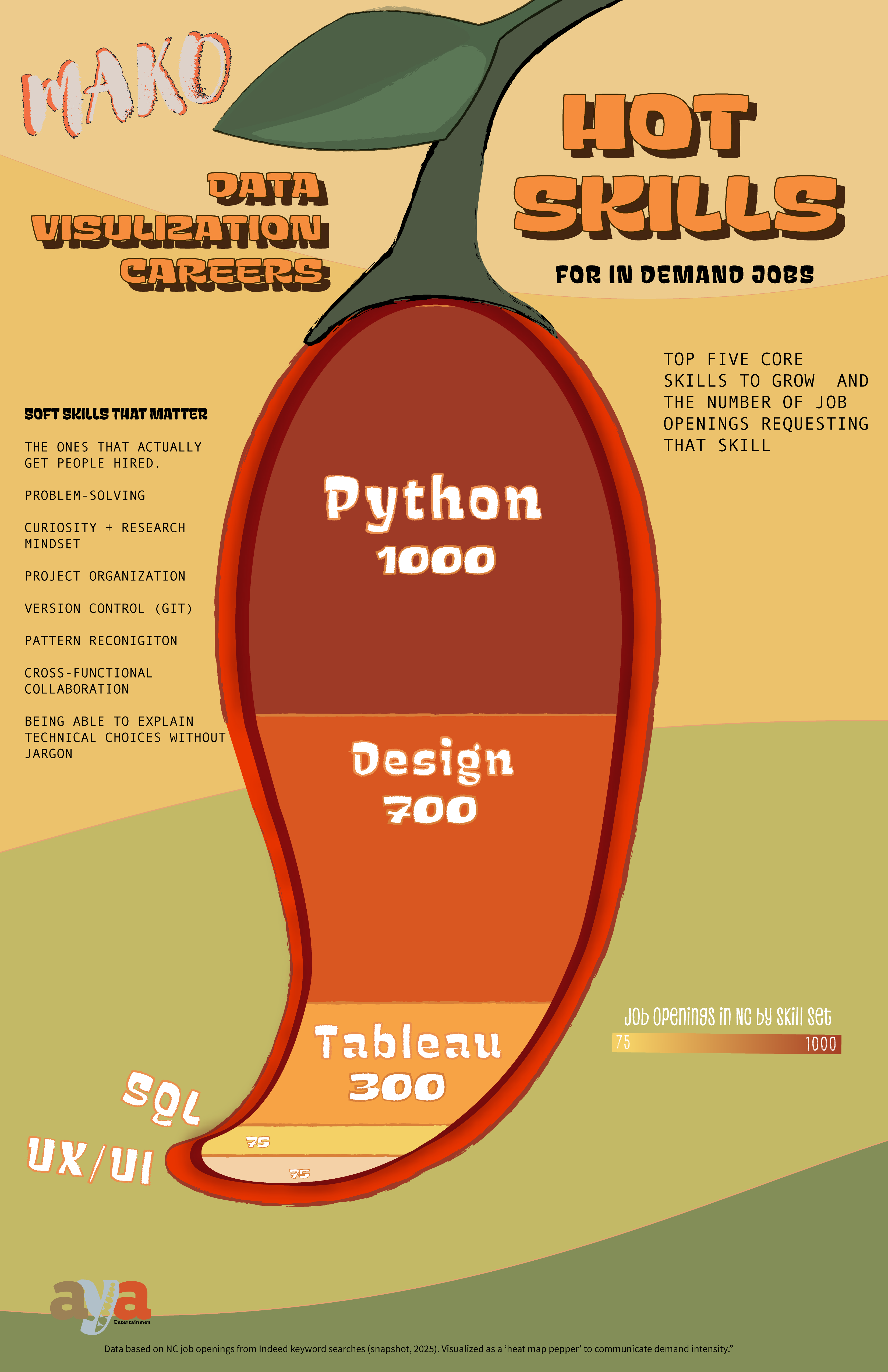
Design a packaging system, instructional booklet, and hands-on printable infographics poster for a single AyaFold! kit.

Key Requirements:

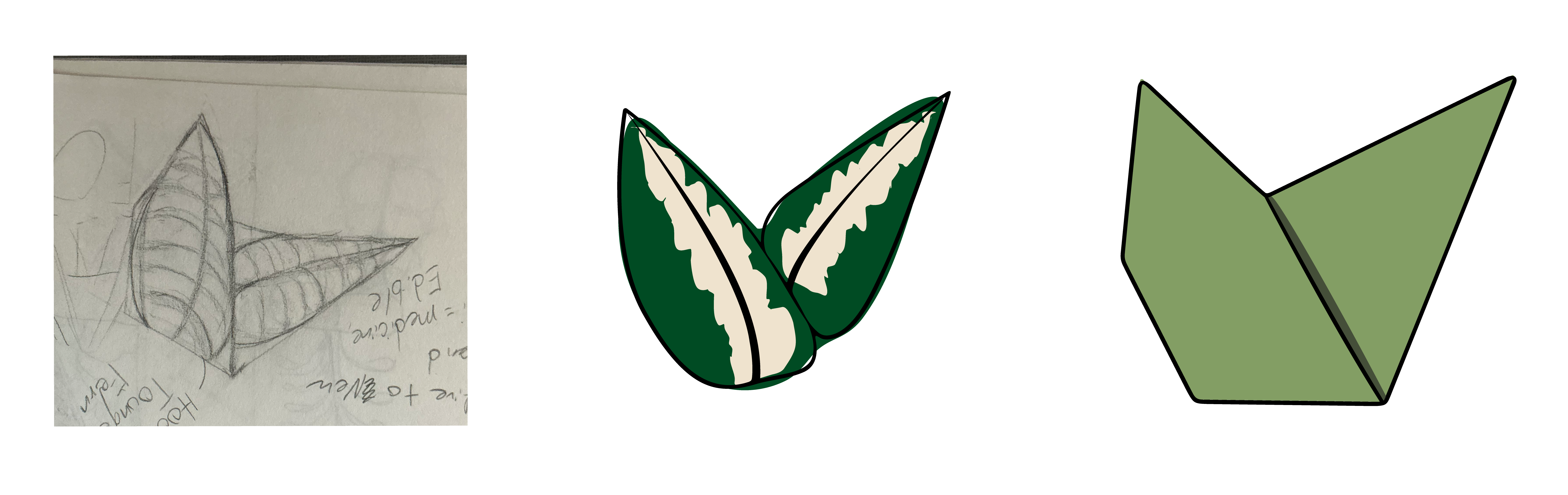
  • Craft and story must function as dual educators.
  • Instructions must clearly articulate how each fold or step maps to a STEAM competency.
  • Visual language must align with Aya Entertainment's values: heritage, creativity, and future-minded learning.
  • Deliverables must feel playful enough for youth, but structured and intentional enough for educators and parents.

Project Visual

Mako Mini Ad

Concept: The Mako Kit

Mako centers on a West African parable: "Not every pepper ripens at the same time." The design challenge was to translate that cultural message into a physical, kinesthetic craft that reinforces a STEAM mindset.

Wrapper Design

Wrapper Flat Image 2

Design Case Study

Mako Box Insert Flat Image

Where This Idea Came From

This project started with one question: why do career roadmaps lie about the future, pretending it’s linear when our lives clearly move in loops, setbacks, and side roads?.

Design Evolution

Aya Sketch to Final

Bridging Research and Design Decisions

I started where I often do: with West African mythology. It's part of my ancestry, and returning to it keeps me grounded when I'm designing "for myself." Adinkra systems contain symbols for nearly every aspect of life, so they're a natural place to look for conceptual anchors.

The Mako symbol, traditionally representing the pepper vine, immediately caught my attention. Its circular form and petal-like shapes read to me not only as peppers, but also as a flower.

Visual Reference

Mako Symbol

Dahlia Inspiration

That visual resemblance led me to the dahlia, a flower I've always been drawn to for its meanings: creativity, beauty, resilience, and inner strength.

Dahlias also possess unusually high genetic diversity, which worked well with the theme of nonlinear growth — the same lesson embedded in the Mako proverb.

Dahlia Reference

Dahlia Photo

Color Direction

From there, the design direction became clear. I explored dahlia-inspired paper folds and found the origami crease pattern that ultimately shaped the kit. The color palette emerged from both the proverb's imagery and its symbolic logic: saturated oranges and greens, the colors of peppers as they ripen.

Bright, high-contrast, and visually inviting, they make the kit feel like something meant to be picked up and learned through doing.

Palette Samples

Color Palette

This is where the three worlds met: cultural symbolism, personal ancestry, and practical design needs converged into one fold-by-fold learning experience.

Parable as Framework

Each box in the collection is built from the visual language, symbolism, and narrative structure of a West African parable. The parable establishes the foundational metaphor for growth, transformation, and purposeful movement. This story framework is not decorative — it directly informs the structure, sequencing, and visual personality of each box.

Origami as System

Origami is used as both a formal design system and a conceptual bridge between story and career development. Specific crease patterns were selected for their geometric behavior, symbolic resonance, and structural integrity. Each origami form mirrors a stage in the career path it represents: exploration, skill-building, specialization, and mastery. The physical act of folding reinforces the idea that progress is built through intentional, layered action.

Crease Pattern Diagram

Career Mapping Through Fold Logic

Career pathways are mapped directly onto the folding logic. Early folds represent foundational knowledge and exposure. Intermediate folds reflect decision points and specialization. Final forms represent professional identity and long-term growth. The user isn't just reading about a career path — they're physically constructing it.

Fold Stages Diagram

Box Inserts and Educational Layer

Each box contains a printed insert that fully documents the symbolic system behind the design. These inserts explain the original West African parable and its cultural context, the meaning embedded in the selected origami crease pattern, how each stage of the fold corresponds to a specific phase of the career path, key skills, mindsets, and educational milestones associated with each stage, and visual references that link abstract symbolism to real-world career outcomes.

The inserts function as both cultural grounding and instructional material. They ensure the user understands not only how to assemble the form, but why the form exists and what each step represents.

Box Insert Spread

Design Intent

The AyaFold framework operates simultaneously as a cultural storytelling system, an embodied learning experience, and a structured career visualization tool.

Nothing in the system is decorative. Symbolism, geometry, and career data function as one integrated language. Through symbolic systems design and systems thinking, AyaFold reframes career development as an adaptive, buildable process rooted in endurance, strategy, and environmental awareness rather than fixed destinations.

The entire brand is anchored in the Aya philosophy: strength through endurance, growth through resistance, and the ability to prosper even in fallow soil.

Brand Philosophy Visual

The Connective Tissue

For each career field, I looked at the throughline — what major skills were consistently required and how society traditionally views and values that career over time. This allowed me to move past surface job titles and instead map the deeper structure of each profession.

The three concepts presented demonstrate this method.

Methodology Diagram

Cultural Translation Through Symbolic Pairing

Each box integrates botanical symbolism and Adinkra philosophy through a cultural translation design approach. These symbols are not decorative overlays — they function as parallel meaning systems that reinforce the narrative and professional logic of each box.

AyaFold Kit Designs and Symbolism

Mako Box Design

Data Visualization Kit

Anansi Box Design

Web Design & Dev Kit

Aya Box Design

Environmental Engineering Kit

Mako Symbol

Mako — Growth through patience

Anansi Symbol

Anansi — Wisdom and strategy

Aya Symbol

Aya — Endurance and resilience

Orange Dahlia

Orange Dahlia

Red Spider Lily

Red Spider Lily

Fern

Fern

Career Path Descriptions

Data Visualization

Orange Dahlia + Mako

The orange dahlia represents resilience, adaptability, and persistence under pressure. It is paired with the Mako Adinkra symbol, which signifies growth through patience, resilience through adversity, and being true to one's own pace. Together, these symbols frame Data Visualization as a discipline built on sustained inquiry, refinement through iteration, and long-term clarity rather than instant certainty.

Web Design & Development

Red Spider Lily + Anansi

The red spider lily symbolizes transformation, transition, and threshold moments. It is paired with Anansi, the West African spider archetype known for intelligence, survival through wit, strategic thinking, and adaptation rather than brute force. This pairing positions Web Design and Development as a discipline driven by logic, navigation of invisible systems, and intellectual agility across constantly shifting digital environments.

Environmental Engineering

Fern + Aya

The fern represents endurance, regeneration, and long-term ecological balance. It is paired with the Aya Adinkra symbol, meaning endurance, resourcefulness, and the ability to flourish under resistance. This pairing defines Environmental Engineering as the philosophical and structural root of the AyaFold brand — embodying stewardship, sustainability, and the capacity to prosper even in challenging conditions.

Target Audience

The core user for this kit is the 15-year-old version of me: creative, curious, and hands-on, but without exposure to careers that matched my strengths. I approached this as an autobiographical persona exercise, identifying the patterns and barriers I experienced and that many teens still share — limited STEAM visibility, few culturally grounded materials, and roadmaps that felt more intimidating than helpful.

Key User Needs

Clear guidance without condescension. Hands-on, step-by-step learning. Cultural grounding to build connection and confidence. A nonlinear approach to progress and skill building. A learning format that supports neurodivergent patterns such as structure, visual cues, and tactile engagement.

Kids who think like I did — hyper curious, easily overloaded, great with their hands — don't need vague encouragement. They need clarity. Research on ADHD learning patterns shows that structured, step-by-step guidance can unlock focus, so the kit uses an origami sequence to make complexity feel doable.

How These Needs Shaped the Design

Origami as the core medium because tactile learners build confidence through making. The Mako proverb to anchor problem solving in cultural meaning. A dahlia crease pattern to embody nonlinear, slow-reveal progress. Clear, encouraging instructional copy designed for focus, pacing, and self-efficacy.

Aya Entertainment, LLC — The Parent Brand

To give AyaFold a world to live in, I developed Aya Entertainment, LLC as a conceptual parent company. This extra step allowed me to explore how a single product line fits within a broader brand ecosystem — and gave me the opportunity to build out a complete identity system from the ground up.

Aya Entertainment is positioned as a media and educational product company dedicated to inspiring youth through culturally grounded learning experiences. The identity balances playful creativity with structured intentionality, reflecting the company's mission to make STEAM accessible, personal, and rooted in heritage.

Brand Mark

Aya Entertainment Logo
Aya Entertainment Primary Logo

Primary Logo

Designed to scale from app icons to event signage. The mark carries meaning at every size without losing legibility or symbolic clarity.

Brandboard

Brandboard

A single reference document that aligns internal teams and external partners on color, type, tone, and visual direction.

Stationery System

Stationery System

Business cards, letterhead, and envelopes designed as a cohesive set — ensuring the brand feels consistent whether it's a pitch deck or a thank-you note.

Digital Site Mockup

Digital Site Mockup

A responsive concept showing how the brand translates to screen. Typography, spacing, and interaction patterns follow the same logic as print.

Brand Brief

Brand Brief

The strategic foundation: audience, positioning, voice, and visual principles. Every design decision traces back to this document.

Why Build the Parent Brand?

Products don't exist in isolation. Building out Aya Entertainment forced me to think beyond a single deliverable and consider how design decisions compound across touchpoints. A logo isn't just a logo — it's a system component that needs to work on packaging, in email signatures, on social media, and in investor decks.

This exercise strengthened the AyaFold concept by stress-testing it against real-world brand requirements: Can the visual language flex across formats? Does the voice hold up in different contexts? Is there room for the brand to grow without losing coherence?

The answer to all three was yes — because the system was built with scalability in mind from the beginning.

Conclusion

AyaFold sits at the intersection of culture, craft, and clarity. It reminds us that learning is most powerful when it honors where we come from and how we actually think. By weaving Adinkra symbolism, data-thinking, and tactile making into one experience, the Mako kit reframes STEAM education as something personal, grounded, and nonlinear. This project proves that design can do more than inform; it can guide, encourage, and make futures feel possible, one fold at a time.

Navigation

← Back to Portfolio Next Project →