Willow & Blossom Floral Designer
Overview
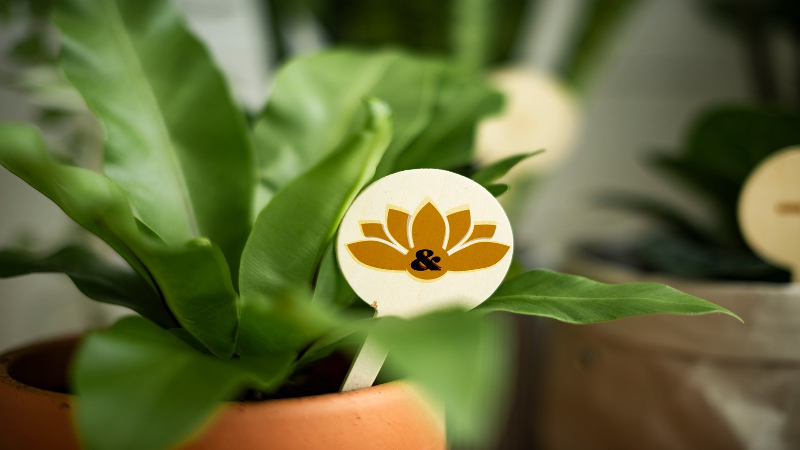
Willow & Blossom Floral Designer is a conceptual identity for a floral business based in southern England. Drawing from historic gardens, castle architecture, native botanicals, and regional craft traditions, the brand positions floristry as structured, expressive craftsmanship rather than soft decoration.
The identity was designed to move beyond the familiar language of wedding floristry and appeal to clients who value heritage, artistry, and thoughtful detail over trend-driven styling.
Logo, Color + Typography
Problem
Many floral brands rely on the same visual vocabulary: blush palettes, watercolor flowers, cursive typography, and overly delicate styling. Willow & Blossom needed to feel distinctive, rooted in place, and capable of expressing floristry as both craft and composition.
Solution
The identity draws from estate architecture, garden geometry, botanical illustration, and the tension between organic growth and structural form.
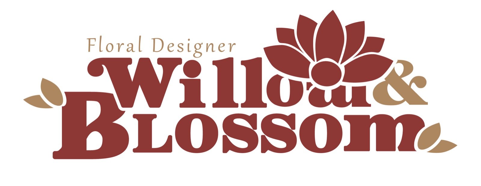
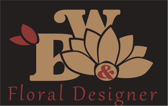
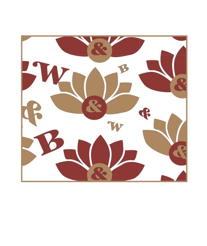
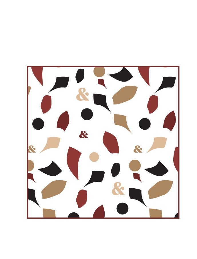
The logo system uses symmetry, pathways, masonry-inspired shapes, and botanical references to create a mark that feels architectural rather than ornamental. Ivy and lotus symbolism introduce ideas of growth, resilience, and elegance without fragility.
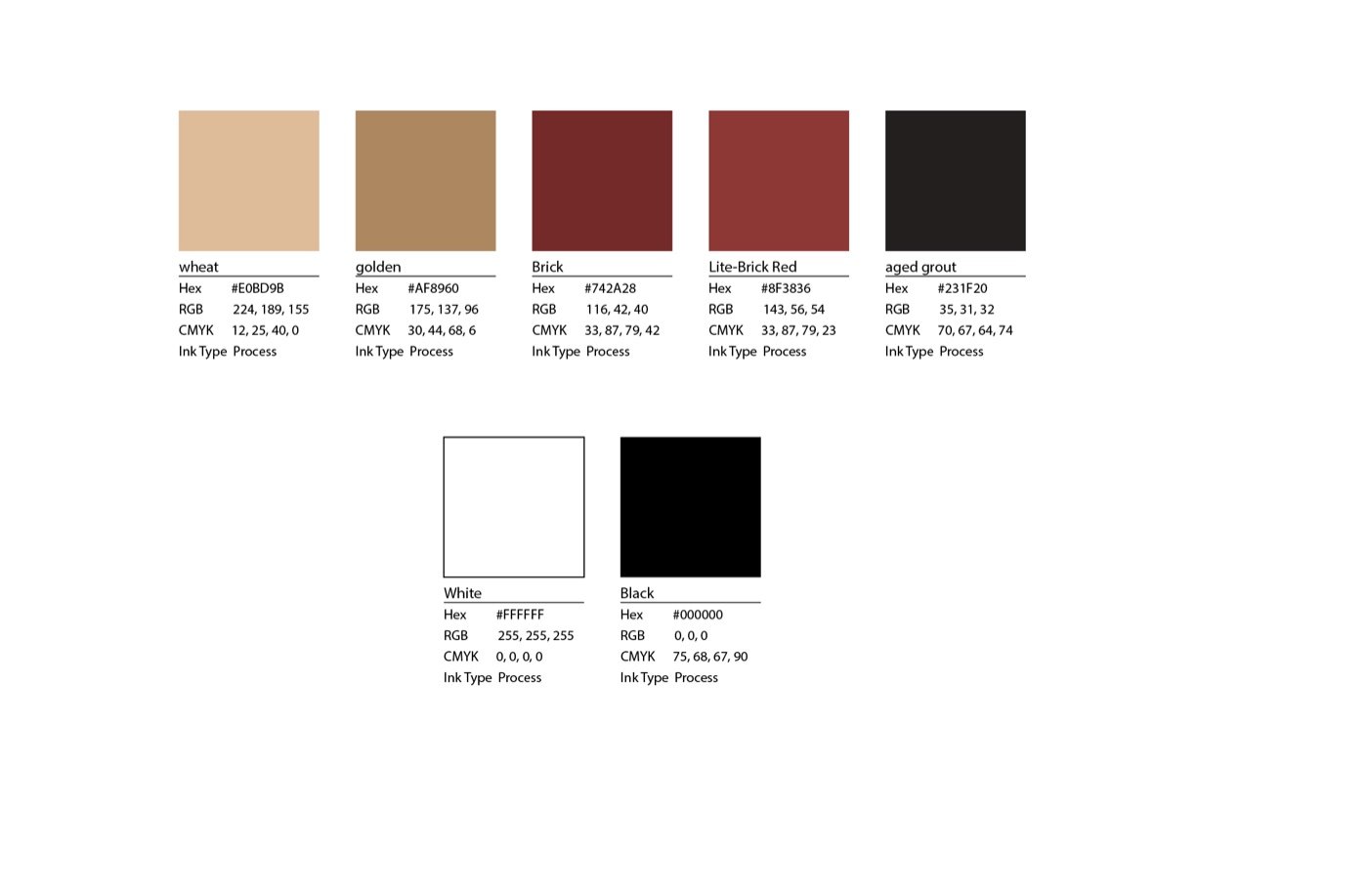
A palette of clay, oxblood, bark, crimson, and black evokes aged paper, mossy stone, wrought leaves, and dried petals. Serif typography brings an archival quality, while sharper supporting forms add editorial structure. Together, the system feels closer to a rare book or fashion publication than a traditional wedding brand.

Digital Presence
Problem
The identity needed to translate the detail and atmosphere of the floral work into a digital experience without slipping into the familiar visual language of wedding floristry.
Solution
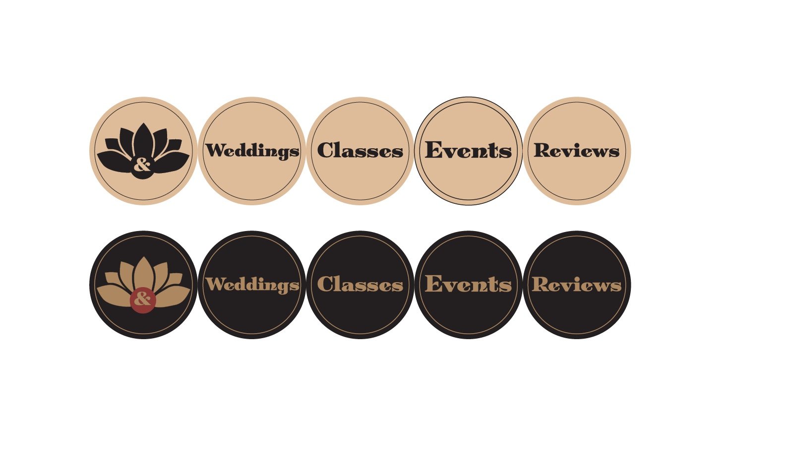
The digital system combines editorial layouts, botanical imagery, restrained typography, and architectural spacing across web and social touchpoints. The result presents the work as crafted, premium, and rooted in place while allowing individual events and arrangements to remain visually distinct.
Retail Applications
Problem
The identity needed to remain recognizable across storefront graphics, printed collateral, and the physical retail environment.
Solution
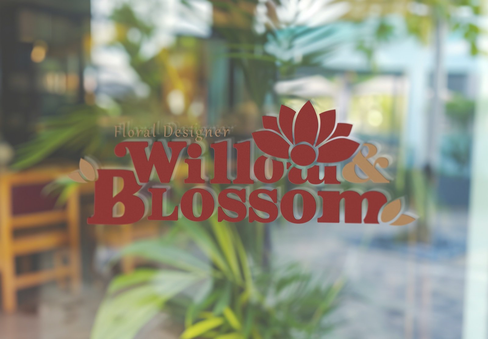
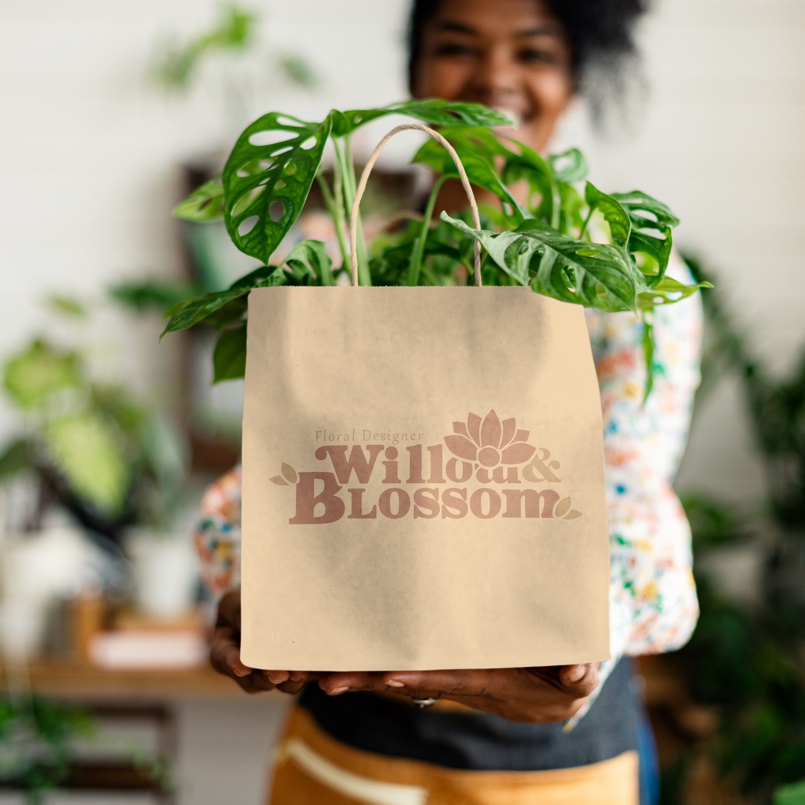
The system extends through consistent color, typography, scale, and logo variation rather than relying on a single rigid application.
Storefront decals, business cards, signage, and visual merchandising use the same balance of architectural structure and botanical detail. This allows the brand to adapt to each medium while preserving a coherent sense of place and craftsmanship.

Event Branding
Problem
Event materials needed to support floral installations without competing with them or reducing the brand to decorative signage.
Solution
Large-format banners, table graphics, and supporting collateral use restrained typography, strong geometry, and controlled color to frame the floral work rather than overpower it.
The result gives Willow & Blossom a couture presence across weddings, venue installations, and premium events while maintaining consistency with the broader identity.
Outcome
Willow & Blossom positions floristry as living sculpture shaped by intention.
The final system brings together heritage, architecture, botanical symbolism, and editorial restraint to create a brand that feels established, distinctive, and deeply connected to its setting.