Rivermark School Dining Services
Reimagining a fragmented third-party dining experience as a cohesive school-branded family touchpoint.
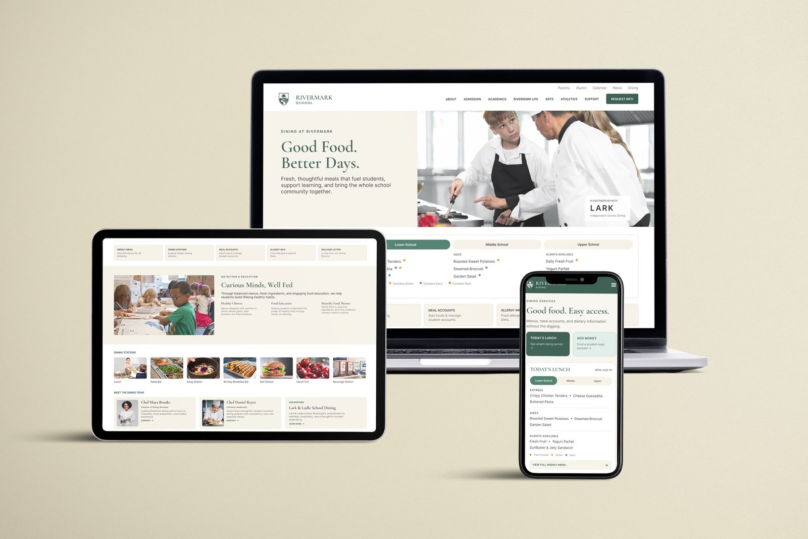
Overview
This is a self-directed concept project, not a client engagement. Rivermark School is fictional: an independent K–12 day school I built out with its own mission and identity so the design problem had real stakes to design against, instead of working against a placeholder client name.
Rivermark is a growing suburban day school in the Southeast built around one idea: steady growth with purpose. The river in its name stands for movement and curiosity, and the school’s values (belonging, growth, responsibility, well-being) treat academic life, health, and community as one connected experience rather than separate boxes to check.
The Experience Problem
As a school like Rivermark grows, campus services tend to get added through outside vendors: scheduling platforms, health portals, dining programs. Each one works fine on its own. The problem shows up in the seams between them.
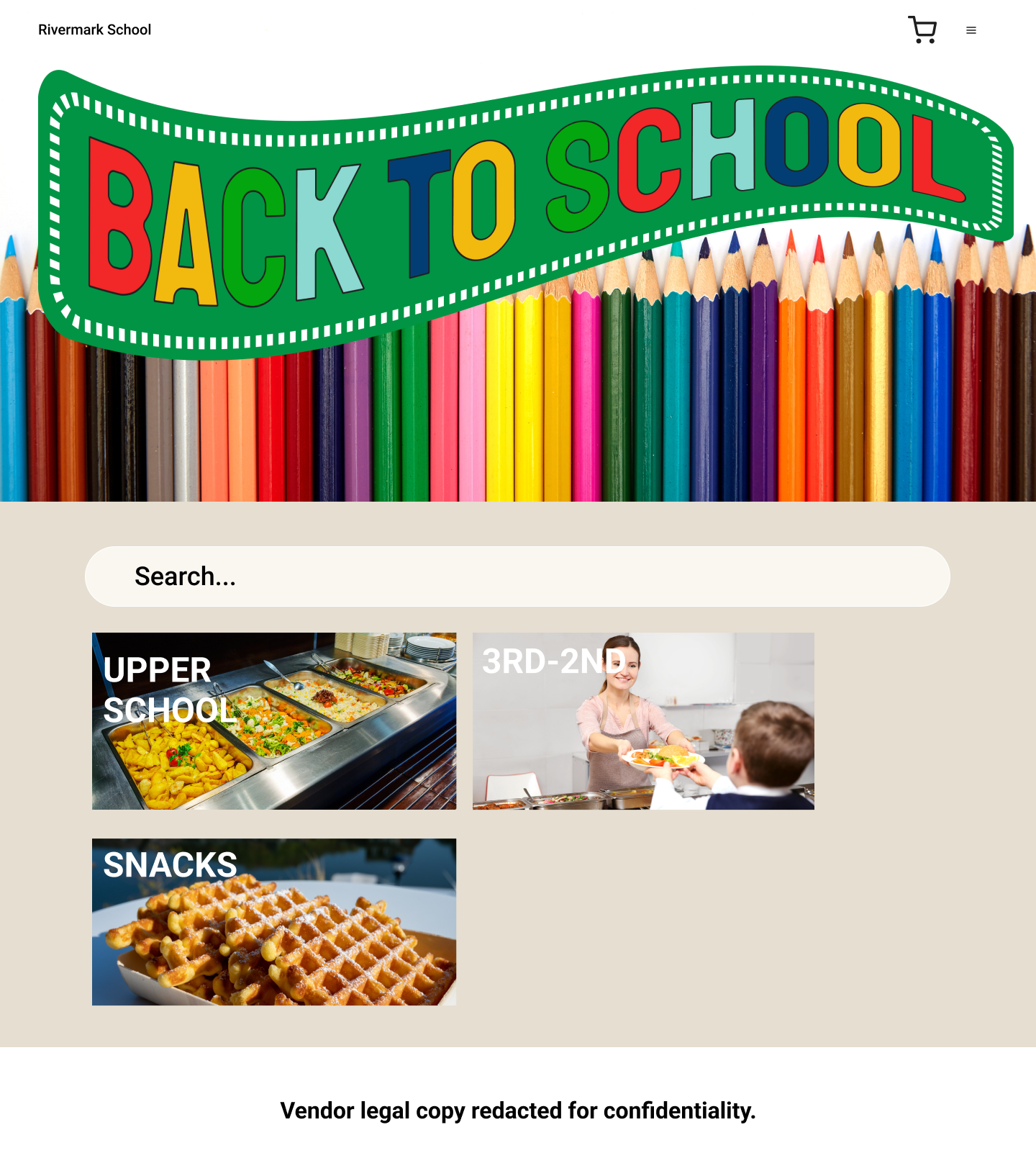
Dining was the clearest example. A family moving from Rivermark’s main site to dining information landed in a different visual system, a different navigation structure, different terminology. It read less like another part of the Rivermark campus and more like leaving the school’s website altogether. The information itself wasn’t missing. Menus, allergy details, account tools, and nutrition resources all existed. They were just scattered across vendor pages, PDFs, and separate logins. For a school whose stated values are belonging and well-being, that fragmentation worked against exactly what Rivermark says it stands for.
The Design Challenge
The goal wasn’t to hide the dining vendor or pretend Rivermark ran the service itself. It was to design something that could hold two true things at once, a problem closer to systems integration than typical page redesign. It had to answer two questions at the same time:
- Where am I? Still at Rivermark School.
- Who provides this? Dining, operated in partnership with Lark, an independent-school dining specialist.
Instead of routing families straight into a vendor-controlled experience, the concept builds a Rivermark-owned page that acts as the bridge between the school and its dining partner. Not a redirect. A room in the same house.
The Approach
I started from Rivermark’s own visual language (typography, color, navigation patterns, spacing, editorial tone) rather than the vendor’s, then organized the dining tools and information around what a family actually needs to do: check today’s or the week’s menu, manage a meal account, find allergy and dietary information, understand the dining stations, read up on nutrition, or reach dining staff directly.
The quick-link row under the menu widget is a bento grid: separate cards for weekly menus, dining stations, meal accounts, allergy information, and the welcome letter. That pattern is overexposed in UX right now, showing up on plenty of sites where the content doesn’t really call for it. Here it does. Dining information breaks naturally into a handful of parallel tasks a parent is choosing between, not reading through in order, so a grid of clearly bounded cards is the simplest way to let them scan and land on the one they actually need. The simplicity of the boxes is what makes it work, not the fact that it’s a familiar shape at the moment.
Underneath the branding, this was also an information hierarchy problem. Before, getting from “what’s for lunch” to an actual answer could mean a vendor homepage, a separate menu PDF, and another login for the account balance: several clickthroughs for something a parent is checking on their way out the door. Collapsing that into a single page, ordered by how often a family actually needs each piece, is what makes the page useful and not just better-branded. The visual match to Rivermark’s site makes it feel like one school; the consolidated structure is what actually saves a busy family time.
Lark stays visibly credited throughout. This isn’t about erasing who runs the service. It’s about presenting that partnership as part of Rivermark’s own service ecosystem instead of a separate destination a family has to be handed off to.

Mobile
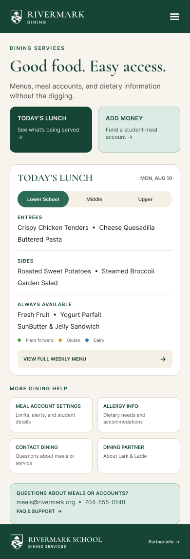
Most families are checking this from a phone, in the couple of minutes between drop-off and whatever’s next, so mobile isn’t just a shrunken version of the desktop layout. It leads with the two most time-sensitive actions, seeing today’s lunch and adding money to an account, ahead of everything else. “Menus, meal accounts, and dietary information without the digging” is the actual promise on the page, and the layout is built to keep it: one column, the same bento logic as desktop, everything else a scroll away instead of buried in a vendor site’s navigation.
Outcome
The result is a school-owned dining hub that keeps the vendor’s functionality fully intact (menus, accounts, allergy information, staff contacts, nutrition resources) while bringing the experience back in line with the rest of Rivermark’s digital presence. Nothing about how the dining program actually operates had to change for the experience of it to feel coherent again. What did change is how many stops it takes to get an answer: what was spread across a vendor site, a PDF, and a separate login now lives on one page, which matters most to the parents checking it in passing between other things.
The underlying idea travels past dining. Any school, or any organization, running services through outside platforms is solving the same problem: several vendors, one institution, and families who shouldn’t have to notice the seams. It’s the same logic Rivermark already named itself after: a river doesn’t stop being one river every time a tributary joins it.