How Money Moves Through Our State
Overview
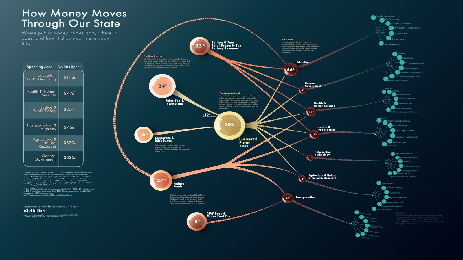
How Money Moves Through Our State is a public-finance data visualization designed to make North Carolina’s revenue system easier to understand.
The project traces money from major revenue sources, including individual income tax, sales tax, corporate tax, transportation fees, and federal funding, into the public systems they support. The goal was to translate a dense government funding structure into a visual story that residents could explore without needing a background in public finance.
Data Research + Information Structure
Problem
State budgets are typically presented through large tables, agency documents, and accounting language that make it difficult for residents to understand where public money comes from and how it moves through government.
The information exists, but it is rarely organized around the questions most people actually have: What do we pay, where does it go, and what does it support?
Solution
I reorganized the data into a clear flow from revenue source to funding hub, service category, and public outcome.
Major taxes and funding streams enter the system on the left, move through central state funds, and branch into areas such as education, health and human services, transportation, public safety, agriculture, information technology, and general government.
This structure preserves the complexity of the system while giving viewers a logical path through it.
Visual System + Hierarchy
Problem
A funding network with many sources, agencies, and service categories can become visually overwhelming very quickly. Treating every node and connection equally would produce a diagram that was technically complete but difficult to read.
Solution
I created a tiered visual system that distinguishes revenue sources, central funding structures, major service areas, and supporting programs through scale, position, color, and iconography.
Curved connections show the direction of funding without turning the graphic into a rigid organizational chart. Larger nodes identify major systems, while smaller supporting nodes reveal additional detail without competing for attention.
A restrained palette of teal, blue-grey, gold, coral, and cream separates categories while keeping the visualization cohesive and readable.
Interactive Funding Map
Problem
A single static infographic could not show the full system clearly without becoming too dense, especially on smaller screens.
Solution
The interactive version allows users to explore the funding network progressively.
A sidebar provides context and definitions, while the primary visualization shows the relationship between revenue sources, the General Fund, service categories, and public programs. Users can follow individual paths rather than processing the entire network at once.
The layout was developed to preserve hierarchy across screen sizes and keep the most important relationships visible before users begin interacting with the chart.
Explore the interactive funding map →
Accessibility + Public Understanding
Problem
Public data graphics often assume financial literacy and rely heavily on dense labels, small type, or color alone to communicate meaning.
Solution
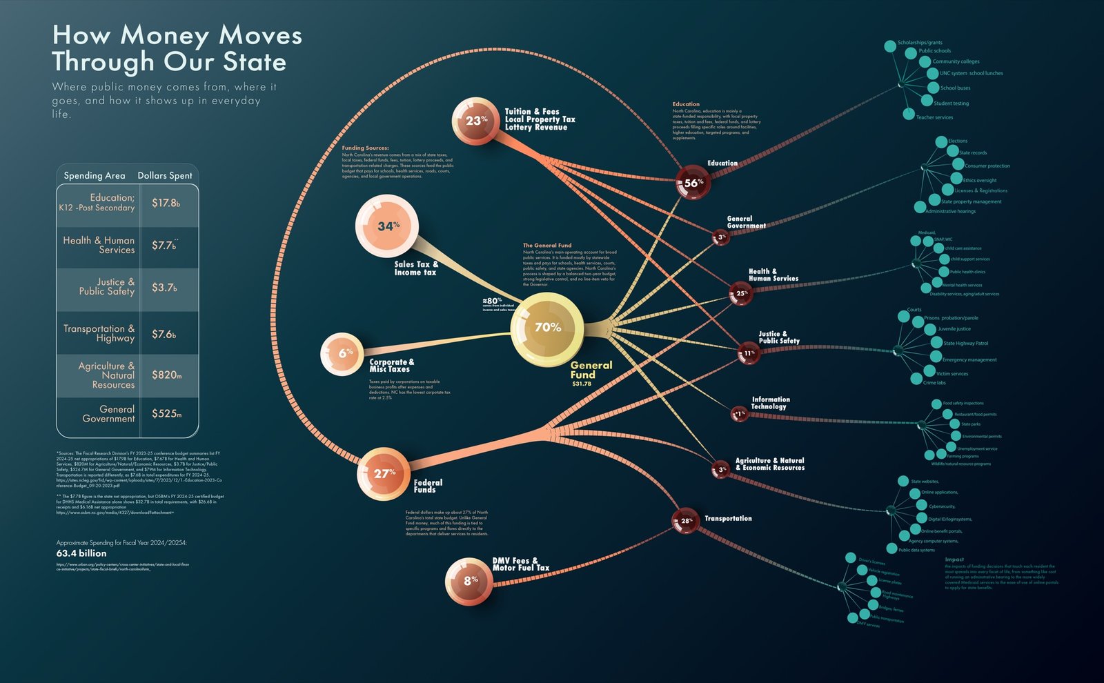
The design uses plain-language category names, clear hierarchy, readable labels, repeated visual cues, and multiple forms of differentiation.
Color supports organization but is reinforced through position, scale, icons, and text. The visualization focuses on directional relationships and relative structure rather than forcing users to decode accounting terminology before understanding the story.
The goal was not to simplify public finance until it became inaccurate. It was to make the system visible enough for people to begin asking better questions about it.
Outcome
The final project turns a fragmented collection of revenue sources and government categories into a coherent public-facing narrative.
The interactive map and supporting infographic help residents see how individual taxes connect to broader public systems, while the modular visual language allows the project to expand as additional agencies, programs, and funding streams are added.
The project demonstrates how data visualization can make government information more accessible without stripping away its complexity. Public money should not require a scavenger hunt and an accounting degree to understand.