Brand Identity · Web Design · Creative Portfolio
Naomi Davis SFX
Overview
Naomi Davis SFX is a professional identity system for an emerging special effects artist working across practical effects, prosthetics, puppetry, and custom fabrication.
Built around the tension between the real and artificial, the brand combines horror and science-fiction references with the clarity needed for professional applications. The result communicates technical skill, creative fearlessness, and a distinct artistic point of view without falling into predictable genre clichés.
Problem
The identity needed to reflect the unsettling, tactile nature of Naomi’s work while remaining credible to clients, collaborators, and entertainment-industry professionals.
Logo, Color + Typography
Solution
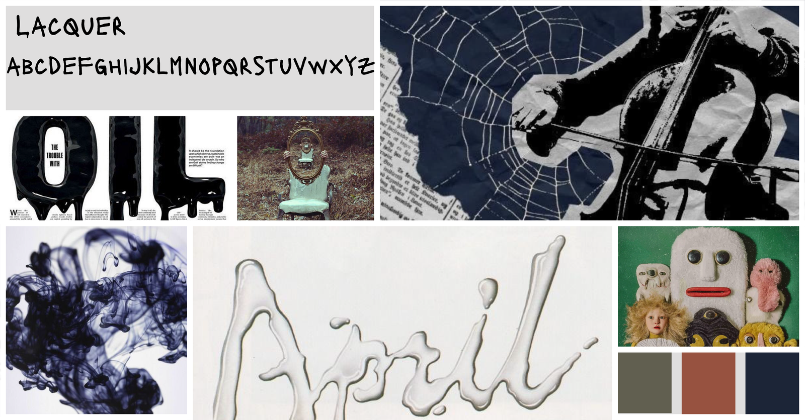
The visual system is built around the uncanny valley, the discomfort created when something appears almost human but not entirely real.
Primary Logo
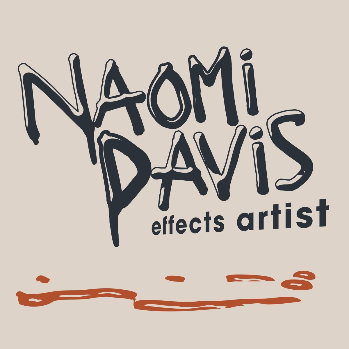
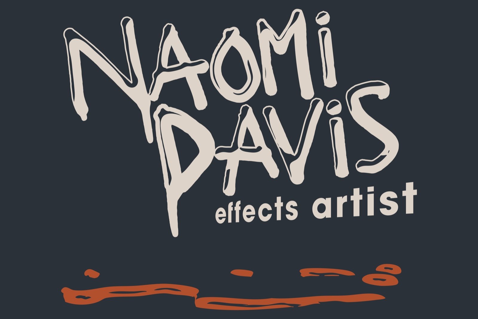
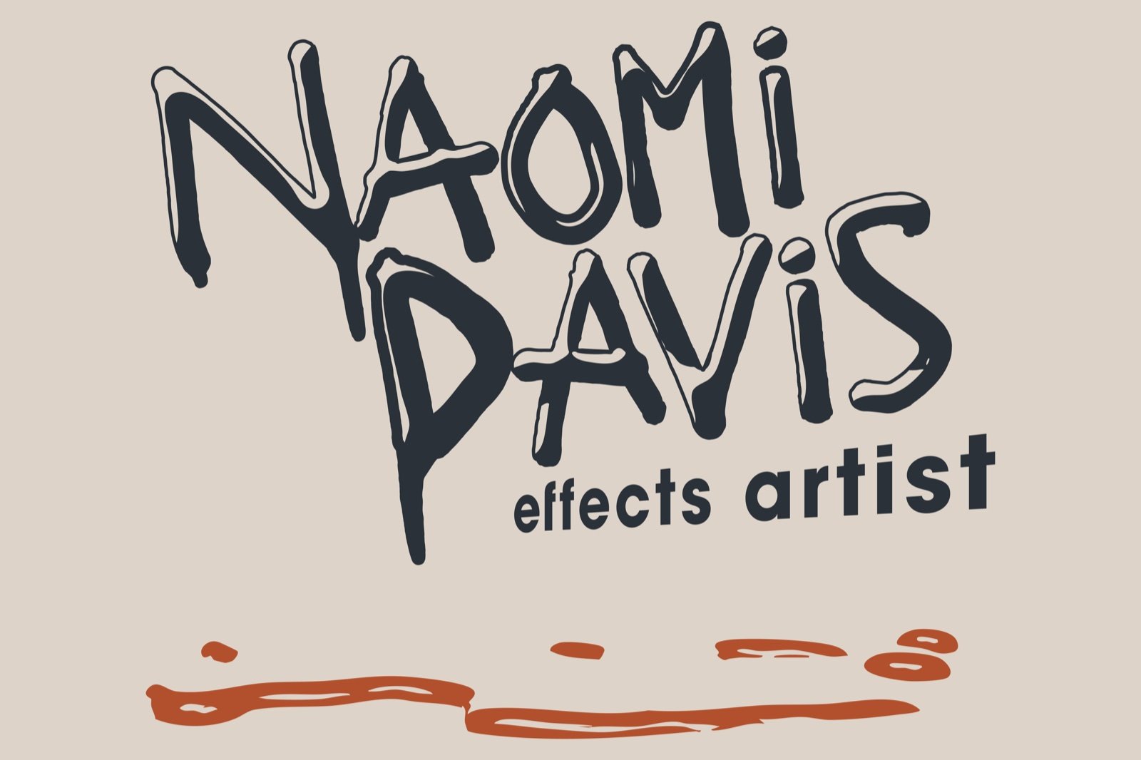
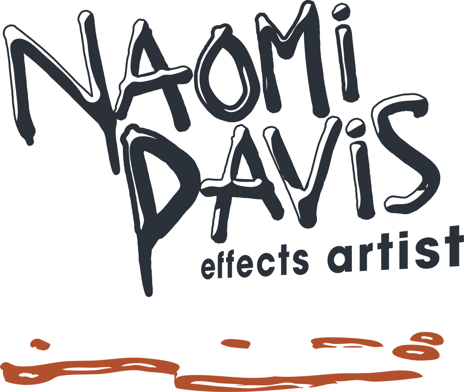
The primary wordmark uses distorted, dripping letterforms inspired by practical effects materials and classic horror typography. A negative-space spill grounds the mark, suggesting ink, latex, or something less identifiable. The smaller “effects artist” typography shifts into an unnatural perspective, adding tension without compromising readability.
Colors
Burnt orange and deep navy create a heat-and-cold contrast, while steel grey, beige, and warm neutrals keep the palette grounded and professional. Together, the system feels cinematic and unsettling without becoming theatrical for its own sake.



Monogram + Supporting Graphics
The primary wordmark carried strong personality but required a simpler mark for social avatars, favicons, marketplace icons, and other small-format applications.
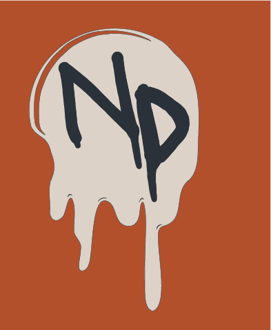
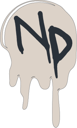
A compact monogram sits inside a drip-shaped container derived from the primary identity. Its stronger silhouette remains recognizable at small sizes while preserving the same horror and science-fiction language.





Supporting eye graphics reference Naomi’s puppetry work and extend the brand beyond the logo. Used along corners, borders, and layouts, the eyes introduce an eerie humor that reflects the range of her work, from playful and strange to genuinely unsettling.
Digital Presence + Etsy Store
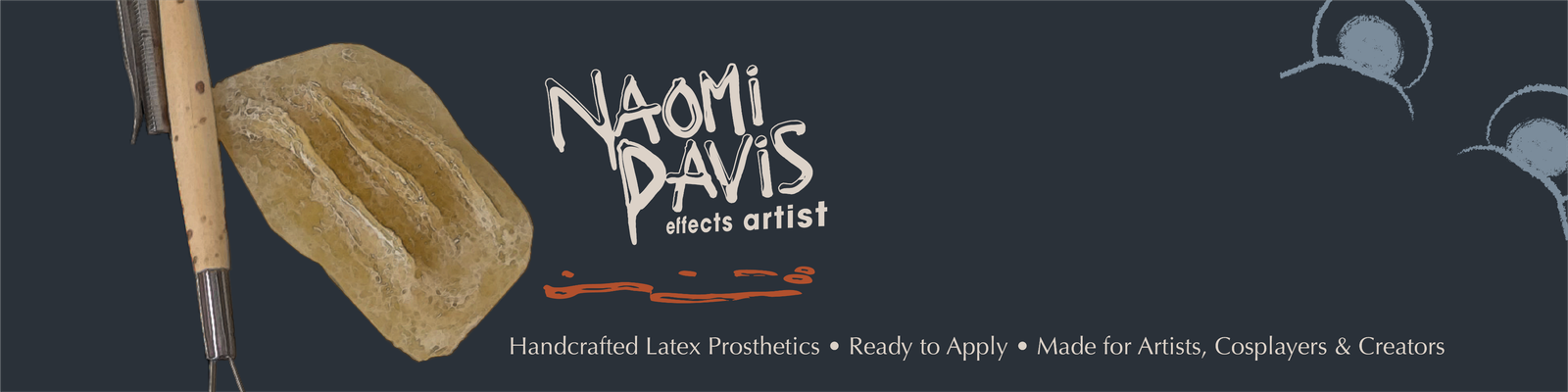
The identity needed to work within the fixed dimensions and crowded visual environment of Etsy while still presenting Naomi as a professional artist rather than a casual craft seller.
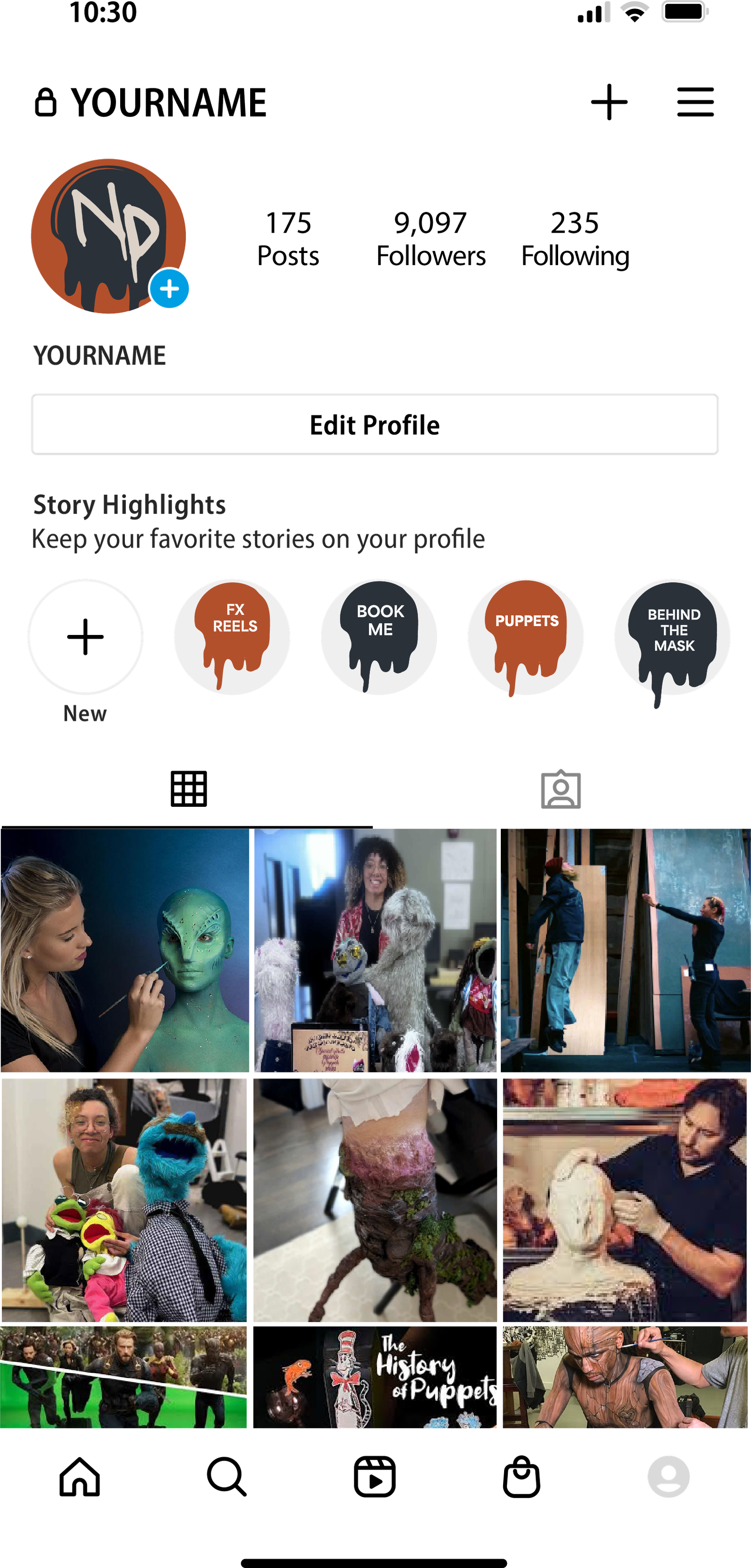
The same system extends to social media and business collateral, giving Naomi a cohesive presence across client outreach, product sales, and portfolio promotion.
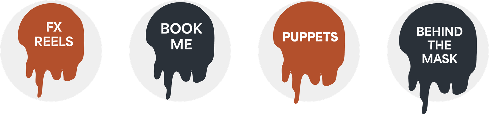
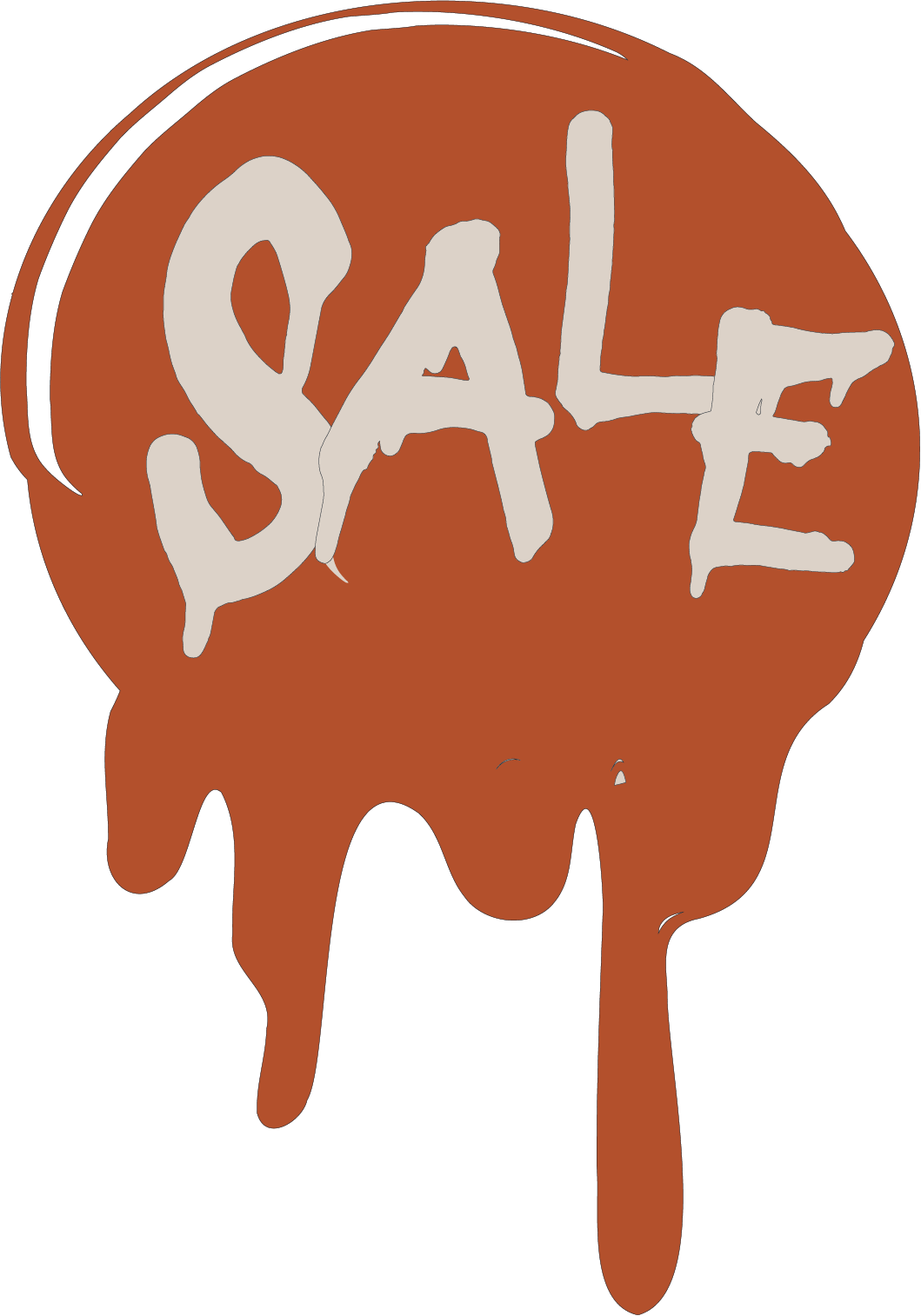
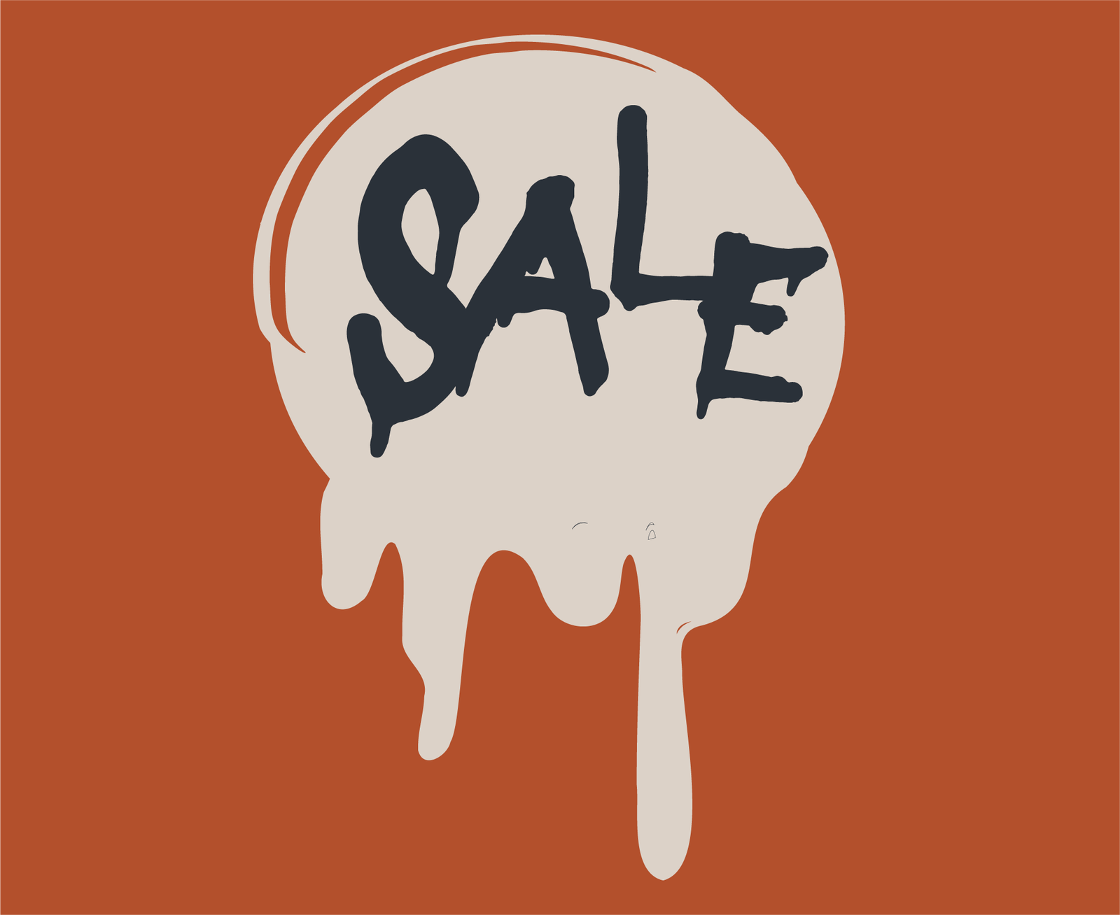
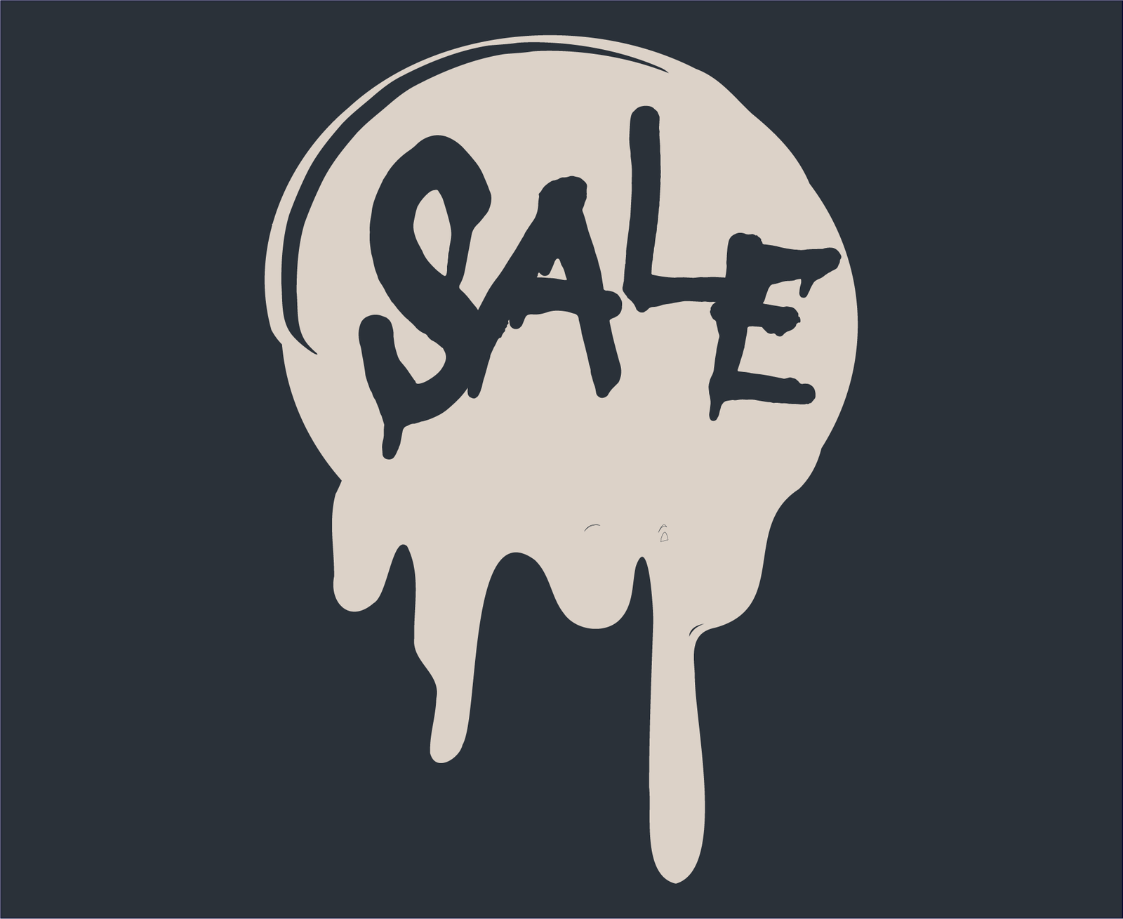
Clear image hierarchy keeps Naomi’s work central, while the color palette, monogram, spill graphics, and typography create consistency across listings. Seasonal variations allow the shop to change over time without losing recognition.
A modular set of shop banners, product-listing templates, profile graphics, and marketplace icons adapts the brand to Etsy’s constraints.



Portfolio Website
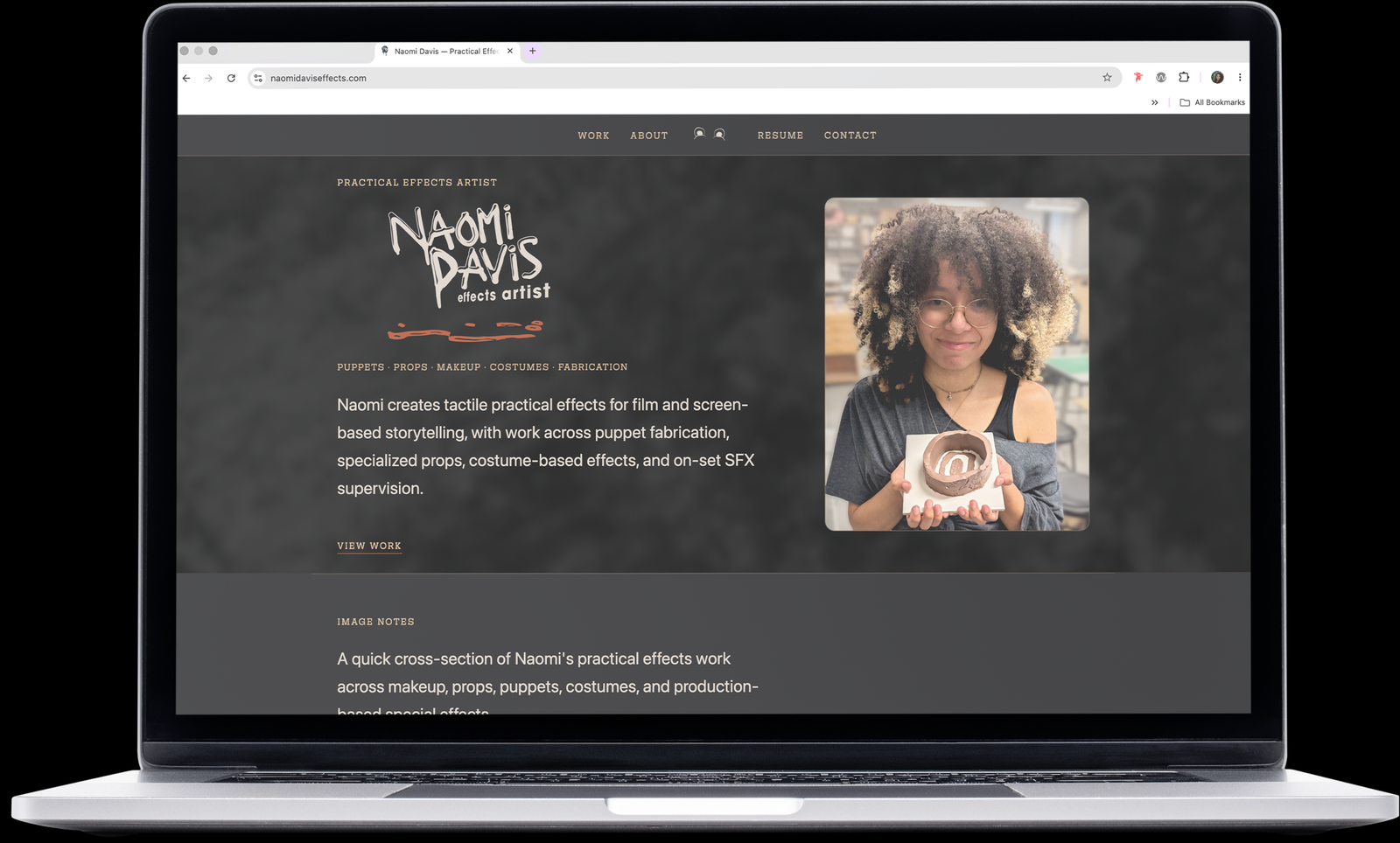
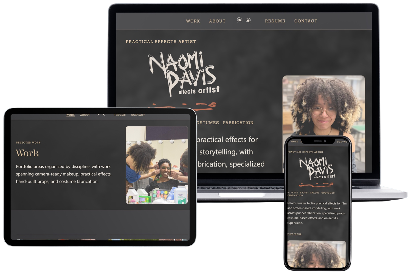
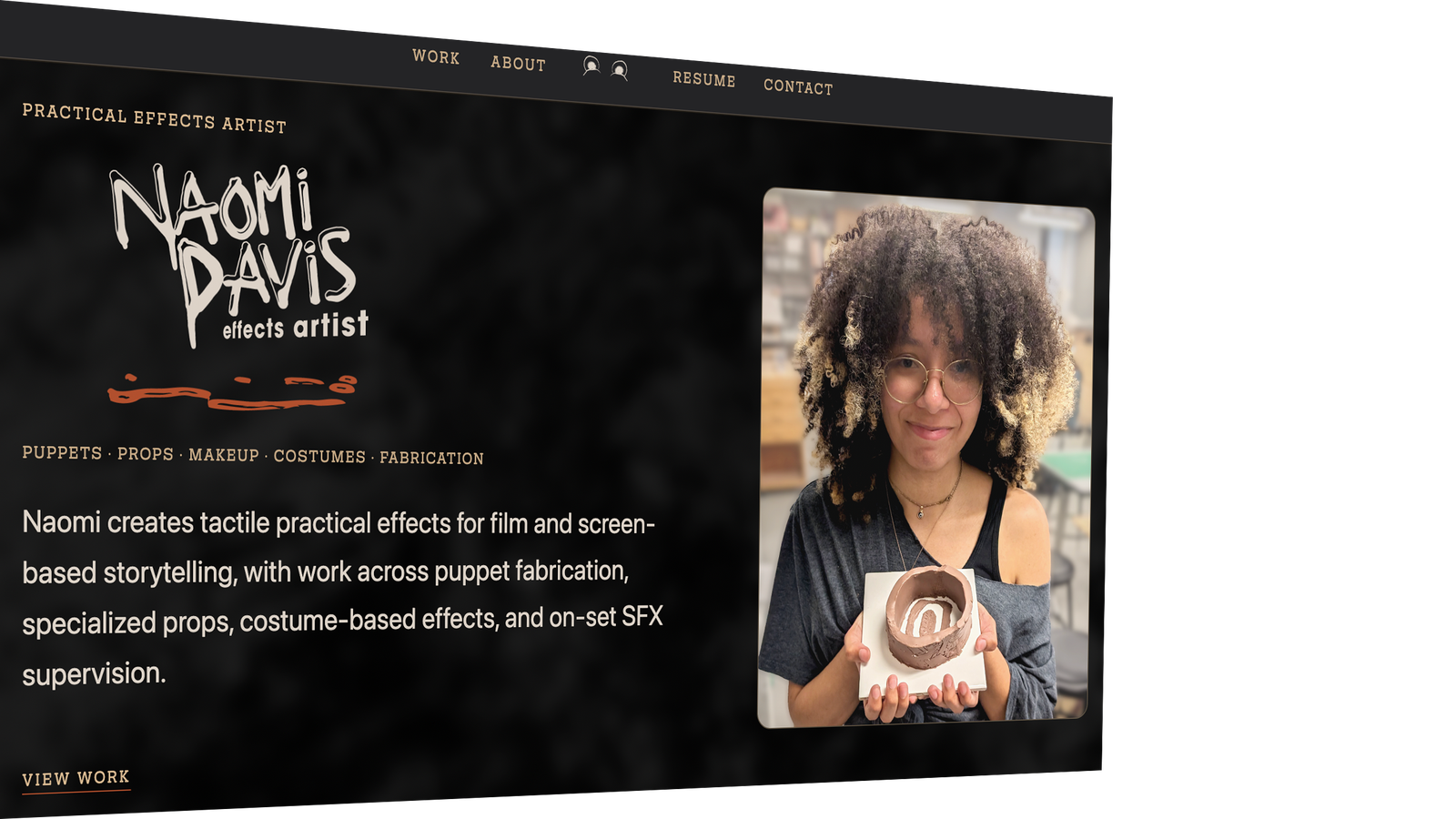
I designed and developed a portfolio website for practical-effects artist Naomi Davis, creating a visual system that supports rather than competes with her highly detailed work.
Outcome
The Naomi Davis SFX identity balances industry credibility with the strange, tactile energy of practical effects.
Every element connects to Naomi’s work: the typography distorts, the spill suggests material transformation, the eyes reference puppetry, and the palette holds warmth against technical precision. Together, the system gives an emerging artist a memorable professional identity that feels unmistakably her own.