2038 Winter Olympics Brand Identity
Overview
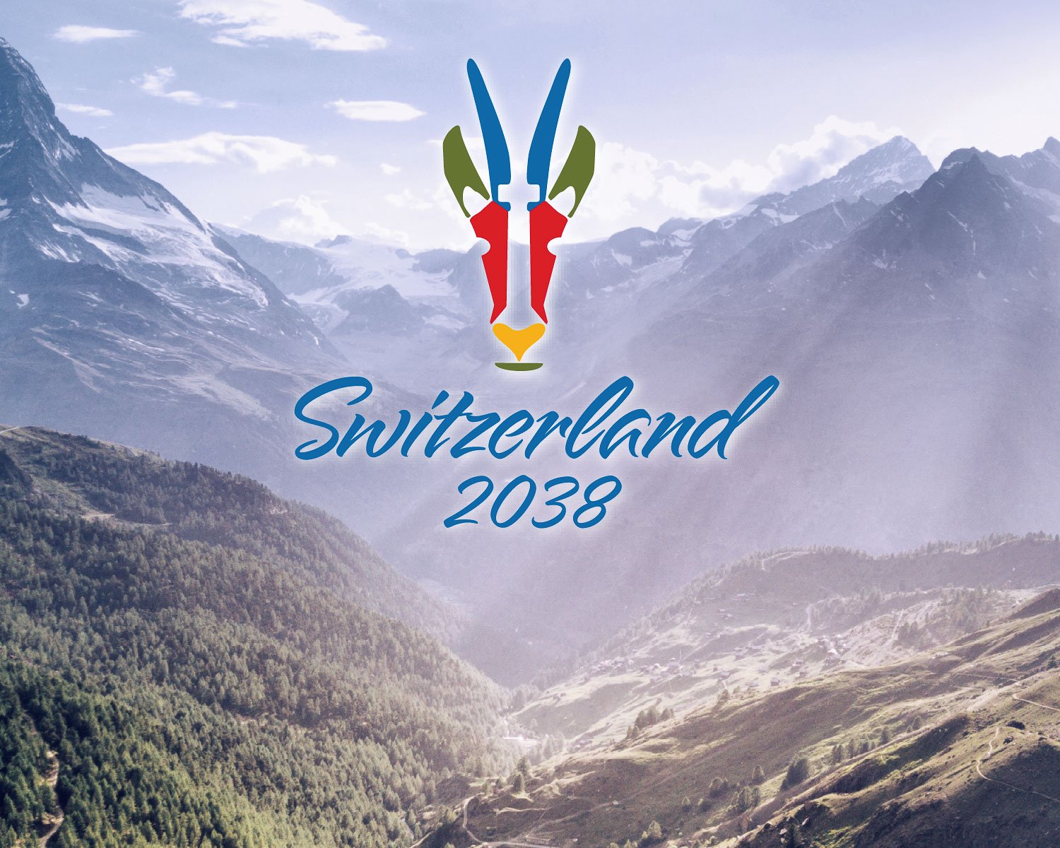
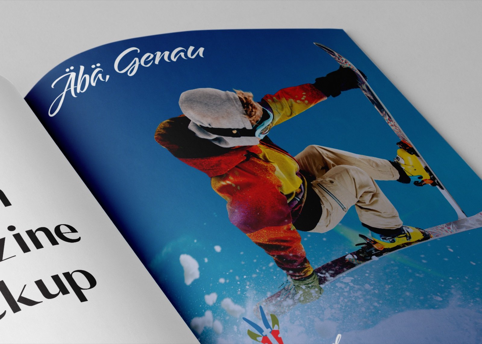
The 2038 Winter Olympics Brand Identity is a conceptual event system designed for a multilingual Swiss host nation. Built around the phrase Äbä, Genau, Swiss German for “yes, exactly,” the identity combines national symbolism, Alpine landscape, and Olympic ceremony with the clarity required for credentials, wayfinding, uniforms, print, and digital media.
The project is a speculative design concept, not an official Olympic commission.

Logo System + Symbolism
Problem
The identity needed to feel distinctly Swiss without relying on generic mountain imagery or becoming too ceremonial to function across a large international event.
Solution
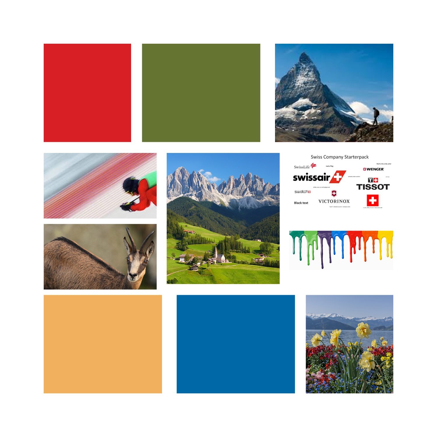
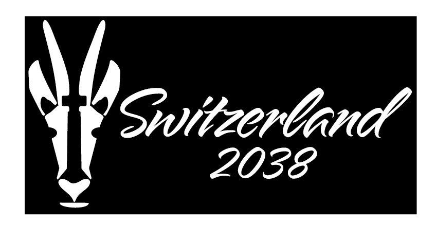
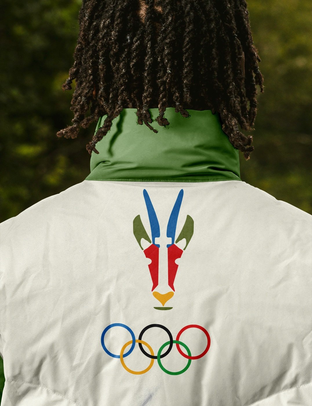
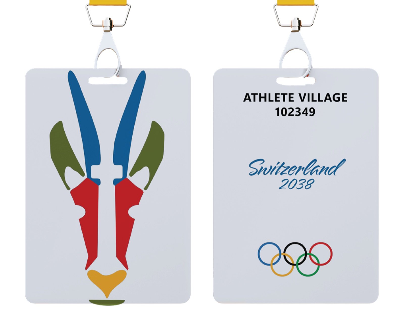
A heraldic chamois-inspired crest brings together references to the protected Aletsch Forest, Swiss Renaissance armor, the Matterhorn, ski heritage, switchback trails, and the national cross.
The chamois represents balance, resilience, and movement, while the crest gives the system enough authority for ceremonial use. Simplified logo variations allow the identity to scale from large-format campaign graphics to patches, wristbands, credentials, and broadcast applications.
The goal was for the mark to feel discovered within Swiss landscape and culture rather than assembled from disconnected national symbols.

Color + Typography
Problem
The system needed to represent Switzerland’s four national languages equally while remaining legible across multilingual schedules, navigation, accreditation, and event information.
Solution
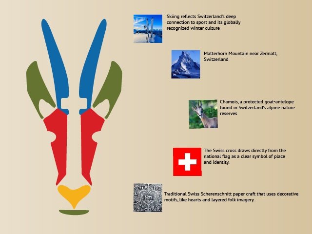
Color functions as part of the identity’s multilingual structure rather than as decoration. Ross Red represents Romansh, L’oro del Vincitore represents Italian, Jägergrün represents German, and Bleu Ciel represents French.
Neue Haas Unica provides a clear and flexible foundation for multilingual communication. Its precise but approachable forms support dense logistical information without making the identity feel clinical. Alpine Script adds ceremony and personality in more expressive brand moments.
Together, the color and typography systems balance cultural representation with the practical demands of an international sporting event.

Digital + Broadcast System
Problem
The identity needed to remain clear across fast-moving broadcast graphics, mobile schedules, social content, and multilingual event information.
Solution
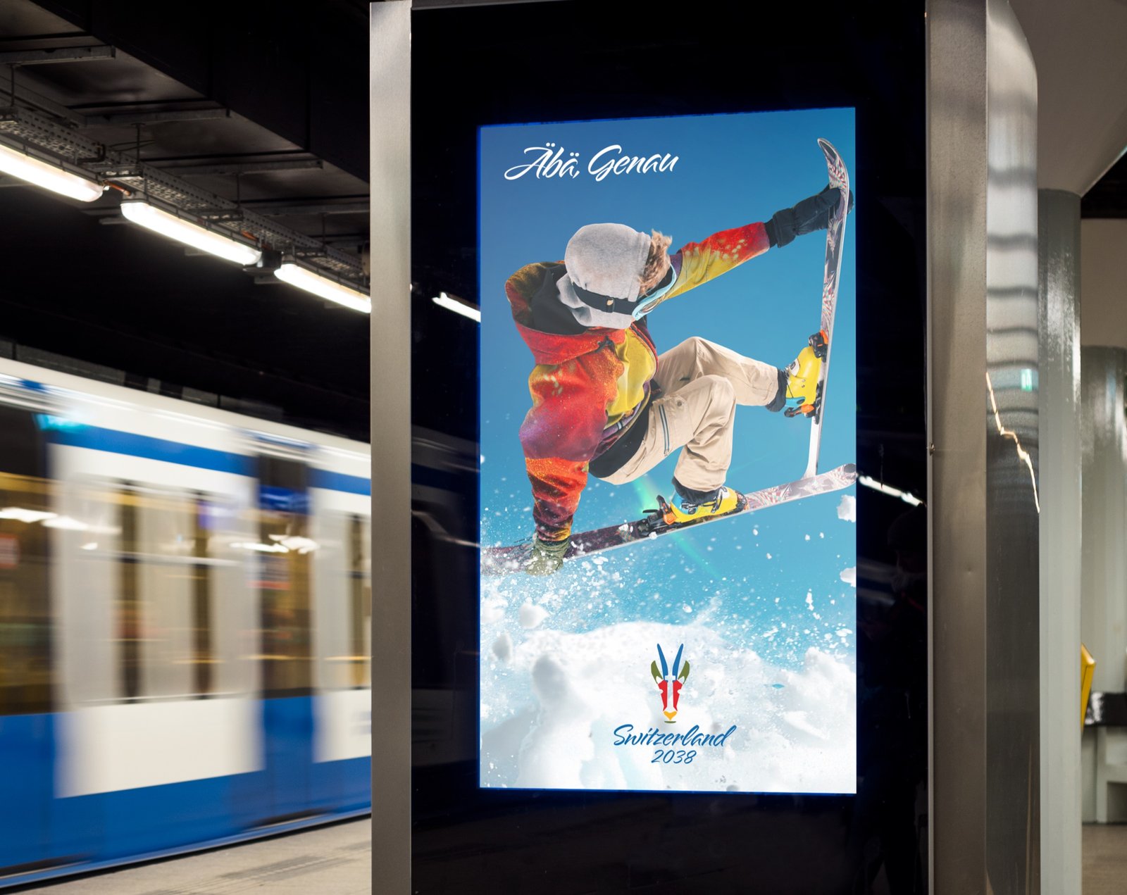
The digital system uses responsive logo variations, language-based color coding, and structured typography to preserve recognition across screens. Flexible templates allow the identity to move between live information, campaign storytelling, and event updates without losing consistency.
Campaign + Event Applications
Problem
Olympic identities must move between spectacle and logistics without losing recognition or coherence.
Solution
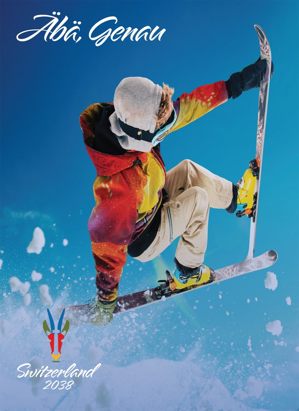
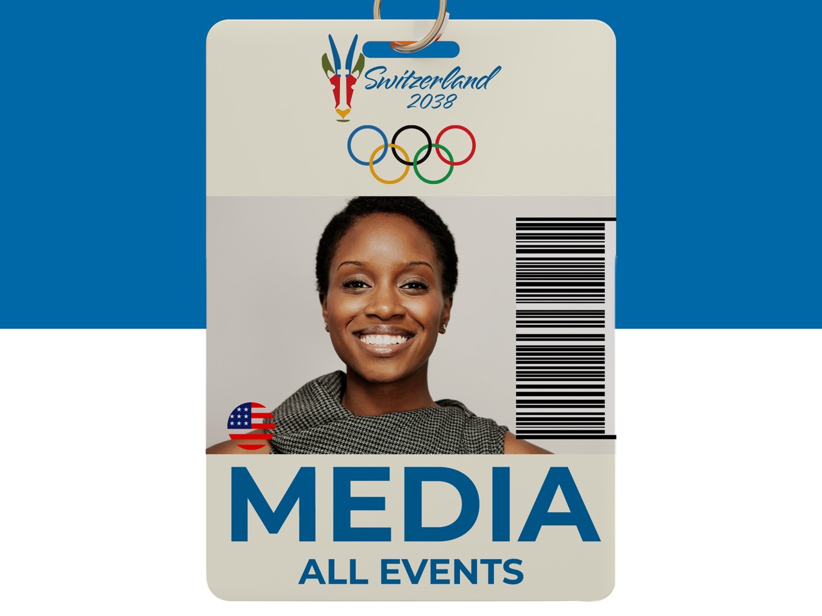
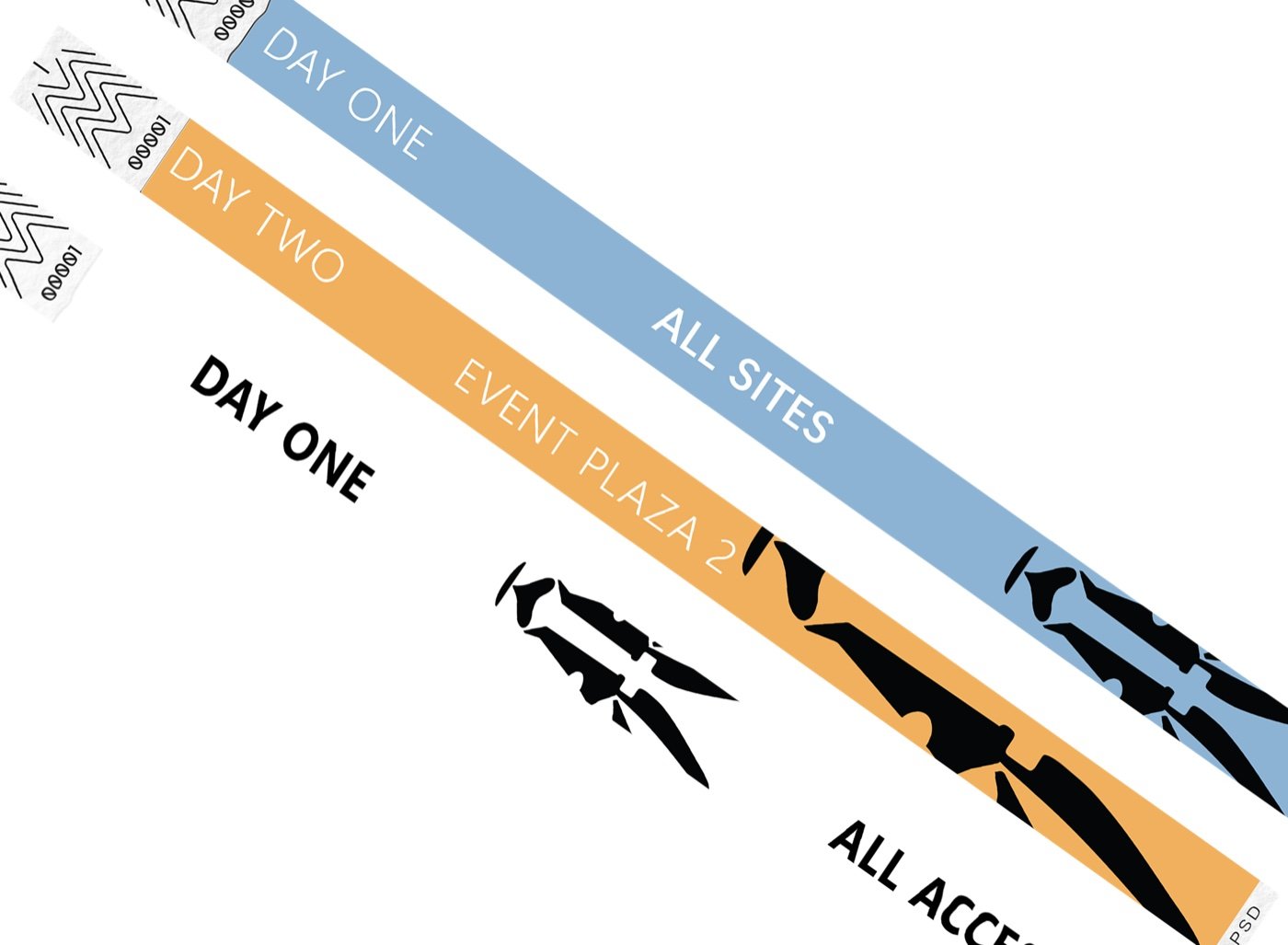
The visual system was tested across campaign advertising, uniforms, wristbands, media badges, athlete credentials, and preliminary venue graphics.
The crest carries ceremonial weight in large applications, while simplified marks, color coding, and structured typography support faster recognition in high-use formats. Consistent hierarchy and application rules allow each touchpoint to serve a different function while still feeling part of the same event.
Outcome
The final concept creates a system capable of moving from ritual to logistics.
Logo variations, multilingual color guidance, typography hierarchy, credential templates, and application rules are unified by Äbä, Genau. Whether the identity appears on a jacket patch, media badge, wristband, venue sign, or campaign graphic, it remains specific to Switzerland, flexible in use, and unmistakably part of the same Games.